Sunday, June 30, 2013

A Look At The Emerging Markets Asset Class

One area of the global equity markets that has experienced a significant correction this year is the emerging markets. As the below charts of one, five and ten year returns indicate, the emerging market space (EEM, VWO) has significantly underperformed the U.S. market (S&P 500 Index) for one and five years, but maintains a large performance edge for ten years. Importantly for investors then is determining whether this recent correction is an opportunity to increase exposure to the emerging market space or not.

From The Blog of HORAN Capital Advisors

A recent research report published by Fidelity Investments, Secular Outlook for Global Growth: Challenges and Opportunities, outlines some key factors for investors to evaluate for various countries. A large part of the long term future growth potential within a particular market is based on a country's GDP growth expectations.

From The Blog of HORAN Capital Advisors

Population growth and productivity growth are key factors that contribute to a country's overall GDP growth potential. With respect to population growth, the report notes difficulties in comparing one country to another due to differing life expectancies. In summary though, Fidelity notes:
"Working-age populations have risen rapidly for several decades, but almost all countries will experience slower growth and receive less of a direct demographic benefit over the next 20 years. Mature countries such as Japan and parts of Europe—with the U.S. as a notable exception—will experience outright declines in working-age population. In general, growth will be faster in the developing world—Latin America, Africa, emerging Asia, and the Middle East—although China’s demographics are not as constructive (emphasis added)."

From a productivity standpoint the report notes three categories that are key drivers of productivity growth: people, structure and catch-up potential.
  • People: "The greater the human capital, the more productive the economy. According to our human capital index, which incorporates measures of educational and scientific achievement as key drivers of future innovation and adoption of new technologies, human capital accumulation over the past two decades should boost global growth in the next 20 years. Human capital tends to be higher in the world’s wealthiest regions, such as the U.S., Japan, and northern Europe. South Korea has the highest human capital ranking, and several emerging economies—including China, Turkey, Thailand, and Vietnam—have also made great strides..."

    "On balance, young populations in the developing world—such as Mexico, Colombia, and the Philippines—will benefit from a maturing phase. Formerly maturing countries—such as China, South Korea, and Thailand—will be disadvantaged as their populations enter the aging phase. Already aging societies—such as Russia, Germany, and Japan—will feel the most negative effects on productivity as their demographics deteriorate further (as noted in the below chart)."
From The Blog of HORAN Capital Advisors
  • Structure: "Complex economies tend to be more competitive, use technology more effectively, and have better business climates and more nurturing institutions (source: Hausmann, Hidalgo, et al.). As a result, higher complexity typically means higher productivity. Greater variety and more sophisticated products in a country’s output signal a more complex economic structure. For example, Japan has the highest complexity ranking, while a number of African countries rank very low. Complexity should contribute slightly to higher global growth over the next 20 years as increasingly complex emerging economies—such as South Korea, China, Hungary, and Thailand—offset stagnating complexity in the most advanced economies."
  • Catch-up Potential: "In theory, less advanced economies should grow faster than more mature economies, thanks to their ability to grow off a lower base, adopt existing technologies, and catch up or converge to the higher income levels of developed countries. In practice, however, this convergence does not occur automatically but is conditional on other factors, such as the people and structure of an economy."

    "Once we account for these other growth determinants, catch-up potential has been—and will continue to be—a positive contributor to global GDP growth. After the rapid growth in recent decades of larger developing economies, such as China, India, and South Korea, higher per capita incomes now leave less catch-up potential for the next 20 years. While smaller poor economies in Africa and other regions will still benefit, catch-up potential will generally contribute much less to global growth."
    If an investor's time horizon is three to five years (or longer), data would seem to support that some emerging or developing economies will be leaders in global growth. As with individual stocks, the direction of the growth rate plays a key role in a country's potential return as well. As the GDP charts earlier in the post show, GDP growth in countries like China and India having been slowing recently. This decrease in the growth rate can cause short term market disruptions. Also, as the ten year performance chart above shows, emerging markets have done quite well relative to U.S. equities, but are emerging market indices mean reverting?If so, the dangers of catching a falling knife are certainly present.

    From The Blog of HORAN Capital Advisors

    There are many additional factors one most consider, such as financial data quality, the political stability or lack there of, etc. However, it does appear some of the emerging economies do offer return opportunities for investors, albeit, these markets are likely to remain more volatile than developed market equities. It is estimated that the emerging markets will continue to capture a larger share of the world's GDP and at some point this will likely have a positive impact on emerging equities.

    From The Blog of HORAN Capital Advisors

    Source:

    Secular Outlook for Global Growth:
    Challenges and Opportunities

    Fidelity Investments
    By: Irina Tytell, PhD, Senior Research Analyst
    Lisa Emsbo-Mattingly, Director of Asset Allocation Research
    Dirk Hofschire, CFA, SVP, Asset Allocation Research
    June 2013
    http://tinyurl.com/ka9gqvx


    Sunday, June 16, 2013

    Interest Rate Policy To Impact The Dollar And Commodity Related Industries

    All eyes have been on the Federal Reserve recently as talk of tapering of the quantitative easing programs was introduced by some Fed governors. An outcome of reducing the QE influence on the economy would likely be a move higher in interest rates. In fact, the yield on the 10-year Treasury recently moved higher from the 1.60% area to the 2.20% level as a result of the tapering comments. If this gradual reduction in QE is implemented, interest rates are likely to normalize at a higher level. Rising yields are not necessarily bad for the economy; however, higher rates are likely to have an impact on the value of the U.S. Dollar and commodity prices. There are a number of factors that influence the value of a currency, interest rates though, have a direct impact on a country's currency. As interest rates rise, the dollar tends to strengthen.

    From The Blog of HORAN Capital Advisors

    With this strengthening, downward pressure is placed on commodity prices. Some commodities, like oil, are impacted more by the strengthening of the US Dollar as oil is transacted in Dollars around the world. As an example, an oil company in say Norway would receive more Krone for every Dollar converted back to the Norwegian currency in a strong Dollar environment. Because the Norwegian oil company is getting a currency benefit in the exchange, downward pressure is placed on the price of oil. Certainly a country's fiscal situation, along with other factors (Purchasing Power Parity), will impact a currency's value.

    From The Blog of HORAN Capital Advisors

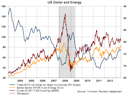
    For an investor then, a question becomes what is the impact of a potential rise in interest rates on commodities and commodity centric firms. Also, why is the dollar strengthening? Is the economy strengthening thus resulting in a higher demand for oil? Is this placing downward pressure on energy and commodity supplies which would translate into higher energy prices? The yellow colored line in the above chart represents the energy sector exchange traded fund XLE. It is pretty clear that energy firms are highly correlated with the move in energy prices. If U.S. Dollar strengthening translates into lower oil prices, the energy space could come under downward price pressure.

    As the below chart shows from a technical perspective oil prices have moved into a tight pendant pattern. Technically, it isn't clear from the chart in what direction oil prices might move, only that it could break hard in one direction or the other.
    From The Blog of HORAN Capital Advisors

    Other direct commodity plays have come under significant price pressures this year as well. Many differing variables are impacting these commodity prices. For the coal related industries (KOL), the significant discoveries of natural gas in the U.S. due to fracking is lessening the demand for coal. Also, lower commodity prices may be indicative of slowing economic growth rates in some of the emerging economies.

    From The Blog of HORAN Capital Advisors

    Both the materials sector and the energy sector have been some of the weaker performing sectors in the market this year. Up until last month, the better performing sectors had been the more defensive and higher yielding ones like health care and consumer staples. We discussed the potential rotation out of these sectors several weeks back with materials and energy beginning to outperform the broader market at that time.

    From The Blog of HORAN Capital Advisors

    Be it right or wrong, the market will be laser focused on the Fed's statement Wednesday in an effort to gain a better understanding of the future direction of interest rate policy. As noted in the link to Scott Grannis' article at the beginning of this post, higher rates are not necessarily a bad omen for the economy. However, future interest rate policy will likely influence these commodity related sectors.


    Friday, June 14, 2013

    Where Does A Top Bond Manager Invest His Personal Funds?

    Note, Google Reader shuts down for good on July 1st. If you read our content via Google Reader the following link outlines RSS reader alternatives.

    http://lifehacker.com/5990456/google-reader-is-getting-shut-down-here-are-the-best-alternatives
     
    Many of the readers of our content receive an email notification when we publish articles. You can sign up for these emails at the following link: Email Notification
    Now the article:

    In a recent interview between Stephen S. Smith, co-portfolio of the Legg Mason B.W. Global Opportunities Bond Fund (GOBAX), and Consuelo Mack of WealthTrack, Steve explains where he has allocated his personal investments over the past few years. His investment of choice has not been bonds.


    Wednesday, June 12, 2013

    Emerging Market Investments Unable To Find A Bottom

    One investment asset class that seemed to be favored by many investment advisers at the beginning of the year was emerging markets. When the crowd highly favors a certain type of investment, investors should be wary of following this crowd behavior. At the beginning of this year, InvestmentNews surveyed advisers and found the following,
    "...more than half the advisers surveyed by InvestmentNews at the beginning of the year said they planned to increase their allocation to emerging market stocks. No other equity asset class was cited as often. About a third of the polled advisers said they planned to increase allocations to emerging market bonds, the most of any fixed-income asset class."
    From The Blog of HORAN Capital Advisors

    Since the beginning of the year, emerging market investments have generated poor returns for investors as noted in the above chart. The chart shows the divergent spread between the performance of the emerging markets index (EEM) versus the S&P 500 Index (SPX). The S&P 500 has outperformed EEM by nearly 24 percentage points on a year to date basis.

    As the InvestmentNews article notes, emerging market bonds were another favored asset class at the beginning of 2013. I suppose the investing community thought if investors like emerging market equities, they will certainly be attracted to emerging market high yield bonds. So Blackrock's iShares came out with an emerging markets high yield bond index, EMHY. As the below chart details, the performance has been anything but stellar. The top three countryweightings for EMHY are:
    • Turkey: 16.75%
    • Venezuela: 14.75%
    • Philippines: 9.93%
    From The Blog of HORAN Capital Advisors

    The recent protests in Turkey have raised questions about the future growth opportunities in that country and investors have sold investment assets tied to Turkey.

    The options trading firm, Schaeffer’s Investment Research, Inc., recently noted in their trading floor blog the  divergent views surrounding EEM's recent "death cross" chart formation.

    The "pro" view: Emerging Markets Are Ready To Show Some Strength
    The "neutral" view: Is this the End of Emerging Market Underperformance?

    Given the recent underperformance of emerging markets, this may present an attractive entry point into this asset class. However, investors need to keep in mind, emerging markets have a large performance advantage over the broader U.S.equity market (S&P 500 Index) over the past ten years. I only note this in the event investors believe in the "reversion to the mean" theory

    From The Blog of HORAN Capital Advisors

    At the end of the day, the growth in the emerging markets will be tied to the economic growth prospects for these emerging market countries relative to the developed markets. What makes these allocation decisions more difficult today are the currency influences that are being manipulated by the central banks' around the globe and their respective quantitative easing programs. The article, The Currency Carry Trade, DBV and Risk, provides some insight into these currency issues.


    Chasing Yield Has A Downside When Interest Rates Rise

    As interest rates have moved higher, as evidenced by the below chart of the 10-year treasury yield, yield related investments have come under significant downward pressure. The below chart shows the 10-year treasury yield rising from 1.63% in early May to 2.19% at today's close.

    From The Blog of HORAN Capital Advisors

    Rising rates have had a negative impact on REITs. Investors that were chasing yield in this low interest rate environment are now experiencing the downside in these investments when market interest rates rise.

    From The Blog of HORAN Capital Advisors

    The above chart was sourced from the website, Institutional Imperative, and the article examines the valuation metrics of REITs. It is a worthwhile read for investors that are searching for yield.

    The spike in interest rates has also resulted in investors selling their investments in bond funds. The below chart shows bond funds experienced their first weekly outflow of the year. EPFR and Deutsche Bank report this outflow was the largest outflow ever.

    From The Blog of HORAN Capital Advisors
    Source: Quartz

    Below is a chart collection of other yield sectors that have been negatively impacted by the recent rise in market interest rates.

    From The Blog of HORAN Capital Advisors

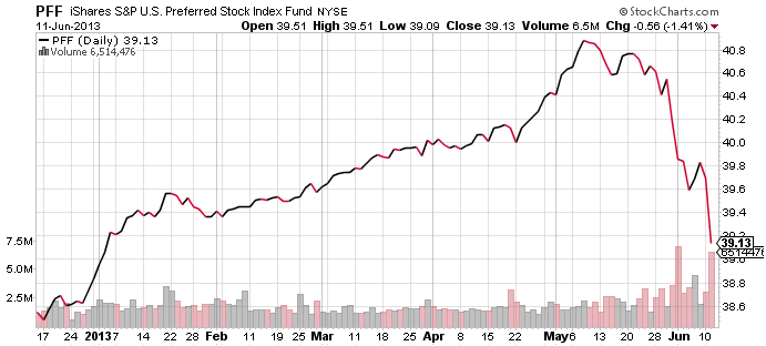
    Updated (6/12/2013. 9:03 AM): Including chart of preferreds:

    From The Blog of HORAN Capital Advisors

    It would appear the market might be sending the Fed a message that it wants QE to continue unabated. The recent hawkish tone from some Fed members and the comments about "tapering" of the QE programs seems to have certainly spooked the investors.


    Sunday, June 09, 2013

    Fickle Investor Sentiment

    One common trait of individual investors during the equity bull market run since November is restraint. Based on the American Association of Individual Investors sentiment survey, investor bullish sentiment fell over six percentage points to 29.47% for the weekly period ending June 6th. This follows a thirteen point decline in the prior week after moving up by over ten points during the week of May 23rd. This two week decline in bullish sentiment occurred during a period when the S&P 500 Index experienced a 5% correction on an intraday price basis.

    From The Blog of HORAN Capital Advisors

    Equity prices began turning higher at the end of the day on Thursday once the market (S&P 500) hit the technically important 1,598 level. The positive momentum carried through to Friday following the nonfarm payroll report. It seems the individual investor is anything but "all in" with their equity exposure.


    Sunday, June 02, 2013

    The Hindenburg Omen Is Triggered Again

    Friday afternoon one technical indicator, the Hindenburg Omen, seemed to dominate the discussion of a number of market pundits.


    The blog at stockcharts.com provides the following criteria in order for the indicator to be triggered,
    "Hindenburg Omen: Created by James Miekka, the Hindenburg Omen warns of potential weakness in the stock market. There are three criteria to activate the omen. First, NYSE new highs and new lows must both be more than 2.8% of advances plus declines. Second, the NY Composite is above the level it was 50 days ago. Third, the number of new highs cannot be more than double the number of new lows. The activation period is good for 30 days. Once active, a sell signal is triggered when the McClellan Oscillator moves below zero and negated when the McClellan Oscillator moves back above zero."
    Below is the chart detailing the criteria triggering the Omen.

    From The Blog of HORAN Capital Advisors

    Although the analyst in the CNBC video implies the Hindenburg Omen hasn't been triggered in a few years, it was last triggered in April. We wrote a post on our blog in August of 2010, The Real Facts About The Recent Hindenburg Omen Trigger, when it was triggered then. Since that August 2010 date, the market has enjoyed one of its better bullish advances. 

    From The Blog of HORAN Capital Advisors

    I believe Chip Anderson's comment at the conclusion of his chart analysis is appropriate for investors to take to heart.
    "Given that this is the second time in two months that this signal has occurred, ChartWatchers would be well advised to look for additional signs of technical weakness in this market."


    Saturday, June 01, 2013

    Remember Those Two Week Market Declines?

    A seemingly rare occurrence has taken place with the close of trading on Friday. The S&P 500 Index has declined for two weeks in a row. The last time this occurred was in November of last year. This is a testament to how strong the market advance has been so far this year.

    From The Blog of HORAN Capital Advisors

    The sectors that have been the weaker performers during this pullback or consolidation have been the traditionally more defensive ones, e.g., consumer staples, utilities, telecommunications. Also, the indices that are focused on dividend paying stocks have underperformed the broader market (S&P 500) as well.

    From The Blog of HORAN Capital Advisors

    From The Blog of HORAN Capital Advisors

    From The Blog of HORAN Capital Advisors

    As noted in several prior blog posts, investors seem to be chasing the higher yielding dividend paying stocks, viewing them as potential bond substitutes. This heightened interest in the dividend payers has pushed the valuations of many of them to stretched levels. With a little market weakness it appears these investors are finding out these dividend payers can be volatile also and they are reducing their position sizes.


    Thursday, May 30, 2013

    The Consequences Of Leveraged Investments Is Unfolding

    The market has interpreted recent commentary from the Fed that quantitative easing (QE) may be nearing an end. This type of thinking from market participants has led to a significant sell off in many fixed income investments as well as yield focused equities and ETFs.

    The negative impact with the price performance of many of these investments that have fixed income qualities has been exacerbated by the fact the underlying investments in some of these ETFs are highly leveraged in and of themselves. In the ETF MORT, one of the top holdings is Annaly Capital Management (NLY). NLY is leveraged about 9 to 1, debt to equity. Consequently, as the cost of borrowing rises, the amount of income payable to investors declines as interest cost increases. Additionally, as rates rise, the value of the mortgages that make up the assets of these mortgage type REITs (mREITs) declines. Also, some higher yielding investments borrow in order to purchase additional assets, like Nuveen's Premium Municipal Income Fund 2 (NPM) that currently borrows nearly 34% of its underlying assets to purchase additional investments.

    From The Blog of HORAN Capital Advisors
    Leverage is a double edged sword and works great when interest rates are falling. However, as rates begin to rise, leverage can really harm one's investment returns. At HORAN, we historically steer clear of leverage within our investments because of the outsized negative impact on performance when interest rates turn higher. As the below chart of the 10-year Treasury shows, it does not appear interest rates can fall much further.

    From The Blog of HORAN Capital Advisors


    Monday, May 27, 2013

    Stocks As Bonds And Modern Portfolio Theory

    Over time, as investors approach and enter into retirement, fixed income is often viewed as the stable portion of one's investment portfolio. Today though, central banks around the globe have implemented monetary policies that have pushed interest rates to near record lows. Does this artificial stimulus then make fixed income a not so safe investment asset class?

    From a prudence point of view, some factors investment advisors inquire about of their clients is an appropriate investment objective, time horizon for the investment funds and risk tolerance. Much thought should certainly go into these decisions so an appropriate asset allocation and investment strategy can be developed. The ultimate asset allocation goal often leads advisors to talk about risk adjusted returns and possibly modern portfolio theory (MPT). The MPT discussion likely will not occur in those exacts words, but some form of generating returns by assuming less risk will be a general theme of the discussion. The advisor's goal in the discussion is to develop a portfolio that lies on the so-called efficient frontier.

    We have written a number posts on the limitations of MPT, (here, here and here) and increasingly believe the artificial distortions unfolding in the fixed income markets could provide further risk to investors that rely strictly on MPT.  In a recent introductory paper on Modern Portfolio Theory and authored by Donald R. Chambers, he states,
    "...In the wake of difficult times such as the financial crisis that began in 2007, the concept of market efficiency is sometimes criticized. However, while no market is perfectly efficient, the evidence suggests that behaving as if markets were highly efficient provides investors with a solid approach (emphasis added)."
    Simply having a "solid approach" does not necessarily lead to higher returns though. Many managed futures funds are constructed using a solid approach. Morningstar reports the average one year return for the managed futures category is a negative 4.73% as of May 24, 2013. The best returning fund over one year reported a return of 9.22%. This compares to the return for the S&P 500 Index of nearly 28%. As a category, the managed futures funds achieved the return with half the risk of the market or S&P 500 Index. For investors then, do you prefer this 9.22% return or the 28% return knowing the market portfolio assumed 50% more risk. Hindsight is a wonderful perspective.

    A recent interview by Citadel strategist, Maarten Ackerman, contains a pertinent discussion on MPT and the efficient frontier. The risk for bond investors in this low interest rate environment is evident in the discussion with Ackerman. Ackermann continues to have confidence in MPT; however, discusses the risk inherent in bonds in this low interest rate environment. One weakness in MPT is the use of past returns and risk. Using potential returns and potential risks certainly is a preferred approach. He mentions an alternative to bonds is higher yielding high quality dividend paying stocks. In my view, stocks are not bonds. This chasing of yield has pushed the valuations of the defensive stocks to potentially stretched levels as noted in several earlier posts.


    For investors, keep in mind that during financial market stress, the correlation of most assets classes moves to near 1.0, i.e., they all go down together. Additionally, these are unique times with central banks flooding economies with liquidity. One technical investor commentary I follow is Charles Kirk of The Kirk Report. He has noted on many recent occasions that the "technical" trading setups are not unfolding as one would have expected in the past. The artificial stimulus activity from central banks could be playing a role in this. One quote scrolling through our Horan website is from Sir John Templeton, "The four most dangerous words in investing are: 'this time it's different.'"

    Maybe it is different this time and another event transpires that highlights the weakness in Modern Portfolio Theory.


    Sunday, May 26, 2013

    Earnings Yield Favors The Cyclical Sectors

    Standard & Poor's notes in a recent report on Earnings Yield By Sector that seven of ten S&P 500 sectors have earnings yields greater than their long term averages. As of mid-May, the S&P report notes,
    "the earnings yield on the S&P 500 was 5.4% (based on trailing GAAP EPS through Q1 2013), and nearly three times as high as the 1.9% yield on the 10-year Treasury bond. The last time the EPS yield was this far above the 10-year note yield was in 1955....Common wisdom holds that if stocks are yielding a lot (in EPS) relative to bonds (in interest), stocks are more attractive than bonds."
    The S&P research report contains an analysis of the historical yield relationship and the subsequent 12-month performance achieved by the Index.

    Another interesting aspect of the report is the average sector earnings yield relative to the 10-year Treasury Note. The three sectors that have earnings yields to 10-year Treasury Note multiples that are currently below their average are consumer staples, utilities and telecommunications. These three sectors are ones that have had the strongest performance this year through April 26th as noted in our post, Sector Rotation Underway. Since April 26th though these same three sectors have had the worst performance.

    From The Blog of HORAN Capital Advisors

    Some of the sectors with the best performance since April 26th are those that have the highest earnings yield relative to the 10-year Treasury note yield.

    From The Blog of HORAN Capital Advisors

    S&P concludes,
    "since stocks are yielding nearly three times in EPS what bonds are yielding in interest, history suggests that stocks may be the more attractively valued asset class. And since the cyclical sectors are trading at a higher premium to their normal EPS-to-bond yield multiple than the defensive sectors, the recent rotation into cyclical sectors at the expense of the defensive ones is a trade that appears to us to have some sustainability."
    For investors, although stocks appear appear to be a more attractive investment versus bonds, the summer months historically have been a weak period for equities.

    Source:

    Earnings Yield By Sector
    by: Sam Stovall, Chief Equity Strategist
    Standard & Poor's
    May 14, 2013
    http://us.spindices.com/documents/commentary/20130514-sector-watch-eps-yields.pdf?force_download=true


    Thursday, May 23, 2013

    Individual Investor Bullish Sentiment Spikes Higher

    Today's release of AAII's Investor Sentiment Survey saw bullish investor sentiment increase 10.5 percentage points to 49.0%. This reading is right at the average plus one standard deviation level. The bull/bear spread widen to +27.4%. The weekly reading can be volatile so looking at the 8-week moving average smooths some of this volatility. This week's 8-week average is reported at 33.7%, up from 32.3% last week.

    From The Blog of HORAN Capital Advisors


    Sunday, May 19, 2013

    Anadarko Petroleum Trades As Low As One Penny On Friday

    In the final second of trading on Friday, Anadarko Petroleum Corp. (APC) goes from a $90 stock and trades down to $.01, that is a penny a share before closing at $90.03. I am sure some buyers (computers) thought they were fortunate to pick up APC at one penny. On the contrary, the NYSE canceled trades executed below $87.56 per share.

    From The Blog of HORAN Capital Advisors

    From The Blog of HORAN Capital Advisors

    This type of trading activity certainly weighs on investor confidence in the markets and is an issue that most certainly needs to be addressed.


    Complacency Setting In And Fund Flows

    As the market continues to seemingly move higher every day, investor complacency appears to be on the rise. The recent CBOE equity put/call ratio is at a low level of .50. Like other sentiment indicators, this measure tends to be more accurate at extremes. On April 20th we wrote about the elevated put/call ratio and wondered if the market was excessively bearish. Since the time of that post, the market has advanced over 7%.

    From The Blog of HORAN Capital Advisors

    Additionally, fixed income assets as a percentage of all mutual fund assets recently began to decline. Are investors now warming up to equities in spite of the strong advance that has occurred year to date? On the other hand, given the low level of interest rates, bond investors are having a difficult time finding fixed income assets that provide adequate yield without taking on maturity and/or credit risk. Income yielding stocks seem to be the bond investors new bond substitute.

    From The Blog of HORAN Capital Advisors

    Recent economic news has not been great or not as bad as economist had expected. The Empire State Manufacturing Index was below expectations, housing starts lower than expectations and industrial production lower than expectations. The employment numbers showed an improvement last week; however, it is difficult to gauge whether it is because people continue to drop out of the work force (declining participation rate) and other non favorable factors.

    This is certainly a difficult point in the market cycle for investors to navigate. One thing the market does like to do is one, prove the consensus wrong and two, climb the proverbial "wall of worry."


    Wednesday, May 15, 2013

    Bond Funds And Central Banks Are Buying Equities

    Morningstar recently reported the number of bond funds buying or holding stocks is at the highest level in 18 years. The below chart from Charles Schwab details data over the last ten years. Schwab/Morningstar note the percentage of bond funds holding equities has remained stable over this time period though. Nonetheless, more bond funds are buying equities in an effort to find higher yielding securities than currently available from bonds.

    From The Blog of HORAN Capital Advisors

    In addition to bond funds jumping into dividend yielding stocks, Schwab reported the following from a survey of the central banks around the globe:
    "Last month, Central Bank Publications and Royal Bank of Scotland Group Plc conducted a survey of 60 central bankers. Nearly 25% of respondents said they own stock shares or plan to buy them. The Bank of Japan, featured heavily in the news recently and holder of the world's second-largest level of reserves, said it will more than double investments in stock exchange-traded funds by 2014. The Bank of Israel bought stocks for the first time last year, and the Swiss National Bank and Czech National Bank have upped their holdings to at least 10% of reserves.

    Of the 60 banks surveyed, 14 said they'd already invested in stocks or would do so within five years. In fact, this is the first time ever the question about stocks has been in this annual survey.

    Behind the heightened interest in stocks are growing central-bank reserves requiring increased diversification. In US dollar terms, the four largest central banks have expanded their balance sheets to more than $13 trillion, compared to only $3 trillion 10 years ago. Most central banks have had heavy and consistent reliance on fixed-income securities, but with yields low (and falling) in many countries, keeping all reserves in fixed income risks a declining value of reserves.

    However, 70% of the central banks in the survey (including the US Federal Reserve) indicated that stocks remain "beyond the pale." A few central banks, including the Fed and the Bank of England, have no mandate to purchase stocks directly.

    Jim O'Neill, chairman of Goldman Sachs Asset Management, weighed in: 'I don't think people should worry about (central banks owning stocks). Frankly, it makes a huge amount of sense in a world of floating exchange rates and such incredible opportunity, why should central banks keep so much money in very short-term, liquid things when they're not going to ever need it?'"


    Sunday, May 12, 2013

    A Tired Bull Market

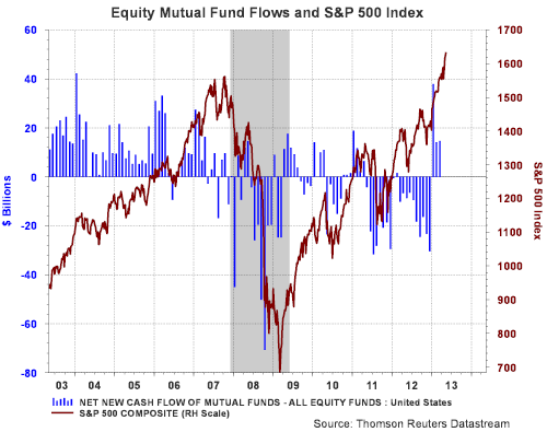
    Not much seems able to restrain the strength of the bull market in U.S. equities. On a year to date basis the S&P 500 Index is up 15.43%. The advance has finally drawn investors into equity mutual funds as reflected in positive equity mutual fund flows the first three months of the year.

    From The Blog of HORAN Capital Advisors

    The positive market results continue to keep the S&P 500 Index in a positive uptrend channel that began in the middle of November of last year. Aside from the fact company fundamentals and valuations look reasonable, at least not overvalued, higher equity prices could continue to unfold. However, we have noted in several recent posts the rotation that has occurred of late out of the more defensive sectors into the more cyclical ones.

    From The Blog of HORAN Capital Advisors

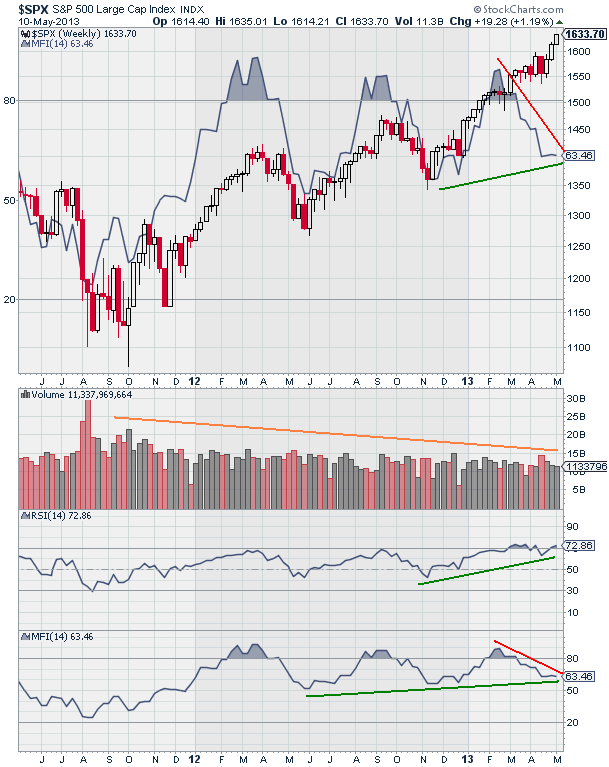
    Because of the significant amount of artificial stimulus being pumped into the global economy by most central banks around the world, we believe investors need to have a heightened focus on the underlying technical aspects of the market in order to gain insight into potential market turning points. No one technical indicator is the panacea that will predict the market's future direction. One indicator useful to evaluate for the market and/or individual stocks is the Money Flow Index (MFI). This index is a variation of the Relative Strength Index (RSI). The StockCharts.com website provides the following definition of MFI:
    "The Money Flow Index (MFI) is an oscillator that uses both price and volume to measure buying and selling pressure. Created by Gene Quong and Avrum Soudack, MFI is also known as volume-weighted RSI. MFI starts with the typical price for each period. Money flow is positive when the typical price rises (buying pressure) and negative when the typical price declines (selling pressure). A ratio of positive and negative money flow is then plugged into an RSI formula to create an oscillator that moves between zero and one hundred. As a momentum oscillator tied to volume, the Money Flow Index (MFI) is best suited to identify reversals and price extremes with a variety of signals."

    "The Money Flow Index is a rather unique indicator that combines momentum and volume with an RSI formula. RSI momentum generally favors the bulls when the indicator is above 50 and the bears when below 50. Even though MFI is considered a volume-weighted RSI, using the centerline to determine a bullish or bearish bias does not work as well. Instead, MFI is better suited to identify potential reversals with overbought/oversold levels, bullish/bearish divergences and bullish/bearish failure swings (emphasis added). As with all indicators, MFI should not be used by itself. A pure momentum oscillator, such as RSI, or pattern analysis can be combined with MFI to increase signal robustness."
    As the below charts display, the weekly chart of the market and the MFI are showing divergence. A weekly time period is used in order to smooth out the potential day to day market variations. On the daily chart, the MFI trend is positive; however, the index recently rose above the overbought area of 80 on the chart. Also, market volume has been in a steady decline since late 2011 and has not picked up in spite of positive equity fund flows as noted in the first chart in this post.

    From The Blog of HORAN Capital Advisors

    From The Blog of HORAN Capital Advisors

    As with any indicator, no single one is the perfect market predictor. As an example, the Accumulation Distribution Line (ADL) is in a very bullish pattern and is based on the money flow concept as well. As the ADL definition notes, this indicator has given off false signals as well.

    At HORAN, we do remain positive on the market, but believe some consolidation could occur and would be healthy for the performance potential through the balance of the year. Our focus has been to reduce or sell some of the holdings in the defensive sectors and build or add to positions in the more cyclically exposed sectors that have underperformed this year, and over the last year for that matter. One stock we trimmed recently was Johnson & Johnson (JNJ). We trimmed the holding for more than technical reasons, but looking at the chart with the MFI overlay, it does show some potential stock weakness ahead when looking at just the MFI.


    Thursday, May 09, 2013

    U.S. Centric Companies Outperforming

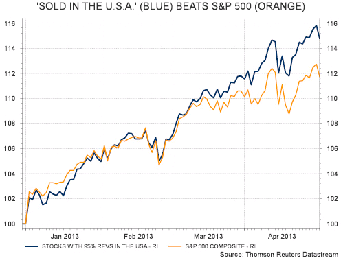
    In a recent AlphaNow report from Thomson Reuters, it shows U.S. companies that generate a majority of their revenues from the U.S. are outperforming the broader market S&P 500 Index. The report highlights that 150 companies/stocks generated at least 95% of their revenues within the USA and outperformed the S&P 500. On a 2013 year to date basis (through May 1), they note their total return beat the S&P 500: 15% vs. 12%, and 31% to 21% in the past two years.

    From The Blog of HORAN Capital Advisors

    The report also notes, "The three top overweights come in sectors which have all outperformed so far in 2013 (see chart) – financials (+13% overweight), telecom services (+11%) and utilities (+10%). That’s before adding in consumer discretionary (+2% overweight) which is the second best performing sector as of May 2." Of late though, much has been stated about the potential rotation underway out of these more defensive sectors and into the more cyclically oriented ones. Investors need to be on guard about chasing past returns.

    From The Blog of HORAN Capital Advisors


    Tuesday, May 07, 2013

    Can Cyclicals Breakout And Provide Momentum For Higher Equity Prices?

    We noted in a post a week and a half ago that the market's defensive sectors have been the main driver of the S&P 500 Index's strong performance this year. In this earlier post, Sector Rotation May Be Underway, we noted investors may be rotating out of the defensive sectors and into the more cyclical ones. In that regard, J. C.Parets of All Star Charts wrote an interesting article showing the more cyclical sectors recent strong performance vs. the staples sector is retesting resistance for the fourth time in two years. This number of retests has historically been a bullish indicator and could be for cyclicals in this now. The question is whether this rotation into cyclicals can be sustained and drive the market to further highs.

    From The Blog of HORAN Capital Advisors

    h/t: The Kirk Report


    Sunday, May 05, 2013

    Equal Weighted S&P 500 Index Insights

    Ten years ago Standard and Poor's released its Equal Weighted S&P 500 Index (EWI). Since that time a number of index firms have created equal weighted ETFs that investors are able to invest in directly. In S&P's recently released white paper, 10 Years Later: Where In The World Is Equal Weight Indexing Now?, they cover a great deal of the historical data on the equal weighted index relative to the more common market cap weighted S&P 500 Index. Due to the cap weighted nature of the S&P 500, one obvious characteristic is the EWI S&P 500 is more heavily weighted in the smaller capitalization stocks and underweighted in the large cap stocks of the S&P 500 Index. Because of this factor, S&P demonstrates the equal weighted index does have a tendency to outperform more frequently in up markets than in down markets and the EWI does carry a higher beta.

    From The Blog of HORAN Capital Advisors

    In addition to more frequent up market outperformance, over a longer time frame, the EW S&P 500 Index has outperformed the cap weighted S&P 500 Index.

    From The Blog of HORAN Capital Advisors

    Given the emergence of technology and the tech sector leading up to the technology bubble in 2000, one might believe performance differences between equal weighted and cap weighted indices is due to the differing sector weights. However, one must keep in mind the sector weighting within the EWI is determined by the number of companies that make up the overall index. As noted by S&P,
    "Since 1999, the S&P 500 EWI has been consistently overweighted materials, consumer discretionary and utilities, and underweighted energy, health care and telecommunication services relative to the S&P 500. However, for other sectors the situation has varied considerably over time. In fact, even for sectors for which the S&P 500 EWI has been consistently overweight or underweight, the difference in concentration between the two indices has altered significantly.

    Throughout the history, the largest change in the relative sector weights of the two indices has been in the information technology (IT) sector, mainly due to the change in the sector weights of the S&P 500 itself. During the technology bubble in the late 1990s, the IT sector weight of the S&P 500 increased to 33% in March 2000 from 13% at the start of 1998. Correspondingly, the S&P 500 EWI went from being underweight in the sector by less than 3% to being underweight by more than 20% in the same period. This has a very important implication that explains the different performance of the S&P 500 EWI relative to the S&P 500..."
    S&P's paper does indicate the performance differences are more attributable to selection effects than allocation effects though.

    From The Blog of HORAN Capital Advisors

    A recent example of this selection impact can be seen in the below chart comparing the S&P cap weighted and equal weighted (RSP) performance relative to Apple's (AAPL) stock price performance. RSP is the Guggenhiem S&P 500 Equal Weighted ETF. Apple remains the largest holding in the cap weighted S&P 500 Index and its significant underperformance since mid November has contributed to the cap weighted index underperforming the equal weighted index.

    From The Blog of HORAN Capital Advisors

    For investors then, an equal weighted approach may not result in outperformance on an every year basis; however, it has proven to outperform over longer time frames. Additionally, the EWI is rebalanced on a quarterly basis, thus, leading to a strategy that results in selling high and buying low.

    Source:

    10 Years Later: Where In The World Is Equal Weight Indexing Now?
    S & P Dow Jones Indices
    By: Liyu Zeng, CFA, Director, Global Research & Design
     and Frank Luo, Ph.D, Head, Global Research & Design


    Saturday, May 04, 2013

    Investors' Continued Search For Yield

    In this low interest rate environment, investor search parameters on Google indicate investors have a propensity for dividend paying stocks at this point in time. Last week we noted in our post, Sector Rotation May Be Underway, that the defensive sectors in the S&P 500 Index generated strong outperformance versus the more cyclical sectors this year. A common characteristic of these defensive sectors is they comprise some of the better dividend yielding stocks. A caution for investors is many of the stocks within the defensive sectors are trading at historically high valuations on a price to earnings basis.