Showing posts with label Investments. Show all posts

Saturday, July 02, 2016

The Pursuit Of Yield Continues To Benefit Return For 2016 Dogs Of The Dow

Investors' continued pursuit of income in this low bond interest rate environment has led them to higher yielding stocks. Partial evidence of this can be found in the total return of the Dogs of the Dow basket of stocks this year. As noted in earlier posts, the Dogs of the Dow strategy is one where investors select the ten stocks that have the highest dividend yield from the stocks in the Dow Jones Industrial Index (DJIA) after the close of business on the last trading day of the year. Once the ten stocks are determined, an investor invests an equal dollar amount in each of the ten stocks and holds them for the entire next year.

The average YTD total return through July 1, 2016 of the ten 2016 Dogs of the Dow equals 15.4%. This compares to the Dow SPDR and S&P 500 SPDR returns of 4.4% and 4.0%, respectively. The top performing Dow Dog this year is Verizon (VZ), returning 24.5%. Of course, it was also the highest yielding Dow Dog at the beginning of 2016. Below is a table containing various metrics on the 2016 Dogs of the Dow.


A full list of the Dow stocks with return and yield data can be found at the Dogs of the Dow website.


Sunday, May 01, 2016

Dogs Of The Dow Outpacing Broader Market

This year's performance of the Dogs of the Dow is indicative of investor interest in dividend paying stocks. The Dogs of the Dow strategy is one where investors select the ten stocks that have the highest dividend yield from the stocks in the Dow Jones Industrial Index (DJIA) after the close of business on the last trading day of the year. Once the ten stocks are determined, an investor invests an equal dollar amount in each of the ten stocks and holds them for the entire next year.

As can be seen in the below table, the average return of this year's Dogs of the Dow is 8.9% versus the Dow Jones Industrial Average ETF return of 2.8% and the S&P 500 Index ETF return of 1.7% through April 29, 2016. Particular strength is being seen in the energy and industrial Dow Dogs this year. Much of the year has yet to unfold; however, Intel's (INTC) current yield of 3.43% (yield of 2.79% at year end 2015) would qualify it as a Dog of the Dow at the moment. Year to date Intel's stock price has declined 12.1%. Intel would replace Wal-Mart (WMT) where WMT's current yield is 2.99%.


Saturday, February 07, 2015

A Strong Dollar Does Not Mean Large Cap U.S. Multinationals Underperfom Small Cap Equities

The US Dollar has been on a strengthening trajectory since early 2011 and more so since mid year last year. This move in the Dollar has been a headwind for U.S. domiciled multinational companies earnings, with many firms citing this as a reason for earnings disappointment during this earnings reporting season.

From The Blog of HORAN Capital Advisors

One belief is investors can avoid this negative currency impact within their investment portfolio by focusing more on small company stocks since small caps are less exposed to this exchange rate risk. The thinking is small cap companies generate a larger percentage of their overall business from domestic sources versus the larger multinationals that generate a larger portion of their revenue from overseas. In fact this seems to be the case during the earlier phase of the Dollar's strengthening as the above chart shows small cap outperformance from 2010 through most of 2013. However, as the Dollar continues to strengthen, larger cap companies actually outperform small caps as occurred in the mid 1990s. This can be seen in the below chart that compares the relative return of large caps versus small caps (orange line) to the U.S. Dollar Index.

From The Blog of HORAN Capital Advisors

S&P Capital IQ provided additional analysis in a report released in late January titled, Don't Duck A Rising Buck. In the report S&P analyzed the performance of large cap stocks versus small cap stocks during bear markets and bull markets and compared the results to the trend of the U.S. Dollar. The report is a worthwhile read for investors. In short, the data suggests large cap companies actually outperform small cap companies in a rising Dollar environment when the overall equity market is in a bull market phase. This outperformance occurs when the Dollar Index rises above 95 (closed Friday just below 95.) The report contains a sector performance comparison as well.

From The Blog of HORAN Capital Advisors

There are several reasons this outperformance by large caps may occur when the Dollar Index is above 95 and when the equity market is in a bull phase. Foreign investors likely see the U.S. economy growing at a faster pace than other economies, and this is the case today. With this thinking, foreign investors will allocate investment funds to U.S. equities. In doing so, they tend to focus on larger multinational firms that are more broadly know. Additionally, larger equities are more likely to be more liquid. This additional investment flow into the U.S. and the investment in Dollar denominated assets further pushes the U.S. Dollar Index higher. For non U.S. investors then, they receive an additional return benefit from a positive currency exchange when Dollar's are converted back into their home currency.

Just one comment on small caps. At HORAN, we have been out of small cap equities since late 2013. A reason we chose to eliminate the category from our client allocations was partially due to the valuation of small cap stocks broadly. In a Reuters report today, Valuations May Hurt Small Caps, Despite Job Growth, the article cites the apparent overvaluation of small cap stocks. Specifically, the article notes,
"The trailing price-to-earnings ratio of the index is at 22.7, which is 40 percent more than its long-term average of 16.2. Its price-to-sales ratio of 1.6 is nearly 67 percent higher than its long-term average."
In summary, even though small caps are less exposed to overseas business, there are several factors that indicate large cap U.S. equities outperform in spite of the currency headwind. Additionally, the valuation of small cap stocks are likely to be a headwind for the small cap equity asset class.


Sunday, June 15, 2014

Active Share And Equal Weighted Investment Strategies

S&P Dow Jones Indices recently released an interesting white paper, Equal-Weight Benchmarking: Raising the Monkey Bars, that provides detail on why equal weighted benchmarks have mostly outperformed the cap weighted S&P 500 Index historically. Importantly, S&P notes,
"While cap-weighted indices measure many things, there is (at least) one important thing that they do not measure. The return of a cap-weighted index represents the performance of the average invested dollar, not the performance of the average stock. What is the average stock’s performance? The process of adding each stock’s return and dividing by the total number of stocks is precisely how the return of an equally-weighted index is calculated."
From The Blog of HORAN Capital Advisors

One important aspect of the white paper led to the discussion of "Active Share." Active Share has recently become a more popular topic as the variable provides investors with a data point to evaluate whether their active manager is really a closet indexer. Active share is essentially a measure that indicates by how much a particular portfolio differs from its representative benchmark. The importance of knowing whether your investment manager is employing a closet index strategy has to do with the fact that a closet indexing strategy is one that is difficult to outperform the market on an after fee basis. PIMCO released a white paper late last year, Active Share, Tracking Error and Manager Style, that provides a more indepth discussion on Active Share.

For more concentrated investment managers, one holding less than 50 securities, the PIMCO article notes managers with Active Share between 20%-60% would be characterized as having a low Active Share. Active Share over 90% would be considered high. At HORAN, our model portfolio holds 44 positions today with an Active Share of a little over 80%. The S&P 500 Index is our benchmark for our individual stocks, yet we have positions in eight stocks not represented in the S&P 500 Index. These eight positions account for 16.6% of our individual large cap equity weighting. Additionally, there are several larger S&P weighted positions we do not hold.

In conclusion, active share is only one measurement statistic investors can evaluate when comparing investment managers from one another. Just as a high Active Share can provide a manager with a greater likelihood to outperform their respective benchmark, it could also result in a greater likelihood to underperform. As noted in the PIMCO white paper, Active Share does affect idiosyncratic risk or that risk that can be mitigated by diversification. On the other hand, PIMCO notes there is no link between active share and systematic risk. Systematic risk is undiversifiable risk or market risk.


Sunday, June 01, 2014

College Costs A Bigger Hurdle Than Health Care Costs For Many

Terry Horan, CLU, ChFC is CEO of HORAN Associates, HORAN Capital Advisors' business partner. Terry often states the two greatest challenges facing Americans today are:
  • access to quality, affordable health care; and
  • securing professional counsel to build and sustain wealth for a lifetime
After seeing a report from JP Morgan Asset Management, I wonder if one of the greatest challenges of all for families is being able to finance their children's education. Below are several slides pulled from the 46-page booklet. First a couple of highlights:
  • since 1983 college tuition costs have increased faster than any other household expense. Tuition costs have increased a cumulative 645% versus health care's cumulative increase of 326%.
  • at a 5% annual increase, college costs will more than double by 2030
  • for children born today, the projected cost of a four-year private college education will total over $409,913. The same cost for a public education will total over $185,000.

From The Blog of HORAN Capital Advisors

From The Blog of HORAN Capital Advisors

From The Blog of HORAN Capital Advisors

Young families will be hard pressed to save enough funds to finance their children's education costs. In addition to a well thought out saving plan, the dollars saved will need to be invested in asset classes that can generate significant positive returns. In our firm's view bonds will not grow at an adequate rate so families will need to position their investments in potentially better returning asset classes like equities and alternatives.


Saturday, April 19, 2014

Dow Dogs Are Front Of The Pack

Interestingly, we last highlighted the Dogs of the Dow strategy about this time last year and at that time the Dow Dogs were outperforming the overall Dow Jones Industrial Average Index. For all of 2013 the Dow Dogs of last year outperformed the Dow Index as well as the S&P 500 Index. As we turn our attention to 2014, the Dogs of the Dow are again outperforming many of the broader market indices except for the utility index and the transportation index. The Dow Dog strategy consists of selecting the ten stocks that have the highest dividend yield from the stocks in the Dow Jones Industrial Index (DJIA) after the close of business on the last trading day of the prior year. Once the ten stocks are determined, an investor would invest an equal dollar amount in each of the ten stocks and hold them for the entire year. Investors should note the strategy has generated mixed results over the years though.

Below is the year to date performance of the Dow Dogs through the market close on 4/17/2014. Below the table is a listing of the performance of a few market indices for this year as well. The year to date outperformance of this strategy is in line with the recent rotation occurring within the market from growth style equities to value style equities.

From The Blog of HORAN Capital Advisors

From The Blog of HORAN Capital Advisors


Wednesday, March 26, 2014

Why It Matters That Value Stocks Are Outperforming Growth Stocks

Quite a bit of discussion has occurred over the past several days regarding the fact value stocks are outperforming growth stocks. This outperformance has taken place since the beginning of March as can be seen in the below chart.

From The Blog of HORAN Capital Advisors


In looking at a longer view of the value growth cycle, growth had been the outperforming style since April of last year.

From The Blog of HORAN Capital Advisors


The importance of this fact has to do with the performance of these two styles relative to the economic or business cycle. As noted in a white paper, Forecasting Performance Cycles of Value and Growth Stocks in Global Equity Markets, written by David Kovacs, CFA of Turner Investment Partners,
"Following periods when short-term rates ease, lending activity and subsequently business development typically accelerate. During these periods value stocks, led by financial and industrial companies, begin to outperform. As the global economy begins to expand, demand for basic materials, such as metals, and energy related commodities, such as oil and natural gas, rises. That leads to an increase in the price of these commodities which in turn has historically led to the outperformance of the stocks of commodity producers and processors."

"As in the case of an economic slowdown, the monetary response to economic expansion is also typically delayed until sustained signs of acceleration in inflation are apparent. In response, central banks begin to hike short-term interest rates to the point where the interest rate yield curve is flat or inverted, i.e. short-term rates are either equal to or higher than long-term rates. Lending activity to businesses then typically slows significantly, profits of financial institutions decline, and financial stock prices begin to lag the market averages. Economic activity moderates, and once again those stocks that can grow their earnings at the fastest pace, namely, growth stocks, typically resume a period of multi-year outperformance."
In short, as the economy begins to accelerate, value companies begin to outperform. Conversely, when the economy begins to slow, those companies that can grow their earnings in spite of the slowing environment (growth stocks) will begin to outperform.

Below is a chart comparing the sector weightings for the S&P 500 Growth Index to that of the S&P 500 Value Index. Additionally, the last two charts show the top holdings for each of these indexes.

From The Blog of HORAN Capital Advisors

From The Blog of HORAN Capital Advisors

From The Blog of HORAN Capital Advisors

The stock market does tend to be a pretty good weighing machine on future economic activity. If the value style is in fact beginning to assume market leadership on a sustained basis, maybe economic activity is improving. We noted this fact in our post last week highlighting a few economic variables that would be indicative of a strengthening economic environment, Economic Data Continues To Support A Stronger Equity Market. For investors, looking at value stocks that have lagged the market advance that occurred in the second half of 2013 could provide some rewarding investment opportunities.


Sunday, March 23, 2014

Saving At A Younger Age Pays Off In Retirement

In J.P. Morgan's recently released Guide To Retirement, one chart in the guide notes the advantage of beginning a savings program at an early age. The early start to a savings program generates its payoff due to the power of compounding. Compounding refers to the process of earning return on principal plus the return that was earned earlier. I believe the below chart speaks for itself, but with entitlement reform an almost foregone conclusion, retirees will need savings outside of government provided programs like social security.

From The Blog of HORAN Capital Advisors

h/t: Reuters Data Dive


Saturday, March 22, 2014

Declining Foot Traffic At Malls A Challenge For Retailing

Retailing has never been an easy business. Consumer tastes and preferences are ever changing. In a recent report by Fidelity Investments, they note the trend in foot traffic at malls has been on the decline over the past three years.

From The Blog of HORAN Capital Advisors

The report notes a number of factors are likely causes attributable to fewer shoppers frequenting malls, of course the weather is cited as one of those factors this year. More systemic reason are probably influencing this behavior as well with the report noting,
"The growth of mobile devices and the increased accessibility of online pricing have helped fuel increased Web sales. Through the first three quarters of 2013, e-commerce sales increased by 17.4% over the same period in 2012 [according to the U.S. Census bureau]. Today, consumers increasingly turn to their smartphones and tablets to comparison shop on multiple sites simultaneously, rather than travel from store to store for the lowest prices. Purchases can often be delivered within a day or two, at either a nominal shipping expense or free of charge. Further, merchandise returns have been streamlined, as many e-commerce retailers send prepaid return shipping labels to customers with their purchases, removing yet another obstacle to shopping online."
In spite of the potential difficulties facing retailers there are retail segments that seem to be navigating this transition favorably in the opinion of Fidelity.
  • Retail destinations catering to a healthy lifestyle.
  • Housing-related retailers.
  • Warehouse clubs with a varying general merchandise offering.
  • Fast casual restaurants.
  • Dollar stores and off-price retailers
  • “Fast-fashion” retailers.
More detail can be found in the Fidelity report link below.

Source:

Have You Been To The Mall Lately?
Fidelity Investments
By: Peter Dixon, Sector Portfolio Manager, Fidelity Asset Management
March 13, 2014
https://www.fidelity.com/viewpoints/investing-ideas/mall-shopping


Sunday, February 23, 2014

Corporate Profit Margins Not At A Peak

Morningstar economist, Francisco Torralba, Ph.D., CFA, recently published a report that looked at corporate profits broken down between profits generated internationally versus profits generated in the U.S. This distinction is important as many strategists contend the profits to GDP ratio, or as they call it profit margins, are at a peak and unsustainable, i.e., will mean revert in the near term. The chart that is often displayed to support this view is the following one:

From The Blog of HORAN Capital Advisors

A few of the articles noting this issue of so-called peak corporate profit margins can be read below. Note the date in which the articles have been written vis–à–vis the equity market's performance.
In the Morningstar article Dr. Torralba, Ph.D. notes the following about the profit margin graph displayed above:
"A profit margin is commonly defined as profits divided by revenues. GDP is an aggregate expenditure in the economy, which is definitely not equal to aggregate corporate revenues. It is reasonable to expect that profits as a share of GDP and profit margins are correlated but they are not the same thing. A meaningful ratio would instead divide profits, which is the income of corporations, by total income in the economy. This new ratio I interpret as the share of total income that goes to corporations: not the profit margin, but the profit share."

"My second point is that the number in the numerator of the “profit margin” on the chart above comes from national income figures. It includes profits generated by corporations with legal residence in the U.S., regardless of whether those profits came from U.S. operations or foreign operations. This measure of profit includes income earned by Amazon in the United Kingdom, and excludes income earned in the U.S. by Toshiba. GDP, on the other hand, captures economic activity within U.S. borders, whether it is done by U.S. companies or foreign companies, and excludes activity by U.S. companies abroad. It is misleading to compare these two magnitudes: worldwide profits of U.S. corporations and GDP generated within U.S. borders."

Torrala corrects for this difference between U.S. and international profits by analyzing data from the Federal Reserves Flow of Funds tables that does disaggregate profits that are generated domestically and those generated outside the U.S. The first chart below shows the result of this analysis. The second chart shows a projection of the trend in the first chart. His conclusion:
"To be more specific, I have estimated the trend of my two time series, foreign and domestic, of the profit share. As of 2008, the last year for which I estimate the trend, the "normal" (i.e. trend) profit share was 12.5%. If it had continued rising at the same pace as it did in 1988-2008 as of 2012 the "normal" profit share would be 13.2%. The actual profit share was 14.4%: still too high, but by 9%, not by 70% as Hussman says (last chart below)."
From The Blog of HORAN Capital Advisors

From The Blog of HORAN Capital Advisors

The conclusion of Torralba's report certainly notes corporate profits can not grow forever. He validly notes that segmenting profits generated domestically versus those international are important, especially due to the improving economic picture in Europe, or at least not appearing to be  worsening.

Source:

Viewpoint on Corporate Profits
By: Francisco Torralba, Ph.D., CFA
Morningstar Investment Management
February 5, 2014
https://corporate.morningstar.com/ib/documents/TargetMaturity/Viewpoint%20on%20Corporate%20Profits.pdf


Saturday, November 16, 2013

Benchmarking Investment Performance

An important task for investment managers and clients is to develop an investment policy statement (IPS) for the investment portfolios that are being managed. The IPS details guidelines specific to the client that outlines the client's goals and objectives. Some of the criteria of the IPS will detail the goals and objectives of the client along with liquidity needs. In the end the IPS will serve as a road-map for the investment manager in managing the client's portfolio as well as detail the specific asset allocation for the client's account(s). For the client then, the next step is evaluating the manager's investment results, not only against the criteria in the IPS, but also compared to relevant performance benchmarks. The question then becomes what are appropriate performance benchmarks.

Selection of an appropriate benchmark is not as clear cut as it may seem. In selecting a benchmark should the market benchmark be a capitalization weighted one or a price weighted one? Or should the benchmark really be tied to achieving specific return parameters that might be outlined in one's financial plan? Below I will discuss the difference between these various benchmarks with thoughts on the most appropriate one to use for evaluating an investment manager's performance.

Capitalization Weighted Benchmark: Probably the most common capitalization weighted benchmark is the S&P 500 Index. The holdings that comprise the index are weighted based on capitalization. This is determined by multiplying a company's stock price by the number of shares outstanding. As a consequence larger companies command a higher weighting within capitalization indexes.

Price Weighted Benchmark: In a  price weighted benchmark the index companies are weighted based on a company's respective stock price. For example, a company with a stock price of $100 would have twice the weighting as a company with a stock price of $50. The disadvantage of price weighted indexes is a company's actual stock price does not have much to do with why a company with a larger share price has a larger weighting. Also, a company's stock price is influenced by the number of shares outstanding; thus shares outstanding heavily influence the stock's price and weighting. The Dow Jones Industrial Average is an example of a price weighted index.

Equal Weighted Benchmark: As the description indicates the company weightings in an equal weighted benchmark are equal. Smaller size companies will have the same weighting as larger companies. One negative of an equal weighted benchmark is the benchmark requires frequent rebalancing in order to maintain the equal weighting. If one's portfolio is attempting to mimic the equal weighted benchmark transaction cost and capital gain taxes will likely be higher. Also, the smaller companies in the index may actually be difficult to replicate in an actual portfolio due to liquidity constraints. Equal weighted benchmarks and ETFs have gained in popularity. One reason may be the fact smaller capitalization companies have outperformed larger cap companies over the last four and a half years.

Goals Based Benchmarks:  The key component of a goals based benchmark is the direct relationship to an investor's future goals and objectives. In constructing this type of benchmark the investor will need to define his or her future needs as it relates to asset levels and spending needs. Often times this is best accomplished by the investor developing a financial plan. Institutions, such as not for profit organizations, can benefit from goals based benchmarks as well. Equivalent to the financial plan is a longer term financial projection, say a 1, 3 and 5 year budget. The performance of one's investments will most likely deviate from the financial goals established in the plan. What is critically important is to attempt quantify these deviations or construct a portfolio that minimizes the downside deviations. It is becoming more wide spread that performance reporting incorporates some type of downside measurement. Morningstar reports include upside and downside data in the reports they prepare on mutual funds and ETFs.

The benefit of goals based benchmarks seems clear, that is, one's portfolio construction is tied to achieving the targets laid out in the financial plan. Investors will likely not be happy if their manager says they beat the benchmark return by generating a negative 28% return when the benchmark is down 30% and now the client needs to adjust their lifestyle.

I believe goals based benchmarking is important. I do not believe it should be relied upon in a vacuum. If the equity market is up 30% and the investor's portfolio is up 10%, although this might achieve the goal targets in the financial plan, a discussion between the client and investment manager needs to center around why the large return difference. Is the difference the result of poor investment selections or a too conservative asset mix? In the end there needs to be a balance between the risk being taken in the investment portfolio as well as achieving the goals based returns. For clients that are withdrawing funds from their investment portfolio on a regular basis, downside risk management can be very important, vis-à-vis the percentage withdrawal rate.


Thursday, May 30, 2013

The Consequences Of Leveraged Investments Is Unfolding

The market has interpreted recent commentary from the Fed that quantitative easing (QE) may be nearing an end. This type of thinking from market participants has led to a significant sell off in many fixed income investments as well as yield focused equities and ETFs.

The negative impact with the price performance of many of these investments that have fixed income qualities has been exacerbated by the fact the underlying investments in some of these ETFs are highly leveraged in and of themselves. In the ETF MORT, one of the top holdings is Annaly Capital Management (NLY). NLY is leveraged about 9 to 1, debt to equity. Consequently, as the cost of borrowing rises, the amount of income payable to investors declines as interest cost increases. Additionally, as rates rise, the value of the mortgages that make up the assets of these mortgage type REITs (mREITs) declines. Also, some higher yielding investments borrow in order to purchase additional assets, like Nuveen's Premium Municipal Income Fund 2 (NPM) that currently borrows nearly 34% of its underlying assets to purchase additional investments.

From The Blog of HORAN Capital Advisors
Leverage is a double edged sword and works great when interest rates are falling. However, as rates begin to rise, leverage can really harm one's investment returns. At HORAN, we historically steer clear of leverage within our investments because of the outsized negative impact on performance when interest rates turn higher. As the below chart of the 10-year Treasury shows, it does not appear interest rates can fall much further.

From The Blog of HORAN Capital Advisors


Tuesday, April 23, 2013

Better Investing Members Favored Stocks

Better Investing Magazine publishes the most active stocks reported by its membership. The list is based on an informal sampling of Better Investing members. Below is the list of most active stocks as of April 23, 2013.


Monday, April 08, 2013

Dow Dogs Are Outperforming This Year

An investment strategy some investors follow at the beginning of each year is investing in the Dogs of the Dow. As noted in prior posts, the Dow Dog strategy consists of selecting the ten stocks that have the highest dividend yield from the stocks in the Dow Jones Industrial Index (DJIA) after the close of business on the last trading day of the year. Once the ten stocks are determined, an investor would invest an equal dollar amount in each of the ten stocks and hold them for the entire year. The strategy has generated mixed results over the years.

For the Dow Dog investor this year though, the dogs are outperforming the Dow Index as well as the S&P 500 Index (10.5% return YTD) as noted in the below table. As of the market's close today, the Dow Dogs have returned 15.9% versus the Dow Industrial Index return of 11.5%.

From The Blog of HORAN Capital Advisors


Tuesday, February 26, 2013

States That Rely The Most/Least On Corporate Income Tax Revenue

One factor a business will consider when locating/relocating to a particular state is whether or not a state's tax policies are favorable for business growth. One aspect of this evaluation is the share of revenue a state derives from corporations. The Tax Foundation recently prepared a summary by state on the importance a state places on various revenue sources. Below is a map of corporate tax revenue as a percentage of all state/local tax revenue. Also included in the Tax Foundation report is a similar breakdown on property tax revenue, sales tax revenue and personal income tax revenue.

From The Blog of HORAN Capital Advisors

With all the discussion about the need for more revenues by government entities, companies are likely to pay a great deal more attention to individual state tax policies.


Sunday, February 10, 2013

Google Maintains Smartphone Market Share Lead Over Apple

Late last week comScore reported data on smartphone market share. Google's (GOOG) market share at December 31, 2012 grew to 53.4% from September 30, 2012 share of 52.5%. Apple's (AAPL) market share also increased to 36.3% versus 34.3% in September. The biggest share loser was Blackberry (BBRY) with its share falling two percentage points to 6.4%.

From The Blog of HORAN Capital Advisors

Source:

Apple Commands 36 Percent of Smartphone OEM Market
comScore
By: Stephanie Flosi, Senior Marketing Communications Analyst
February 6, 2012
http://www.comscore.com/Insights/Press_Releases/2013/2/comScore_Reports_December_2012_U.S._Smartphone_Subscriber_Market_Share

Disclosure: Long GOOG


Tuesday, January 01, 2013

Dogs Of The Dow For 2013

Now that 2012 has come to a close, the Dogs of the Dow are set for 2013. Two companies are new additions this year and they are Hewlett-Packard (HPQ) and McDonald's (MCD). The two companies falling out of the top ten yielding stocks are Procter & Gamble (PG) and Mondelez (MDLZ).


The Dow Dogs of 2012 underperformed the Dow Jones Index by 1.6 percentage points. The Dow returned 7.3% versus the 2012 Dow Dogs return of 5.7%. This is far different than the 2011 return when the Dogs of the Dow returned 16.3% versus the Dow's return of 8.4%.


Most Popular Posts In 2012

Following is a list of the blog posts from last year receiving the largest number of hits from our readers. The last two posts received a high number of hits, but did not make the top five. However, the content of the last two posts may be timely reading for investors.


Saturday, December 01, 2012

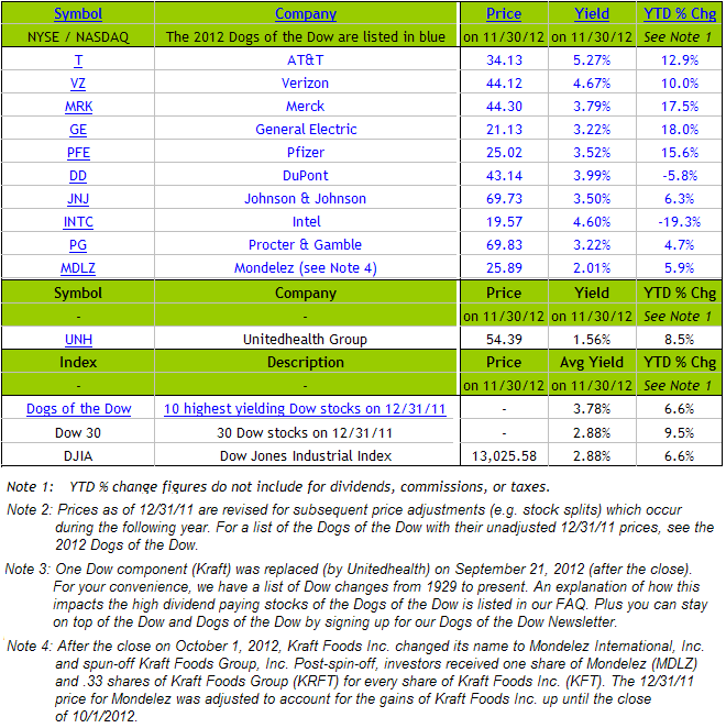
Dogs Of The Dow Performance Update

For the first eleven months of the year, the Dow Dogs price only performance has matched the Dow Index return with both returning about 6.6%. The S&P 500 Index return of 12.6% is nearly double the Dow Jones Industrial Average return. The Dow Dogs do have a yield higher than the index which results in slight outperformance for the Dow Dogs.

As noted in prior posts, the Dow Dog strategy consists of selecting the ten stocks that have the highest dividend yield from the stocks in the Dow Jones Industrial Index (DJIA) after the close of business on the last trading day of the year. Once the ten stocks are determined, an investor would invest an equal dollar amount in each of the ten stocks and hold them for the entire year. Investors should note the strategy has generated mixed results over the years.


Monday, October 08, 2012

More Weakness Seen With Modern Portfolio Theory

Niels Jensen's, of Absolute Return Partners, market letter to investors notes how Modern Portfolio Theory (MPT) has become less effective over time. Over the past few years we have written several posts (here and here) on the problems with MPT. One chart in the Jensen's market letter displays the increasing correlation between asset classes that has developed since 2000 thus limiting the effectiveness of diversification as outlined in Modern Portfolio Theory.

From The Blog of HORAN Capital Advisors

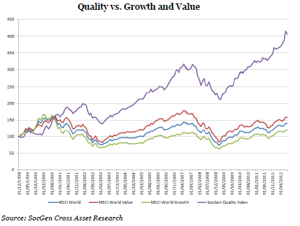
Additionally, the market letter notes the outperformance of "quality" stocks versus say growth or value. As the letter states, quality refers to the strength of a company's balance sheet as well as the sustainability of its dividend policy.

From The Blog of HORAN Capital Advisors

A key for investors is to understand the approach taken by their investment manager in constructing their investment portfolio.

Source:

When Career Risk Reigns (PDF)
Absolute Return Partners LLP
By: Niels J. Jensen
October 2012
http://www.arpllp.com/core_files/The_Absolute_Return_Letter_1012.pdf