Thursday, December 31, 2015

2015 Was A Year For Growth Stocks And Only A Handful Were Needed

The Dow Jones Industrial Average declined 2.2% in 2015, its first negative return year since 2008. The S&P 500 Index fell .7% and the Nasdaq posted a positive 5.7 return for the year. Several interesting phenomenon occurred in 2015: narrow market breadth, strong outperformance of growth stocks versus value stocks and strong performance of the FANGs (Facebook (FB), Amazon (AMZN), Netflix (NFLX) and Alphabet or Google (GOOG)).
  • For the year the average return of the FANGs equaled 77.2%. 
  • Looking at returns a little more broadly, yet highlighting the narrow market leadership, the average return for the top 10 stocks in the S&P 500 Index by market capitalization were up 25.9%, while the average return of the remaining 490+ were down 1.1%.
As noted at the beginning of the post, there was a large difference in return of large cap growth and large cap value stocks. The S&P 500 Growth Index was up 3.76% while the S&P 500 Value Index declined 5.59%. The growth and value indices do have overlap in the holdings that comprise each of the index. Some key highlights though:

S&P 500 Growth Index (310 names)
  • Average return = 9.1%
  • Average all positive returns 20.2% (212 companies)
  • Average all negative returns -15.0% (97 companies)
S&P 500 Value Index (367 names)
  • Average Return = -8.5%
  • Average all positive returns 12.1% (136 names)
  • Average all negative returns -20.5% (231 names)
Below is a chart noting the 2015 return (not average return) for each respective index.

From The Blog of HORAN Capital Advisors

S&P Dow Jones Indices does use data to construct indexes for "pure" value and "pure" growth parameters.  S&P constructs these indexes with the following parameters in mind:
  • Style Index Series: This series divides the complete market capitalization of each parent index approximately equally into growth and value indices, while limiting the number of stocks that overlap between them. This series is exhaustive (i.e., covering all stocks in the parent index universe) and uses the conventional, cost-efficient, market capitalization-weighting scheme.
  • Pure Style Index Series: This series is based on identifying approximately one quarter (1/4) of the market capitalization of the index as pure growth, and one quarter (1/4) as pure value. There are no overlapping stocks and stocks are weighted by their style attractiveness.
As can be seen in the below chart, the S&P 500 Pure Value Index is down nearly double the S&P 500 Value Index for 2015. The complimentary pure growth index has generated half the return as the S&P 500 Growth Index; however, the absolute magnitude of the difference is not large.

From The Blog of HORAN Capital Advisors

Lastly, the two charts below show the average sector returns for the growth/value and pure growth/pure value styles. Again, because the pure growth and pure value styles eliminate any overlap between the two indexes, the differing sector returns is clearly visible. For the S&P 500 Pure Value sectors, not one sector has an average return that is positive for 2015. This simply speaks to the significant outperformance of growth versus value in 2015.

From The Blog of HORAN Capital Advisors

From The Blog of HORAN Capital Advisors

As 2016 gets under way, the significant disparity in growth versus value will be one factor investors will want to evaluate. Value type equities certainly look attractive from a valuation perspective; however, the slow pace of economic growth, both in the U.S. and abroad, have weighed significantly on value stocks. Additionally, energy oriented equities account for three times as many names in the value index and the weak returns in this space have been well written about this year. In the coming week we will have more perspective on our views for 2016.


Monday, December 28, 2015

Individual Investors Still Liking Apple

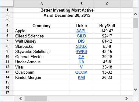
The below list details the most active stocks reported by Better Investing members. Better Investing members continue to show buying interest in Apple (AAPL). Since my last update of this list in November, General Electric (GE) and Kinder Morgan (KMI) are new additions while Netflix (NFLX) and Johnson & Johnson (JNJ) have fallen from the top 10.

From The Blog of HORAN Capital Advisors

Disclosure: Firm long AAPL, QCOM. Family Long AAPL, SWKS, GE


Sunday, December 27, 2015

Midstream MLPs Potential Funding Hurdles

Stocks in Energy Master Limited Partnerships (MLPs) have experienced some of the worst declines of any sector this year. The below chart of the Credit Suisse X-Links Cushings MLP Infrastructure ETN (MLPN) is a clear example of the magnitude of the decline. From the ETN's high to its low this year, the ETN fell over 52%. In less than a month, and mostly the past week, MLPN has rebounded 19% yet remains 43% below its 52-week high.

From The Blog of HORAN Capital Advisors

Given the magnitude of the decline in MLPs investors are evaluating whether this is an opportunity to begin building positions in the asset class. One decision point revolves around technicals while the other is centered in evaluating the fundamentals of many MLPs themselves. Technically, the recent bounce in some MLPs is placing them near short term overbought levels. In my view it will be the fundamentals that drive the future long term returns of the asset class and it is here where the waters become a little murky.

The growth of shale fracking has been a game changer for the natural gas and overall energy market in the U.S. The over supplied levels for both gas and oil has been written about ad nauseum this year, but suffice it to say the U.S. has abundant supplies of energy resources in the near term.

From The Blog of HORAN Capital Advisors

From The Blog of HORAN Capital Advisors

The consequence for exploration and production (E&P) MLPs is the increased supply is resulting in lower prices for their product, thus pressuring margins. Historically, the safe plays in MLPs were the midstream companies that essentially transported the product from the well head and then paid a toll based on the volume of oil/gas transported through their pipelines. Therein lies one question, if the E&P companies produce less, will less be transported by midstream MLPs, thus negatively impacting the revenue of the midstream MLPs?

Two additional issues are facing MLPs broadly that are related. As noted above a part of MLP growth has come from the booming natural gas segment, largely a result of shale fracking. In order to handle the growth, MLPs have increased their capital expenditure budgets and financed the expenditures via both equity and debt funding sources. This has occurred at the same time MLPs have strived to grow their distributions to shareholders.

Given the challenges facing many of the E&P MLPs, a few have cut distributions in order to funnel cash flow to capital expenditures due to the inability to access the credit markets without facing potential credit rating downgrades. Additionally, some of these MLPs have resisted issuing equity at these lower stock price levels due to the increased dilutive impact to existing shareholders. Also, the E&P companies will be facing an increasing need to roll over maturing debt.

From The Blog of HORAN Capital Advisors
Source: Ned Davis Research via Twitter

In reviewing the fundamentals then, one common measure used to evaluate MLPs is the debt to EBITDA ratio. In a 2013 Barron's article, Ned Davis Research opined,
“the debt-to-EBITDA ratio of the Alerian MLP Index goes a long way towards explaining returns. When the median stock in the index trades above 2.6 debt-to-EBITDA, MLPs have lost 10% on average. When it’s been below 2.6, they’ve gained 20%...” 
One midstream oriented MLP index is the Cushing MLP Infrastructure Index and all but one MLP in that index has a debt to EBITDA ratio greater than 2.6. Half of the MLPs have debt/EBITDA ratios greater than 5.0 and several are double digits.

From The Blog of HORAN Capital Advisors

The next question is what level of financing will be needed going forward to fund growth? The above file contains detail on cash flow from operations versus capital expenditures. In total, the gap that needed to be funded in 2015 with debt or equity is in excess of $11 billion. I also included a more detailed quarterly cash flow report for Energy Transfer Partners (ETP) in order to provide readers with insight into the funding sources and uses of cash by the company. A number of midstream MLP's have similar funding source breakdowns between equity and debt issuance.

As noted earlier in this post, debt is likely to be a more restrictive funding source, so equity is the alternative. With MLP prices depressed, MLP’s are less likely to issue equity due to the level of dilution. The alternative is to cut cap ex, cut the dividend or a combination of the two. Given the market’s negative reaction to recent distribution cuts by several MLPs, managements at MLP companies are likely to take a harder look before cutting distributions and more likely focus on cap ex first. Cutting capital expenditures has the potential negative impact of constraining future growth; however, this is likely what is needed given the U.S. energy glut.


Saturday, December 26, 2015

Our Most Read Blog Articles In 2015

Below are links to some of the most read articles on our blog in 2015. Several of the articles written early in 2015 may continue to have relevance as we approach 2016,
  • the first article below on how to profit from a rise in oil prices.
  • article #10, which highlights issues surrounding a strong U.S. Dollar
  • article #5 on the list detailed issues we believed the market needed to resolve in order to generate strong returns this year. Some of the issues we outlined then, like weakness in high yield bonds, have risen to the top of investors minds as the year is coming to a close.
  • the last article in the list evaluated the significance of the death cross and how the trigger might be most useful in one's decision making process.
Over the course of the next several weeks we will provide a more comprehensive review of 2015, and more importantly, our outlook for 2016 which will also be included in our Winter Investor Letter.
  1. How To Profit From An Increase In Oil Prices When It Occurs (1/29/2015)

  2. A Rising Bearish Wedge Pattern Is Developing In the S&P 500 Index (2/10/2015)

  3. Dividend Paying Stocks Struggling Mightily (5/6/2015)

  4. Additional P/E Multiple Expansion Possible Until The First Fed Rate Hike (3/8/2015)

  5. A Market Needing To Resolve Divergences In 2015 (1/2/2015)

  6. Ed Hyman: Bull Market In Early Stage (1/11/2015)

  7. Bullish Sentiment Declines To Level Last Seen In Early 2013 (3/19/2015)

  8. Mega Cap Stocks Driving Market Returns (12/5/2015)

  9. Shale Oil And Gas Production Projected To Increase In February (1/17/2015)

  10. Dollar Strength Continuing Headwind For Emerging Market Equities (10/6/2015)

  11. Anemic Economic Growth Since The Great Recession And Some Causes (5/11/2015)

  12. Market Advance Not Extraordinary In Terms Of Magnitude And Duration (2/27/2015)

  13. Death Cross More Of A Buy Signal? (9/2/2015)


Thursday, December 24, 2015

Retailers Poised To Offer Significant Discounts In The New Year

The business inventory to sales ratio and retail inventory to sales ratio are above or near levels last seen prior to the last recession. In an article in the Wall Street Journal ($) this morning it was noted, "Sales at physical stores fell 6.7% over the most recent weekend, while traffic declined 10.4%, according to RetailNext, which collects data through analytics software it provides to retailers. That is worse than the 5.8% decline in sales and the 8% drop in traffic recorded from Nov. 1 through Dec. 14." This build up in inventory at the retail level as well as in the pipeline, likely results in brick and mortar retailers offering significant discounts after Christmas.

From The Blog of HORAN Capital Advisors

The major challenge for brick and mortar retailers is the consumer's desire to shop online. Data through the third quarter reflects the growth in online purchases.

From The Blog of HORAN Capital Advisors

The continued popularity of online shopping is a challenge brick and mortar retailers will not easily resolve.


Monday, December 21, 2015

Buybacks And Dividends Exceeded Reported Earnings In Third Quarter

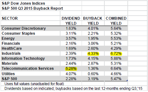
For the third quarter, S&P Dow Jones Indices is reporting that on a quarter over quarter basis buybacks for S&P 500 companies increased 14.5% and increased 3.7% on a year over year basis. The dividend plus buyback yield for the index is 5.53% and is at the highest level since the fourth quarter of 2011. The third quarter total of buybacks and dividends of $245.65 billion exceeded reported earnings of $205.90 billion. This is the fourth consecutive quarter that buybacks and dividends exceeded reported earnings. Highlights from S&P's buyback releases:
  • For the seventh consecutive quarter, over 20% of the S&P 500 issues reduced their year-over-year diluted share count by at least 4%, therefore boosting their earnings-per-share (EPS) by at least 4%.
  • Total shareholder return, dividends plus buybacks, set a 12-month record, at $934.8 billion.
  • “...14.6% of the S&P 500 issues have a current share count level at least 4% lower than their Q4 2014 level, meaning that those issues have already front-loaded at least a 4% tail wind to their Q4 2015 EPS,” according to Howard Silverblatt, Senior index Analyst at S&P Dow Jones Indices.
    From The Blog of HORAN Capital Advisors

    As detailed in the below table, the industrials sector has the highest combined dividend plus buyback yield of all the S&P 500 Index sectors at 6.72%.

    From The Blog of HORAN Capital Advisors

    It seems apparent that companies took advantage of the third quarter market weakness in the third quarter to reduce their share count. Historically, this has not always been the case as I noted in an article a few years ago; however, Q3 seems to be the exception.

    From The Blog of HORAN Capital Advisors

    One key to continued strength in buybacks and dividend growth will be the ability of companies to grow earnings and cash flow. Silverblatt noted in the report, 
    • Silverblatt stated that cash reserves declined 1.4% during the third quarter as S&P 500 Industrial (Old) available cash and equivalent decreased to $1.30 trillion, from the second quarter’s $1.32 trillion, and was 2.1% below the record $1.33 trillion set at the end of 2014.
    • “High levels of shareholder return are now part of norm, with dividend increases almost assumed for non-commodity issues, and buybacks, while receiving bad-press, are expected to continue. Companies continue to have the resources to support these expenditures via cash-flow and still low financing rates. However, given that the Fed has now started to increase interest rates, debt financing will become more expensive, albeit slowly, putting pressure on buybacks. Cutting or limiting buybacks may not be a welcome move for investors, but scaling back dividends is typically a road that management avoids at high costs.”

    Source:

    S&P 500 Q3 Buybacks Increases 14.5% Over Q2 2015, Up 3.7% Year-Over-Year
    S&P Dow Jones Indices
    By: Howard Silverblatt, Senior index Analyst
    December 21, 2015


    Wednesday, December 16, 2015

    Industrial Production Turns Negative

    This afternoon the Fed raised interest rates by 25 basis points, i.e., .25%. Certainly a quarter point hike in rates should not have a significant impact overall. However, the economy does seem to be shifting into a lower gear. One note of caution is the industrial production report this morning. The report shows the first year over year decline since the end of the last recession. As the below chart shows, a negative reading on industrial production nearly always occurs around recessionary periods.

    From The Blog of HORAN Capital Advisors

    Econoday's report on the release contained a couple of highlights.
    • November was another weak month for the industrial economy, in part reflecting unusually warm temperatures that are driving down utility output. Industrial production came in down a very sharp 0.6% in November. This is the biggest drop in 3-1/2 years. Utility output fell a monthly 4.3% after falling 2.8% in October. Mining, reflecting low commodity prices and contraction in energy extraction, has also been week, down 1.1% for a third straight decline.
    • This brings us to the most important component, manufacturing, where October's 0.3 percent bounce higher (revised downward from 0.4 percent) now unfortunately looks like an outlier. Manufacturing production came in unchanged in November reflecting weakness in motor vehicles, down 1.0 percent in the month, and also a dip back for construction supplies which fell 0.2% after a weather-related surge of 2.3% in October. One positive is a slight snapback for business equipment which, after declines in the two prior months, rose 0.2%.
    • All the weakness is pulling down capacity utilization, to 77.0% in November for a heavy 5 tenths dip. Utilization is running more than 3 percentage points below its long-term average. Mining utilization is now under 80%, down 1.1 points in the month to 79.4%. Utility utilization fell 3.4 points in the month to 74.5% with manufacturing utilization down 1 tenth to 76.2%. Excess capacity, though not cited as a major factor behind the lack of inflation in the economy, does hold down the cost of goods.
    This poor reading on industrial production is occurring in an environment where the U.S. economy is growing at a below trend pace. The weak industrial production number could be an indication of slower economic growth ahead. The industrial production and related capacity utilization figures are considered coincident indicators, meaning that changes in the levels of these indicators usually reflect similar changes in overall economic activity, and therefore gross domestic product (GDP). The release will shed light on short-term rates of change and business cycle growth. As the below chart notes, economic growth since the end of the financial crisis has been running  nearly 50% below the average growth rate of the economy since 1950.

    From The Blog of HORAN Capital Advisors


    Monday, December 14, 2015

    Junk Bond Risk Leading To A Potential 'Blood In The Streets' Environment

    Investor attention at the end of last week's trading was focused on the sharp sell off in high yield bonds, better know as junk bonds. This sell off was precipitated by the firm, Third Avenue, restricting redemptions on its Focused Credit Fund. Subsequent to Third Avenue's announcement, Stone Lion Capital Partners L.P. said it suspended redemptions in its credit hedge funds due to the high level of redemption requests it has received. Many stories have been written about the events impacting the high yield bond market, here and here

    In reality, a better classification for the Third Avenue Focused Credit Fund is probably a distressed debt fund or special situation fund. The fund's "focused credit" reference means just that, the fund is highly concentrated with nearly 30% of the fund's assets invested in its top 10 bond holdings. In other words, the fund is not a diversified bond fund. Our clients know we eliminated our high yield bond exposure in July of 2014. One reason we sold the high yield exposure last year was due to the narrow spreads on high yield broadly as reflected by the red dot in the below chart. This tight spread characteristic is an indication of the rich valuation of the high yield asset class at that time.
    From The Blog of HORAN Capital Advisors

    The issues surrounding high yield are being felt in the equity market as high yield bonds and stocks are highly correlated. Last week the Nasdaq declined 4.1% with the S&P 500 Index and the Dow Jones Industrial Average both declining 3.8% and 3.3%, respectively. For the year both the Dow and S&P 500 Index are essentially flat for the year on a total return basis while the Nasdaq remains up a little over 4.0% year to date. On a price only basis the S&P 500 Index is down 5.6% from its high in May.

    The pullback last week has resulted in the CBOE Equity Put Call Ratio spiking higher to .92 as can be seen in the chart below. As I have noted in earlier posts, P/C ratios over 1.0 are representative of an oversold market. The second chart shows the VIX index and this fear measure has also jumped higher to 24.4. Readers can track these fear measures here.

    From The Blog of HORAN Capital Advisors

    From The Blog of HORAN Capital Advisors

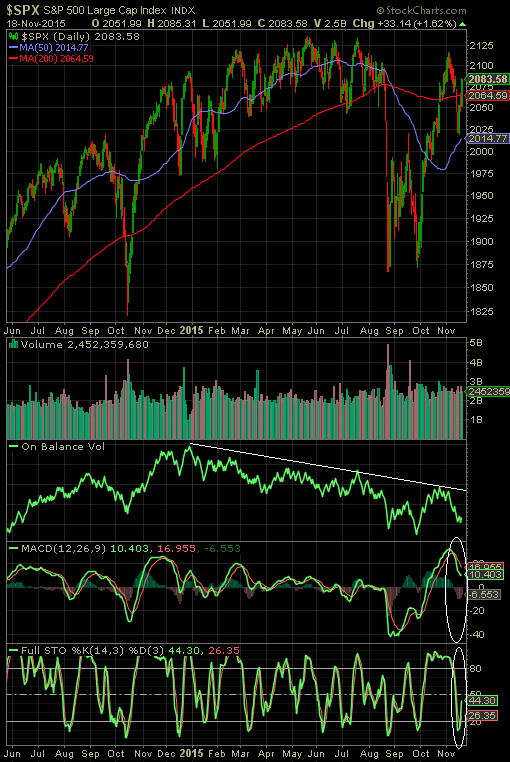
    One near term concern we discussed in a mid-November post was the fact the On Balance Volume indicator (OBV) continued to show more trading volume on down days than on up days. This has been the case all year and has resulted in a downward sloping trend for the OBV a noted by the second white line in the below chart. From a positive perspective some technical indicators are beginning to look more favorable (CBOE P/C ratio noted earlier), but also indicators like the Full Stochastic Indicator below.

    From The Blog of HORAN Capital Advisors

    The risk developing in the junk bond market is a consequence of the Fed's extended near zero interest rate policy and investors feeling the need to reach for yield. Similar challenges have developed in the energy Master Limited Partnership (MLP) space. The belief is the Fed desires to begin removing the proverbial bunch bowl and raise interest rates at the conclusion of next week's Fed meeting. I suppose it is possible the recent issues facing the bond market could result in the rate increase being pushed into early next year.

    Many of the headlines over the weekend were bearish ones with valid concerns about the high yield bond issues spreading into other areas of the market. On the other hand, this week's Barron's cover story highlighted 2016 forecast by ten strategists and all ten predicted higher equity returns for next year, with the average equaling 10%. With the issues facing the high yield bond market and a potential Fed rate hike around the corner, higher volatility in equities could face investors as the year nears its end. If this volatility is on the downside, Baron Rothschild, a member of the Rothschild banking family, is created with saying, "Buy when there’s blood in the streets, even if the blood is your own."


    Thursday, December 10, 2015

    The Facts Behind A Disappearing Middle Class

    Today, a number of media outlets have been discussing the disappearing middle class. The report was released by the Pew Research Center and notes, in 2015 21% of households comprise the top two income tiers, with Pew defining as more than twice the nation’s median income or at least $126,000 a year for a three-person household, which is up from 14% in 1971. For the bottom two income tiers, a three-person household earning $42,000 a year or less, in 1971 25% of households were in the lower two earning tiers versus 29% in 2015. The media outlets failed to provide detail around the cause behind this change.

    Below is select commentary from the website Political Calculations and the author's article, Solving the Mystery of the Disappearing U.S. Middle Class, which provides detail behind this shrinkage in the middle class. With the ranks of both the lowest and highest income earning American households simultaneously increasing as the ranks of middle income earning Americans have become depleted. But who were the biggest winners and losers?"
    • "The biggest winners since 1971 are people 65 and older. This age group was the only one that had a smaller share in the lower-income tier in 2015 than in 1971. Not coincidentally, the poverty rate among people 65 and older fell from 24.6% in 1970 to 10% in 2014. Evidence shows that rising Social Security benefits have played a key role in improving the economic status of older adults. The youngest adults, ages 18 to 29, are among the notable losers with a significant rise in their share in the lower-income tiers."
    "What the Pew Research Center's analysts were seeing in the 'hollowing out' of the U.S. middle class wasn't the result of some nefarious cause, but rather the inevitable result of the changing age demographics of the U.S. population. More specifically, the differences in the size of the living population of the U.S. by generation. The chart below shows the number of Americans born, whose births were registered, in each year from 1909 through 2004, while also indicating their generational grouping."

    From The Blog of HORAN Capital Advisors

    The next chart below provided by Political Calculations shows the income distribution by the last three generational groups.

    From The Blog of HORAN Capital Advisors

    The article notes,
    • "What we see is that Baby Boomers, who would be Age 51 to Age 69 in 2015, occupy the ranks of the highest income earners in the U.S., while Millennials, who would be Age 16 to 33 in 2015, occupy the ranks of the low end of the income earning spectrum."
    • "Meanwhile, we see that the much smaller Generation X finds itself sandwiched between these two larger generations in the ranks of the middle class."
    • "Is it really any wonder then that the number of middle class households has shrunk as it has while the apparent income inequality among U.S. households has increased?"
    "The mystery of the disappearing U.S. middle class is solved - the apparent movement of Americans toward the "economic extremes" is primarily the result of the changing age demographics of the U.S. income earning population (emphasis added)! Now, if we could just get a better class of journalists to dial down their overly excited and poorly considered emotional hyperbole...."

    Additional detail can be found by reading the entire Political Calculations article.


    Sunday, December 06, 2015

    A Fed Rate Increase May Be Larger Headwind For Short Maturity Bonds

    Whether the Fed raises rates in December or early in 2016, many market strategists believe higher interest rates will be a reality very soon. A few of our recent articles mentioned our belief that the Fed missed the opportunity to raise rates twelve or eighteen months ago and a rate rise now will be implemented simply in order to provide the Fed with a cushion in the event additional stimulus were needed. Certainly the Fed has used other extraordinary means in an effort to stimulate the economy other than rate adjustments over the last few years.

    Nonetheless, the anticipated change in Fed policy to one where rates begin to move higher can have short term negative consequences for bond investors as we have written recently. All bonds will not react the same as rates are increased though. Logically if would seem the largest negative impact will be felt at the long end of the yield curve; however, the below chart compares the yield curve shifts over the last several years. What is occurring is longer rates are actually declining with rates on the short end, under five years, increasing. In other words, the curve is flattening with the twist occurring around the five year maturity range resulting in poorer total return for shorter maturity bonds than longer ones.

    From The Blog of HORAN Capital Advisors

    Certainly rising rates can have an impact on long rates; however, another key variable is the level of inflation. What the economy has not seen during this recovery is a move to higher inflation. On the contrary, with the contraction in energy and commodity prices, along with a stronger U.S. Dollar, inflation has remained near zero as can be seen with the red line in the below chart.

    From The Blog of HORAN Capital Advisors

    A potential catalyst to increased inflation is the fact consumer wage growth has been accelerating over the past three years despite what gets reported in the media. Since the consumer accounts for about 70% of economic activity in the U.S., higher wages can result in more buying pressure and thus the potential for higher selling prices on goods and services. Additionally, consumers are getting an indirect boost in their income as a result of the contraction in energy prices. Consumers are paying less for gasoline and utilities, leaving more income available to be spent on discretionary purchases. In addition to a strong U.S. Dollar, the increased efficiency being created by the internet and cloud via growth in e-commerce seems to be keeping a lid on price inflation. The end result near term is the worst performing segment of the bond market in terms of maturity may be on short term bonds versus the long term ones.


    Saturday, December 05, 2015

    Mega Cap Stocks Driving Market Returns

    One aspect of the market recovery since the August/September lows has been the narrow market breadth. The Russell 1000 Index return has been held up by the large mega cap stocks within the index. This has been the case for the S&P 500 Index as well. As the below chart shows, the yellow line representing the year to date return for the Guggenheim Russell Top 50 Index (XLG) has outpaced both the iShares Russell 1000 Index (IWB) return and the Guggenheim S&P 500 Equal Weight Index (RSP) return.

    From The Blog of HORAN Capital Advisors

    The other phenomenon occurring this year is the wide disparity in performance of growth and value stocks. The below chart shows growth stocks within the S&P 500 Index are outpeforming the value stocks within the index by nearly ten percentage points. The value index is being weighed down by several of its top weighted sectors like energy and industrials. Additionally, both Exxon Mobil (XOM) and Chevron (CVX) are represented in the top 10 holdings in the iShares S&P 500 Value Index (IVE) and energy broadly has been one of the weakest market sectors.

    From The Blog of HORAN Capital Advisors

    It seems one can not give away some of the industrial and energy companies. Recent headwinds of a strong U.S. Dollar and low energy prices have negatively impacted many industrial and energy stocks. With the Fed seemingly near liftoff for interest rates, further Dollar strength is likely and will continue to pressure multinational companies like industrial and energy firms. A silver lining is the fact year over year comparison for energy prices and the Dollar begin to get easier starting in the first quarter of 2016. This would put less negative pressure on earnings growth for some of these companies through 2016, all else being equal.


    Saturday, November 28, 2015

    Gold And The Equity Markets

    Gold prices have not been immune to the broader issues facing the overall commodity market. Year to date, the price of gold is down 10.8% while the broader CRB Commodity Index is down 20.3%. A part of the issue negatively impacting the price of gold is output is outpacing demand. With the decline in the price of gold the cost to extract gold exceeds the market price in many cases.

    From The Blog of HORAN Capital Advisors

    More importantly though, gold is mostly transacted in US Dollars and the strength in the Dollar is a headwind for the price of the metal. The light blue line in the below chart represents the trade weighted Dollar Index compared with gold prices (yellow line). The lines show gold price weakness as the Dollar strengthens. Gold has a negative .65 correlation to the trade weighted Dollar index. With the Federal Reserve nearing lift off for U.S. rates, additional Dollar strength will likely be an outcome into 2016.

    From The Blog of HORAN Capital Advisors

    Additionally, the red line in the above chart shows the ratio of the S&P 500 Index to the price of gold. This ratio has a positive correlation to the trade weighted dollar and is partly a result of weaker gold prices as the Dollar rises. Another important factor that contributes to the upward sloping red ratio line is a rising S&P 500 Index. The obvious factor that contributes to higher equity prices is the growth in earnings and therein lies the issue for equity prices. As the below chart shows, earnings growth for the S&P 500 Index will be negative for two successive quarters if earnings are negative for the fourth quarter. This would be the first back to back quarterly earnings decline since 2009. The second chart below shows 12-month forward earnings estimates for the S&P 500 Index and the negative growth expectations are weighing negatively on recent S&P 500 returns.

    From The Blog of HORAN Capital Advisors

    From The Blog of HORAN Capital Advisors

    A large part of the earnings weakness is being attributed to the stronger Dollar and its negative impact on multi national companies as they convert foreign earnings back to the Dollar and the negative earnings issues impacting much of the energy sector. As the calendar rolls into 2016, both the currency and energy comparisons should be less of a headwind on a year over year basis.

    Absent some type of shock or fear event, gold prices, like many commodities, are likely to remain pressured due to a stronger Dollar and an excess gold supply. For the S&P 500 Index, and equities broadly, a resumption of earnings growth going into 2016 will be necessary for equities to move higher. 


    Friday, November 27, 2015

    Replacing Federal Reserve Rate Decisions With A Mathematical Formula?

    Natixis Global Asset Management recently published a white paper, Can the Federal Reserve Be Replaced by a Mathematical Formula?, highlighting the Fed Oversight Reform and Modernization act approved by the Financial Services Committee of the House of Representatives. This Act would require the Fed to establish a mathematical formula in setting interest rate policy. Not surprisingly, the Fed is not in favor of this type of proposal.

    Several highlights in the Natixis paper:
    • The positive side is that it could force the Federal Reserve to monitor developments that it has completely overlooked in the past: credit, asset prices, liquidity, external deficit; it would then need a more complex formula than a Taylor rule;
    • One negative side is obviously that a mathematical formula cannot take into account the complexity of an economic situation: dozens of variables would have to be included (real growth, labour costs, longterm interest rates, savings rate, detailed situation of the labour and real estate markets, etc.);
    • Another negative side is that in contemporary economies, central banks have - and will probably increasingly have - instruments other than the short-term interest rate: purchases and sales of financial assets (bonds, ABS), quantitative easing when interest rates become zero, banks’ prudential ratios, etc. Should each instrument be determined by a mathematical formula?
    • This plan will in all likelihood be abandoned. However, we should not forget that the Federal Reserve’s choices, not guided by a mathematical formula, have quite often been catastrophic over the past 20 years (by accepting asset price bubbles, external deficits, excessive debt levels, etc.). Automating these choices would not have only drawbacks.
    The Taylor Rule is one mathematical formula that gets attention and is used by some to determine what the Fed Funds rate should be. The Taylor Rule looks at inflation and employment levels, which today suggests the Fed Funds rate should be near 3%.

    From The Blog of HORAN Capital Advisors

    The paper notes that today the Fed uses other monetary tools other than adjustments to short term interest rates:
    "purchases or sales of financial assets, generally as part of a quantitative easing programme; in the future, increasingly, banks’ prudential ratios (capital ratios, required reserves, etc.). This makes it possible to markedly increase the effectiveness of monetary policy compared with a situation where only the short-term interest rate is controlled, especially by also controlling long-term interest rates"
    By not using a formula and,
    "By freely setting monetary policy over the past 20 years without being constrained by the use of a mathematical formula, the Federal Reserve has let the following appear:
    • A huge US external deficit from 2002 to 2008;
    • Recurrently, excessive private-sector debt levels;
    • Asset price bubbles;
    • Useless excess liquidity.
    "A more complex mathematical formula than a Taylor rule could have forced the Federal Reserve to react to these developments and to not let excessive indebtedness and asset price bubbles develop, which led to the subsequent financial and banking crises."
    One conclusion from the white paper notes a formula alone may not serve as the only solution; however,
    "But we should not forget that a complex formula that takes into account credit, asset prices, external deficits, etc. would prevent the errors of judgement and monetary policy choices that for the last 20 years have led to - particularly in the United States - crises linked to excessive indebtedness and bursting asset price bubbles."

    Source:

    Can the Federal Reserve be replaced by a mathematical formula?
    Natixis Global Asset Management
    By: Patrick Artus
    November 27, 2015


    Thursday, November 26, 2015

    E-Commerce Sales Growth Challenging Traditional Retailers

    Brick and mortar retailers continue to face the challenge brought about by the continued growth in e-commerce sales. As the below chart shows, e-commerce sales as a percentage of total retail sales has grown to 7.4% from just under 3% at the beginning of 2006. From a growth perspective, year over year growth in e-commerce sales remains steady at over 15%. 

    From The Blog of HORAN Capital Advisors


    Wednesday, November 25, 2015

    Thankful For The Market Action So Far In 2015

    In the spirit of Thanksgiving, investors and readers can be thankful the market has weathered the news headlines headwinds coming out of Europe and the Middle East. Looking at the positives and not sweating the small stuff can certainly make for a happier investor. A recent opinion article in the New York Times, Choose to Be Grateful. It Will Make You Happier, touches on this issue.

    The S&P 500 Index ended the pre-Thanksgiving Holiday trading day essentially unchanged, closing at 2,088.87. This unchanged outcome is what the market has delivered to investors for most of the eleven months of the year. As the below chart shows, the S&P 500 Index has been stuck in a 6% trading range (maroon box) except for the decline between August and September. This August and September period resulted in the market contracting 12.3% from its May high to the August low. The quick recovery from the double bottom reached in September has simply taken the market back into its year long trading range. On a price only basis, the S&P 500 Index is up just under 2% so far in 2015.

    From The Blog of HORAN Capital Advisors

    As investors return to the market following the Thanksgiving Holiday, they will face the uncertainty surrounding the Fed's rate decision in mid December. Until then though, the market's trading range may persist until the rate uncertainty is resolved.


    Saturday, November 21, 2015

    Better Investing Most Active As Of November 21, 2015

    Periodically I detail the most active stocks reported by Better Investing members. Apple (AAPL) continues to be a favorite of Better Investing members, while Qualcomm (QCOM) is the only stock in the top 10 that is showing greater selling interest versus buying interest. New to the list since I list provided an update in August is Under Armour (UA), Visa (V) and Johnson & Johnson (JNJ). Dropping off the list is Southwest Airlines (LUV), General Electric (GE) and Ambarella (AMBA).

    From The Blog of HORAN Capital Advisors


    Disclosure: Firm or Family Long: AAPL, QCOM, SWKS, JNJ


    Thursday, November 19, 2015

    Bullish Investor Sentiment Takes A Hit

    Today's Sentiment Survey release by the American Association of Individual Investors saw bullish investor sentiment fall 3.5 percentage points. This follows a decline in bullish sentiment of 4.7 percentage points in the prior week. Also, during this two week period, bearish sentiment has increased from 18.6% to 38.68% this week.

    From The Blog of HORAN Capital Advisors
    Source: AAII

    The individual investor sentiment indicator is a contrarian one and is most predictive at its extremes. Bullish sentiment readings near 20% are generally associated with an oversold market. As we noted in our post this morning regarding potential near term market technical headwinds, if a pullback ensues, bullish sentiment is likely to decline further. If this does occur, this could position the market for a rally into year end.


    Market Potentially Facing Near Term Technical Headwinds

    After the S&P 500 Index pullback on Thursday and Friday last week, the market's advance on Monday and Wednesday has taken the S&P back into positive territory for November. This is impressive given the 8% gain in October. With this month and a half recovery though, the market seems to be facing some technical headwinds.

    Of particular interest is the fact the Onbalance Volume Indicator (OBV) has been trending lower this year. Even with the positive market returns the past six week, the OBV is not suggesting conviction on up market days. The OBV indicator measures buying and selling pressure as a cumulative indicator adding volume on up days and subtracting volume on down days. The OBV measures positive and negative volume flow and the trend of the indicator is what is important. A downward sloping trend indicates more volume on down market days versus up market days. As the below chart shows, the OBV indicator is firmly in a downtrend.

    From The Blog of HORAN Capital Advisors

    Also, as noted in a number of posts in the past, computer algorithms are having a greater influence on the market. These computer algorithms need to trade on specific patterns which are created by price points traced out by the patterns themselves. As the below weekly chart of the S&P 500 shows, one pattern that remains in play is the inverse head and shoulders pattern. The potential downside price target for this pattern is S&P 1,599.

    From The Blog of HORAN Capital Advisors

    As we noted in our post last week, the high level of the equity put/call ratio was suggestive of a market bounce which investors have enjoyed this week just as the elevated VIX at the beginning of September was a technical indication of a potential market recovery from the ultimate low reached in August. However, as can be seen in the below chart, the VIX has fallen back into the high teens and may indicate a market that is becoming a little too complacent. The OBV certainly is suggestive of a potentially skittish investor as more volume is trading on the down days versus the up days and the right shoulder of the H&S patterns is becoming more distinctive. The market's recovery this week has provided some short term positive support; however, this head and shoulder pattern above remains in play.

    From The Blog of HORAN Capital Advisors


    Sunday, November 15, 2015

    Low Bond Yields Heighten Bond Return Risk When Rates Rise

    Although the rate of interest currently paid on high quality bonds today is at levels last seen in the early 1950's, investors generally allocate a portion of their investment portfolio to bonds. One reason for having a portion of an investment portfolio in bonds is the fact bonds tend to hold up well when equity prices decline. Proof of this can be seen in the below chart comparing various stock returns to different bond category returns during the financial crisis. During the worst of the financial crisis that began in October 2007, U.S. stocks fell 56.8% while the Barclay's Aggregate Bond Index and Barclay's U.S. Treasury Bond Index were up 7.2% and 15.4% respectively.
    From The Blog of HORAN Capital Advisors
    Source: Vanguard

    One near certainty is the Fed will increase interest at some point with it simply a question of when not if. When interest rates are moved higher (some believe a December liftoff), bond prices will decline and bond investors may be in for a bit of a surprise. A unique characteristic facing investors today is the rate of interest paid on high quality bonds is at extremely low levels. Historically, bond investors obtained some support when rates increased due to the income support provided by bonds. The below chart from Nuveen highlights the high percentage contribution to return that income has provided to overall bond returns since the end of the financial crisis and since 1976.

    From The Blog of HORAN Capital Advisors
    Source: Nuveen

    The below table from Vanguard is maybe a bit dramatic, but the table shows the impact on a bond's price return given a three percentage point increase in interest rates. One takeaway from the table is the amount of time it takes to recover the principal loss through the interest payment: over three years. This extended recovery is a result of the low interest rate starting point, 2.1% in the example and not far from today's rate.

    From The Blog of HORAN Capital Advisors
    Source: Vanguard

    T. Rowe Price recently opined on this same issue in a recent report. The firm notes,
    "Rising rates generally result in principal declines in bond securities, and that risk is exacerbated with rates so low because investors have less of a yield cushion to offset price declines. Overall, though, the firm concluded that "since 1979, bonds have generally not done well during tightening cycles." In fact, that has been the pattern in every tightening cycle since 1963." 
    "In the last Fed tightening cycle from 2004–2006, when the Fed rate increased from a multi-decade low of 1.00% to 5.25%, longer-term yields barely budged. This cycle, T. Rowe Price managers expect the bulk of future rate increases to unfold in the short- to intermediate term bond sectors, causing a flattening in the Treasury yield curve (with short term rates rising more than long rates). 'I expect rates to stay fairly low even after the Fed starts raising them,' Mr. Huber says. 'Longer-term rates should stay under control because they are driven by inflation and global growth expectations, which are very modest.'" 
    Mr. McGuirk adds, "We don’t see any big move in long rates, and with the Fed moving gradually, you have a long time to earn the extra income to offset any principal loss."
    One way to shorten the time period it takes to recover the principal loss is to invest in bond's with higher coupon yields. However, given the extended length of time the Fed has kept rates at the near zero level, higher yielding bond supply is down significantly. As can be seen in the below chart, the percent of bonds that yield more than 4% is far below what was available prior to the onset of the financial crisis.

    From The Blog of HORAN Capital Advisors
    Source: Blackrock

    For investors, the low level of interest rates does pose a potentially higher risk to overall bond returns when the Fed does commence with a higher rate policy. The silver lining is the fact the Fed is most likely to move slowly while pushing rates higher and in small increments. A low trajectory in the rate increases reduces the downside that results from a decline in a bond's price. And lastly, as noted in the above T. Rowe Price highlight, with the low level of inflation and slow global economic growth, the longer end of the interest rate curve may increase at a much lower pace than the short end. And it is long term bonds that can experience the largest price declines when rates rise.


    Saturday, November 14, 2015

    Narrow Market Breadth And Companies With Negative Earnings Are Leading

    Although this past week took the S&P 500 Index return for the year into negative territory (down 3.2%) any positive stock returns have been led by only a handful of stocks. For the week, the S&P 500 Index declined 3.7% and was the first weekly decline after six weekly gains.

    From The Blog of HORAN Capital Advisors

    As a recent Goldman Sachs report notes,
    "five S&P 500 firms – Amazon (AMZN), Google (GOOGL), Microsoft (MSFT), Facebook (FB), and General Electric (GE) – account for more than 100% of the index total return YTD prompting client inquiries regarding narrow market breadth. The Goldman Sachs Breadth Index currently equals 1, one of the lowest readings in the 30-year series. Our index has experienced only 11 narrow breadth periods since 1985, including three during the late 1990s that share several characteristics with the current narrow breadth episode. The typical episode lasted 4 months and strong balance sheet, mega-cap, and high momentum were factors that outperformed. The current period is one month old and may last into early 2016."
    In addition to the narrow leadership in the large cap space, T. Rowe Price notes small cap stocks without any earnings have been outperforming those companies that have earnings as represented by stocks in the small cap Russell 2000 Index.

    From The Blog of HORAN Capital Advisors

    This narrow market leadership along with the outperformance of companies with no earnings has contributed to some of the market's recent volatility. Additionally, the recent volatility is playing a part in the spike in bearish sentiment. As can be seen in the below chart, the CBOE equity put/call ratio jumped to .98 as of Friday's market close.

    From The Blog of HORAN Capital Advisors

    As noted in prior posts, put/call ratio readings above 1.0 are most predictive of overly bearish sentiment and is indicative of a market that has the propensity to rally.


    Sunday, November 08, 2015

    Social Security Benefit Increases Do Not Keep Pace With Retiree Costs

    Many retirees receiving a social security benefit know their monthly benefit will not receive a cost of living adjustment in 2016. This is the third time in the last six years where social security benefits did not increase due to the low inflation environment. ICMA-RC recently compared the growth in social security benefits to the growth in some standard costs faced by retirees. As the below chart shows, some of the basic costs retirees face have far outpaced the growth of their social security benefit.

    From The Blog of HORAN Capital Advisors
    Source: ICMA-RC

    As noted in the ICMA-RC article, it is important retirees, and really future retirees, do not put themselves in a situation where social security is their only source of retirement income. Further, retiree investment funds should be invested in a way that provides the opportunity for the funds to grow in excess of the rate of inflation. Even in a low inflation environment basic costs are likely to increase. Additionally, with the Federal Reserve approaching lift off for the Fed Funds rate, a rate increase can have a negative impact on the performance of interest sensitive investments. In a post we wrote in 2013, Chasing Yield Has A Downside When Interest Rates Rise, we detailed the performance of a few categories of interest sensitive assets during a period of rising interest rates. Some investors believe "yield" investments are safer since they pay interest or a higher dividend. As noted in the previously mentioned article, these yield type investments can generate poor returns when interest rates do rise.