Friday, January 30, 2009
Bullish Sentiment Continues To Decline
Posted by
David Templeton, CFA
at
11:00 PM
0
comments
![]()
![]()
Labels: Technicals
GDP Better Than Expected But....
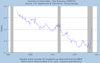
The better than anticipated results can be attributed to the real change in private inventories that added 1.32 percentage points to the fourth-quarter change in real GDP. The issue with this inventory build is sales are not keeping pace with the rate of increase. The inventory to sales ratio has increased significantly as noted in the below chart. The data for the chart is through 11/1/2008.
Posted by
David Templeton, CFA
at
10:44 PM
0
comments
![]()
![]()
Labels: Economy
Wednesday, January 28, 2009
Companies Increasing Dividends Can Still Be Found In This Market
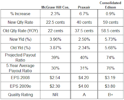
Below is detail on company's that announced increases in the company's dividend over the last several days. The companies detailed below are McGraw Hill Companies (MHP), Praxair (PX) and Consolidated Edison (ED).

Posted by
David Templeton, CFA
at
9:25 PM
3
comments
![]()
![]()
Labels: Dividend Analysis
Saturday, January 24, 2009
Money Supply Causing Concern With Future Inflation
The QTM is based:
"directly on the changes brought about by an increase in the money supply. The quantity theory of money states that the value of money is based on the amount of money in the economy. Thus, according to the quantity theory of money, when the Fed increases the money supply, the value of money falls and the price level increases."
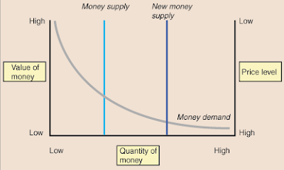
The value of money is ultimately determined by the intersection of the money supply, as controlled by the Fed, and money demand, as created by consumers. The above chart depicts the money market in a sample economy. The money supply curve is vertical because the Fed sets the amount of money available without consideration for the value of money. The money demand curve slopes downward because as the value of money decreases, consumers are forced to carry more money to make purchases because goods and services cost more money. Similarly, when the value of money is high, consumers demand little money because goods and services can be purchased for low prices. The intersection of the money supply curve and the money demand curve shows both the equilibrium value of money as well as the equilibrium price level.
The quantity theory of money is based directly on the changes brought about by an increase in the money supply. The quantity theory of money states that the value of money is based on the amount of money in the economy. Thus, according to the quantity theory of money, when the Fed increases the money supply, the value of money falls and the price level increases (emphasis added).
- M * V = P * Y where
- M is the money supply,
- V is the velocity,
- P is the price level, and
- Y is the quantity of output.
- P * Y, the price level multiplied by the quantity of output, gives the nominal GDP.
The equation for the velocity of money, while useful in its original form, can be converted to a percentage change formula for easier calculations. In this case, the equation becomes (percent change in the money supply) + (percent change in velocity) = (percent change in the price level) + (percent change in output). The percentage change formula aids calculations that involve this equation by ensuring that all variables are in common units.
The velocity equation can be used to find the effects that changes in velocity, price level, or money supply have on each other. When making these calculations, remember that in the short run, output (Y), is fixed, as time is required for the quantity of output to change.
What is the effect of a 3% increase in the money supply on the price level, given that output and velocity remain relatively constant? The equation used to solve this problem is (percent change in the money supply) + (percent change in velocity) = (percent change in the price level) + (percent change in output). Substituting in the values from the problem we get 3% + 0% = x% + 0%. In this case, a 3% increase in the money supple results in a 3% increase in the price level. Remember that a 3% increase in the price level means that inflation was 3%.
In the long run, the equation for velocity becomes even more useful. In fact, the equation shows that increases in the money supply by the Fed tend to cause increases in the price level and therefore inflation, even though the effects of the Fed's policy is slightly dampened by changes in velocity. This results a number of factors. First, in the long run, velocity, V, is relatively constant because people's spending habits are not quick to change. Similarly, the quantity of output, Y, is not affected by the actions of the Fed since it is based on the amount of production, not the value of the stuff produced. This means that the percent change in the money supply equals the percent change in the price level since the percent change in velocity and percent change in output are both equal to zero. Thus, we see how an increase in the money supply by the Fed causes inflation.

Source:
Quantity Theory of Money
http://www.sparknotes.com/economics/macro/money/section2.rhtml
Obama’s Economic Challenge: The Velocity of Hope (PDF)
Fidelity Investments
By: Dirk Hofschire, CFA
January 16, 2009
https://401k.fidelity.com/static/dcl/shared/documents/MKTG_Obama_Economic_Challenge.pdf
Posted by
David Templeton, CFA
at
12:13 PM
2
comments
![]()
![]()
Labels: Economy
Thursday, January 22, 2009
Low Bullish Sentiment Equals High Cash Allocation

Posted by
David Templeton, CFA
at
7:28 PM
0
comments
![]()
![]()
Labels: Technicals
Tuesday, January 20, 2009
Can The Market Hold Support?
Posted by
David Templeton, CFA
at
9:24 PM
1
comments
![]()
![]()
Labels: Technicals
Sunday, January 18, 2009
Investment Advice Tends To Incorrectly Focus On The Recent Past
Not surprisingly then, after the dismal equity market in 2008, a majority of investment strategist indicate investors should now focus their investment efforts on these dividend payers. Strategist find this to be a palatable recommendation since it "was" the dividend growth stocks that generated better returns in the latter part of the last bull market cycle. A similar line of thinking occurred in 2002 when strategists recommended buying technology stocks as they had fallen significantly from their early 2000 highs. Well it wasn't technology that worked in that subsequent cycle, it was energy and materials. Investment advice also follows a similar path when it comes to asset allocation recommendations.
The mantra in 2006 and 2007 was for investors to allocate investments across all equity styles, i.e., large cap, mid cap, small cap, international, etc. This type of recommendation was an easy sell to investors as 2003, 2004 and 2005 saw the rising equity markets lift nearly all markets. The end result in 2008 of this broad diversification among the equity styles was a greater loss of investor capital. It so happens that in down markets, equity correlations tend to move closer to 1. I discussed this topic in a post I wrote in November 2008 titled, Diversification Not Working in this Cycle. So what does this mean going forward?
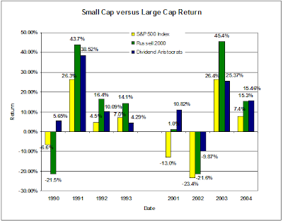
Investors should keep in mind that what worked in the last bull market cycle is unlikely to work in the next bull market. As the below chart shows, after the 2001-2003 recession, it wasn't the S&P 500 Index (large cap stocks) that outperformed. It was small cap (Russell 2000 Index) as well as dividend paying stocks (S&P's Dividend Aristocrats) that generated the better returns. The S&P 500 Index lagged other investment styles due to the higher concentration of technology stocks in the index at that time and the technology sector's inability to keep pace with the other sectors. How many advisers were recommending energy and material stocks? A similar outcome occurred coming out of the 1990-1991 recession.

Posted by
David Templeton, CFA
at
3:24 PM
0
comments
![]()
![]()
Labels: General Market , Investments
Saturday, January 17, 2009
Dividend Aristocrats Explained Via Barron's Video
Posted by
David Templeton, CFA
at
12:10 PM
1
comments
![]()
![]()
Labels: Dividend Return
Financial Stocks Continue To Bear Brunt Of Dividend Cuts
Below is a table detailing year to date dividend rate changes in January. The three cuts are all financial stocks: Bank of America (BAC), Marshall & Ilsley (MI) and XL Capital (XL).
Some detail on the cuts and impact on the S&P 500 Index:
- Financial sector now accounts for 15.8% of all dividends, down from 34%, makes up 11.2% of the market value (22.3% at year-end 2006).
- BAC's dividend reduced from $1.28 to $0.04 (was reduced last Oct from $2.56 to $1.28 after over 25 years of increases, issues was a Dividend Aristocrat). This reduces the S&P 500 payout (and yield) by 3.4%
- BAC was the fifth largest dividend payer ($6.4B), yielding 15.4%, now it yields 0.5% ($0.2B) ranking 202 out of the 369 that pay.
- 2009 S&P 500 dividend expected to be the worst in at least 50 years
Posted by
David Templeton, CFA
at
9:53 AM
0
comments
![]()
![]()
Labels: Dividend Analysis
Friday, January 16, 2009
Summers and President Elect Obama Crater The Financial Sector
Some of the conditions the Obama administration is proposing is essentially telegraphing to the market that equity holders in TARP funded institutions that they are going to shoulder all the risk in turning around the firms and the economy. Some of the conditions, like forcing banks to lend, are similar to requirements that banks underwrite mortgage loans to less qualified first time home buyers. We know where that got us.
Following are some requirements from Mr. Summers' letter (Full Letter Text (pdf)):
- Banks receiving support under the Emergency Economic Stabilization Act will be required to implement mortgage foreclosure mitigation programs. In addition to this action, the Federal Reserve has announced a $500B program of support, which is already having a significant beneficial impact in reducing the cost of new conforming mortgages.
- As a condition of federal assistance, healthy banks without major capital shortfalls will increase lending above baseline levels (emphasis added). The Treasury will require detailed and timely information from recipients of government investments on their lending patterns broken down by category. Public companies will report this information quarterly in conjunction with the release of their 10Q reports. The Treasury will report quarterly on overall lending activity and on the terms and availability of credit in the economy. (more bad loans?)
- Payment of dividends by firms receiving support must be approved by their primary federal regulator. For firms receiving exceptional assistance, quarterly dividend payments will be restricted to $0.01 until the government has been repaid.
Under the proposed terms noted above, the government is essentially making it unattractive for investors to invest in the common equity of the TARP recipient firms/banks. Given the level of outstanding government debt and the current budget deficit, private sector equity investments are needed to assist in the funding as we work through this difficult economic environment.
Posted by
David Templeton, CFA
at
12:32 AM
0
comments
![]()
![]()
Labels: Dividend Return , Economy , Investments
Thursday, January 15, 2009
Investor Sentiment Indecision
Posted by
David Templeton, CFA
at
11:16 PM
0
comments
![]()
![]()
Labels: Sentiment
Better Investings Most Active Stocks
Posted by
David Templeton, CFA
at
9:34 PM
0
comments
![]()
![]()
Labels: General Market , Investments
Tuesday, January 13, 2009
The Beginning Of A New Bull Market?
From a pure technical perspective, many strategists classify a bull market as one where prices generally are rising faster than their historical average over a period of months or years. Some strategists require the market to rise 20% following a low that resulted in a 20% decline in prices (bear market). Last year was a bear market for sure.
As noted above, the market has advanced from its low to a high point this month that generated a return greater than 20%. As the below chart details, the markets could be in the beginning stages of a longer term trend of higher prices.

- (-) the market closed below its 50 day moving average
- (-) the fast (green) MACD line has crossed over the slower red line
- (+) market closed above support around 868
- (+) higher volume on up market days
- (+) market still in a short-term uptrend
There have been ten prior market cycles where the market experienced so-called "waterfall" declines like the market experienced in October and November 2008. Ned Davis Research prepared a graphic representation of these ten declines covering 1929 through 2002. Liz Ann Sonders, Chief Investment Strategist at Charles Schwab (SCHW), highlighted NDR's research in a recent strategy article. Liz Ann noted:
In waterfall declines, the Dow loses more than 20% in a short period, and near the end, the 10-day average of NYSE total volume rises to two times its average seen just a few months earlier. In the majority of cases, the end of the waterfall decline wasn't the end of the bear market.
However, in the composite average, the lows were tested but not broken, followed by a basing phase of up to three months before a breakout to a new bull market. The chart below shows the performance of the Dow as averaged from the 10 waterfall declines between 1929 and 2002.

The economy and market undoubtedly have "issues" that need to be digested; however, the market tends to be a leading indicator and will forecast an improving economic environment with about six months lead time. Could we retest the November 2008 lows, certainly. Remember though, the news media was touting the fact oil was going to $200 per barrel last year right about the time oil hit its high around $150 per barrel. Today, the news media does not have much to say about the market or economy that is positive. What is important is where is the market going looking forward and not where has it been when looking back.
Source:
"Happy New Year" May Be True In 2009!
Excerpt from Schwab Investing Insight
By: Liz AnnSonders, Chief Investment Strategist
January 2009
http://www.schwab.com/public/schwab/research_strategies/market_insight/todays_market/recent_commentary/happy_new_year_may_be_true_in_2009.html
Disclosure: Long SCHW
Posted by
David Templeton, CFA
at
11:59 PM
0
comments
![]()
![]()
Labels: General Market , Investments
Sunday, January 11, 2009
U.S. Government Debt/Deficit A Disaster In The Making?
All told, the shortfall for government social insurance programs (Social Security, unfunded obligations of Medicare Part A & B and Medicare Part D-prescription drug coverage) comes to a present value of $40.9 trillion. This is the government’s official estimate—some private sector economists suggest that the total burden is even greater. Economist Lawrence Kotlikoff has recently estimated the total unfunded liabilities of current federal programs at $70 trillion.
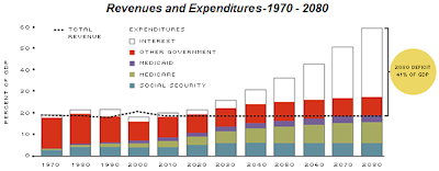 and the resulting growth in the government's debt:
Current measures of the federal deficit and the national debt, as dismal as they might appear, fail to reflect full consequences of current-law fiscal policy. The unfunded future liabilities of government entitlement programs imply rising deficits and a ballooning public debt far larger than today’s shortfalls. And debates about the immediate economic impact of government deficits on private savings and interest rates, while of academic interest, fail to address the full importance of these long-run consequences. Fundamental reform of entitlement programs is critical for putting U.S. fiscal policy on a long-run sustainable path.
Source:
Deficits, Debt and Looming Disaster: Reform of Entitlement Programs May Be the Only Hope
The Regional Economist
By: Michael Pakko
January 2009
http://www.stlouisfed.org/publications/re/2009/a/pages/debts.html
Posted by
David Templeton, CFA
at
9:30 PM
0
comments
![]()
![]()
Labels: Economy
Saturday, January 10, 2009
Stocks Passing The Buffett Test
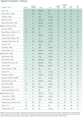
The companies passing all the above screens are detailed in the below table.
- Free cash flow (net income after taxes, plus depreciation and amortization, less capital expenditures) of at least $250 million.
- Net profit margin of 15% or more.
- Return on equity of at least 15% for each of the past three years and the most recent quarter.
- A dollar’s worth of retained earnings creating at least a dollar’s worth of shareholder value over the past five years.
- Ample liquidity. Only stocks with a market capitalization of at least $500 million are included.
- (S&P's) Comparing the five-year discounted cash flow (DCF) estimate with the current price.
 Source:
Acing The Buffett Test ($)
The Outlook
Standard & Poor's
By: Howard Silverblatt, Senior Index Analyst
January 14, 2009
http://erecom.standardandpoors.com/ecommerce/multiRegistration.do
Disclosure: Long BCR, MCD, SLB
Posted by
David Templeton, CFA
at
9:14 AM
1
comments
![]()
![]()
Labels: Investments
Friday, January 09, 2009
Post Election Year Market Returns Somewhat Muted
"...the party in power will tend to make the more difficult economic decisions in the early years of a presidential cycle and then do everything within its power to stimulate the economy during the latter years in order to increase the odds of re-election."
Posted by
David Templeton, CFA
at
9:43 PM
0
comments
![]()
![]()
Labels: General Market , Technicals
Tuesday, January 06, 2009
The Year Of The Vanishing Dividend Increase: 2008
 In regards to dividends, for the month of December,
The below table shows positive dividend actions have been on a steady downward trend since 2005.
- S&P notes the decreases continue to increase and increases continue to decline.
- The last three months of 2008 were the worst months in the Index's history with 288 decrease versus 52 decreases in 2007.
 Source:
Market Attributes Snapshot (PDF)
Standard & Poor's
By: Howard Silverblatt, Senior Index Analyst
December 2008
http://www2.standardandpoors.com/spf/pdf/index/2009_1_SP500.pdf
Posted by
David Templeton, CFA
at
9:47 PM
0
comments
![]()
![]()
Labels: Dividend Analysis
Sunday, January 04, 2009
Investor Bullish Sentiment Continues To Decline
As reported by the the American Association of Individual Investors, this past week's bullishness reading fell to a level below that reported on November 20th. The percent of individual investors that are bullish on the market was reported at 24% versus last week's reading of 28.95%. The 24% level is lower than reported on November 20th: 24.37%. Since November 20th, the S&P 500 Index has risen over 15%. The bull/bear spread came in at -31% versus last week's spread of -15%.
Posted by
David Templeton, CFA
at
11:31 AM
0
comments
![]()
![]()
Labels: Sentiment
Saturday, January 03, 2009
Housing Bubble And Personal Responsibility
"...one culprit continues to get off scot-free: HGTV. The cable network HGTV is the real villain of the economic meltdown."
"HGTV is an evil empire that never rests. You can loathe your current domicile 24/7 with programs such as "Stagers" (move a few things around and double the value of your home); "Designed to Sell" (you can sell your house, even if the house next to yours is in foreclosure); "Design on a Dime" (see, it's cheap); and "Property Virgins" (losing your virginity was fun, wasn't it?) Every show features highly attractive hosts who show you how to "unlock the hidden potential" in your home, how to turn a $10 thrift-store table into a "wow" media center, and how to make everything "pop." Pop is the word of choice on HGTV."

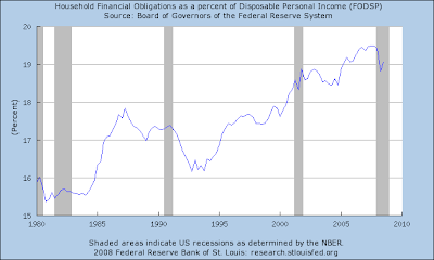
Individuals need to learn to live within their means going forward. Placing the blame on a television show is an insult to ones intelligence.
Source:
Blame Television for the Bubble
The Wall Street Journal
By: Jim Sollisch
January 3-4, 2009
http://online.wsj.com/article/SB123094453377450603.html
Posted by
David Templeton, CFA
at
4:45 PM
0
comments
![]()
![]()
Labels: Economy
Friday, January 02, 2009
S & P 500: Payers Versus Non Payers Performance As Of December 2008
Given the magnitude of the market's decline, even outperformance to the index seems little consolation in the market environment experienced in 2008.
Posted by
David Templeton, CFA
at
10:42 PM
4
comments
![]()
![]()
Labels: Dividend Return
Thursday, January 01, 2009
The Demise Of Wall Street And The Lessons For 2009
A lesson in all of this as we go into 2009 is investors must understand the type of investment approach that is being employed in their investment accounts. A particular investor doesn't need to understand the process down to the minute detail; however, they should be comfortable that their investment manager can explain the process in an understandable way. If you are investing in a hedge fund, your adviser should be able to explain the investment approach in layman's terms.
What is for certain as we look to 2009 is investment advisers will try to "sell" new approaches to managing ones investments. Just as advisers were pushing technology stocks at the end of 1999 and asset allocation over the course of the last two years, there will certainly be new approaches pitched to investment clients in 2009. As 2008 was one of the worst investment markets on record, investors may be looking to better understand what their adviser's investment approach was in 2008 and what it will be in 2009. I am sure new buzz words will include terms like rotation, tactical allocation, etc. Asset allocation certainly did not seem to work in 2008 as nearly all asset classes came under severe pressure and had high correlations.
As investors meet with their advisers, asking questions (even the same question in a different way) about the investment approach is a must. If the adviser talks about tactical allocation or rotation, be sure the adviser can articulate the factors behind a particular approach. Also, be sure the approach is not being pitch because it would have worked in the recent past. The investment approach needs to be one that will work going forward and one that has worked over the long run.
Posted by
David Templeton, CFA
at
6:09 PM
0
comments
![]()
![]()
Labels: Investments
Dow Dogs Were Dogs In 2008
The performance of the Dow Dogs in 2008 was -41.6% versus the Dow Jones Index performance of -36.9%. Over recent years, the Dogs of the Dow strategy has been mixed.
 The Dow Dogs for 2009 are detailed below. New members include Bank of America (BAC), Alcoa (AA), Merck (MRK) and Kraft (KFT). Those companies that were dogs in 2008 and are dropped from the 2009 list are Citigroup (C), General Motors (GM), Altria (MO) and Home Depot (HD).
 Source: Dogs of the Dow
Posted by
David Templeton, CFA
at
1:40 PM
0
comments
![]()
![]()
Labels: Investments
Dow Index Performance In 2008 Third Worst On Record
The -33.8% return in the Dow Jones Industrial Average for 2008 is the third worst on record. As noted by Chart of the Day:
"[the below chart] illustrates the 15 worst calendar year performances of the Dow since its inception in 1896...Only 1931 and 1907 endured greater declines. It is of interest that major banking crises occurred in 1931, 1907, 2008, and 1930 – the four worst calendar years on record in terms of stock market performance."
Posted by
David Templeton, CFA
at
5:00 AM
0
comments
![]()
![]()
Labels: General Market


