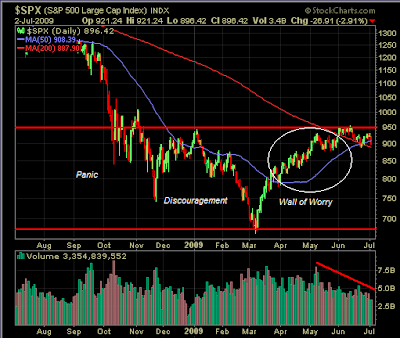
From a technical perspective could the market be following the path of past sentiment cycles? The below sentiment cycle chart was first published in 1991 by technical analyst Justin Mamis in a book titled, The Nature of Risk. In looking at the below chart, it appears the current market pattern is following the pattern outlined in Mamis' chart.
(click charts to enlarge)

 The market's recent advance from the early March low appears to follow the sentiment cycle's "wall of worry" advance. The next phase would then be the investor's "aversion" portion of the cycle. Consolidating some of the gains achieved since the March low would be healthy.
Although the market has had a strong recovery off the March low, since the beginning of the year, the market has essentially traded sideways.
From a longer term perspective, the market has a long way to go to reach its earlier high.
(click to enlarge)
 From an economic perspective, I could cite a number of factors that would support a bullish case for the market and I could cite an equal number of bearish factors. One statistic that sticks out like a sore thumb is the continued increase in the jobless data.
 Source: Chart of the Day
Initial claims have exceeded 600M for 22 straight weeks. Historically, the consumer has represented 70% of the U.S. economy and unless there is some job creation, this 70% stat is not going to hold. What then will stimulate economic growth?


2 comments :
That "wall of worry" you show is quite misrepresented. Duly noted is this...
Declining volume has been the trend all the way up from March bottom.
You show volume declining only from early-May. Yet if you look closely at that early-May volume spike, you will see it occurred right at the top. Essentially, the market went nowhere during those couple of days in early May when volume spiked.
I submit smart money (strong hands) was exiting then.
So, if you remove that early May volume spike when strong hands were distributing shares to weak hands with vigor, you clearly see the volume of shares exchanged consistently declining from March bottom all the way up to the top in June.
And this, I submit, does not demonstrate the character of a market climbing a "Wall of Worry." Rather, it reveals shares being distributed from strong hands to weak.
The "Wall of Worry" is no mere sentiment thing. It is, in fact, demonstrated by the volume of shares exchanged. When investors are worried prices will not rise further, they not only offer up their shares for sale, but they do so in increasing volume. And yet, this increasing volume of shares will be snapped up and the market will continue rising, showing the "worry" to be unfounded. This is how the market climbs a Wall of Worry.
Precisely the opposite has been happening during the market's advance off March bottom. Rather than offer up an increasing volume of shares out of worry and fear, investors are holding on! Big, big mistake...
Tom,
Interesting observations. Applying technical analysis is as much an art as science. I would note the volume was pretty healthy off of the March low until early May. The volume since May has been exceptionally light.
Barry Ritholtz, The Big Picture blog, makes an interesting observation at the following link.
Market Resiliency
Post a Comment