Saturday, April 28, 2012

Why Economic Growth Has Been So Low

As many of our clients and prospective clients know, we frequently discuss the strength of the corporate sector of the economy. As the below chart shows, corporate profit growth has continued to strengthen.

From The Blog of HORAN Capital Advisors

With this level of corporate profit strength, one has to ask why economic growth (GDP) has not been stronger. The first report on first quarter GDP Friday indicated growth was running at 2.2% versus expectations of 2.5%. A recent post at the blog, Calafia Beach Pundit and written by Scott Grannis, the former Chief Economist at Western Asset Management, notes the drag the government sector is having on economic growth:
"Here's another way of appreciating what has happened in recent years. The private sector has been working very hard to increase its efficiency and its output, and that shows up in the record level of corporate profits, both in nominal terms and relative to GDP. But instead of allowing or encouraging the private sector to plow those profits back into the economy in the form of new plant and equipment, new jobs, and new technologies, the federal government has effectively borrowed all the corporate profits generated since 2009 and distributed the money to the unemployed, to the poor, to favored "green" industries, to unions, to state and local governments, and to "make-work projects," among other things. There's been a lot of money thrown around, but lots of it has been wasted in the process that could have been put to better use; we simply don't have much to show for the $1.25 trillion of after-tax profits generated per year on average by U.S. businesses since 2009. (I'm referring here to the fact that federal deficits in recent years have been roughly equivalent to after-tax corporate profits—actually a bit higher. So on a "sources and uses of funds" basis, the government has effectively used all corporate profits to fund its spending.)"
GDP is commonly defined as:

GDP = C + I + G + (X - M)

Where,
  • C = private consumption
  • I = gross investment
  • G = government spending
  • (X - M) = exports - imports
Government expenditures on final goods and services includes salaries of public employees, purchases of military equipment and any investment expenditure by the government. It does not include transfer payments, such as social security or unemployment benefits.

As Scott Grannis notes in his article, there are many aspects of government expenditures that have not been additive to U.S. economic growth in spite of the strength in the corporate sector of the economy.


Better Investing's Most Active Stocks For The Period Ending April 28, 2012

Better Investing Magazine publishes the most active stocks reported by its membership. The list is based on an informal sampling of Better Investing members. Below is the list of the most active stocks for the period ending April 28, 2012

Full View


Thursday, April 26, 2012

Low Investor Bullish Sentiment Positive For Stock Returns?

Today's investor sentiment release by the American Association of Individual Investors shows investor bullish sentiment is at the lowest level since September 22, 2011. The bullish sentiment reading was reported at 27.64% or a 3.5% decline from the prior week. This is the lowest reading since the bullish sentiment reading on 9/22/2011 when bullish sentiment was reported at 25.33%. The bull/bear spread is at -9.8% while it was reported at -22.7 on September 22nd of last year. The investor sentiment reading records investor expectations for the equity markets in the upcoming six months and is considered a contrarian indicator.

From The Blog of HORAN Capital Advisors
Data Source: American Association of Individual Investors.


Wednesday, April 25, 2012

First Quarter 2012 Investor Letter

The first quarter of 2012 ended a period where the equity markets generated two consecutive quarters of strong market returns. Most investors would find the returns generated in the first quarter acceptable for returns in an entire year. The S&P 500 Index was up 12.5%, the MSCI Developed Equities Index was up 11.7% and the MSCI Emerging Markets Index was higher by 14.1%. Recent earnings reports for Q1 continue to exceed analyst expectations. Our newsletter covers Q1 events as well as recent events impacting the the investment markets.

The Letter can be accessed directly from our website at the following link: 1st Quarter 2012 Investor Letter

We hope you find the content of our letter insightful as 2012 continues to unfold.


Sunday, April 22, 2012

Apple's Stock Trading Far Above Its Trend Line

Apple (AAPL) stock continues to dominate headlines from day to day. Of particular importance will be the company's earnings report on Tuesday after the market's close. Over the last nine trading days, the price of Apple's stock has declined from an all time high of $644/share to close on Friday at $572/share, just above its 50 day moving average of $569/share.

From The Blog of HORAN Capital Advisors

The below chart shows AAPL's stock price relative to its longer term trend line. The trend line support is around $449/share which is near its 200-day moving average price of $438/share. Interestingly, the year to date advance in the company's stock price has occurred during a period of declining trading volume for the stock. For investors, does this gap above its longer term trend warrant caution?

From The Blog of HORAN Capital Advisors


Saturday, April 21, 2012

Game Theory Strategy Displayed

An interesting display of game theory in the below video.


Saturday, April 14, 2012

Procter & Gamble Increases Dividend 7% And Payout Ratio Continues To Increase

On Friday, Procter & Gamble (PG) announced a 7.05% increase in the company's quarterly dividend. The dividend increases to 56.2 cents per quarter versus 52.5 cents in the same quarter last year. The 7% increase is one of the lowest rate of increases in recent years. The payout ratio increases to 56.8% based on fiscal year 2012 estimated earnings of $3.96. Earnings for FY 2013 are estimated at $4.30 or growth of a little over 8%.

From The Blog of HORAN Capital Advisors

On a one year basis the stock return of P&G has essentially matched the return of the S&P 500 Index; however, on a year to date basis, P&G's return has lagged the market by almost 10 percentage points. P&G's stock does tend to hold up well during market corrections as noted by the performance of the stock late last year. On a technical note, the trading volume has spiked over the last few trading days on down days for the stock.

From The Blog of HORAN Capital Advisors

Disclosure: Our firm is long PG


Tuesday, April 10, 2012

Dividend Payers Experience Multiple Expansion At Low Nominal Interest Rates

A recent report from Fidelity Investments shows that multiples expand for dividend paying stocks with high payout ratios when nominal interest rates are at extremely low levels as rates are today.

From The Blog of HORAN Capital Advisors

From The Blog of HORAN Capital Advisors

Essentially, the report indicates investors view high dividend payout equities as bond substitutes. The report states:
In a market with extraordinarily low nominal yields, the relationship supporting the
risk premium between equity and fixed income is challenged, and stable high quality dividends can be viewed similarly to a bond coupon. Thus it would be logical for the market to value dividends within the prevailing yield structure of the fixed income market:

Price/Dividend = f (Interest Rates)
Undistributed earnings are still subject to economic uncertainties with investors expressing concern about a company's ability to effectively allocate capital. Consequently, we see a higher equity risk premium in the non dividend payers at low nominal rates.

From The Blog of HORAN Capital Advisors

From The Blog of HORAN Capital Advisors

The Fidelity report details the performance of of dividend payers in the Nikkei Index during the 2002-2012 time period. For Japan this period has been characterized by persistent deflationary pressures and the higher dividend payers have outperformed with lower volatility.

Investors need to keep in mind these higher yielding stocks are still equities. As such, equities are subject to the vagaries of the movements in the stock market.

Source:

What if the Market is Revaluing Dividends? (PDF)
Fidelity Asset Management
By: James Morrow, CFA and Neil Nabar, CFA
March 2012
http://fiiscontent.fidelity.com/939518.PDF?pos=R


Sunday, April 08, 2012

Low Expectations For Earnings In Q1 2012

A low bar has been set for year over year earnings exceptions for the first quarter. According to ThomsonReuters, "the earnings growth rate for the S&P 500 for Q1 2012 is 3.2%. Excluding Apple (AAPL), the overall growth rate declines to 1.8%. The Industrials (10.6%) and Consumer Discretionary (6.6%) sectors have the highest growth rates for the quarter, while Materials (-14.7%) has the weakest growth rate." Factset has a slightly lower earnings outlook for Q1 noting, "the estimated earnings growth rate for Q1 2012 is -0.1%. Seven of the ten sectors are predicted to see a decline in earnings in Q1 2012, led by the Materials (-14.5%) and Telecom Services (-10.1%) sectors."

From The Blog of HORAN Capital Advisors


Friday, March 30, 2012

Buybacks Decline Along With Earnings In Q4 2011

Standard & Poor's fourth quarter 2011 preliminary buyback report for the S&P 500 Index shows buybacks declined in Q4 along with reported earnings. Preliminary earnings were reported at $186.76 in Q4 2011 versus $206.08 in Q3 2011 and $187.67 billion in Q4 2010, while buybacks declined to $91.46 billion versus $118.41 billion in the prior quarter.

From The Blog of HORAN Capital Advisors

S&P's Howard Silverblatt, Senior Index Analyst, notes,
“Companies appear to have finally gotten it right with average share prices declining 14.3% during the third quarter of 2011, companies poured $118 billion into stock buybacks (the most since the heydays of 2007), buying back shares at reduced prices. With depressed prices, companies were able to scoop up additional shares, which reduced the number needed for year-end employee options. In the fourth quarter, with share prices increasing an average of 11.2%, they pulled back.”
I would agree with S&P that it is better for companies to buyback shares at the lower prices reached in Q3 last year. However, this buyback volume can distort reported earnings per share and mask weakness in earnings growth. With fewer shares, earnings growth on a per share basis will be higher than actual corporate earnings growth. Bloomberg reports, the buyback activity reduced Standard & Poor’s 500 Index divisor, a measure of outstanding shares, by 0.6 percent last quarter, the first drop since March 2009.

From The Blog of HORAN Capital Advisors


Sunday, March 25, 2012

The Number Of Dividend Payers In S&P 500 Index At 12-Year High

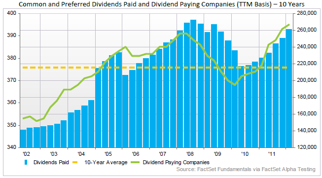
In a dividend report released by Factset this past Friday, it is noted the number of dividend paying companies in the S&P 500 Index has reached a 12-year high. The report notes,
"The number of dividend-paying companies was 393 at the end of Q4 2011 (January 2012), which marks a 12-year high. Aggregate quarterly dividend payments amounted to $260.8 billion over the trailing twelve months. On a per-share basis, the aggregate figure was $26.78 per share, reflecting year-over-year growth of 16.1%. The Financials, Materials, and Information Technology sectors led all sectors in year-over-year growth on a per-share basis (40.0%, 28.4%, and 23.5%, respectively)."
From The Blog of HORAN Capital Advisors

Interestingly, a majority (53.5%) of the companies in the technology sector now pay a dividend. This is up from only 17.9% in July of 2002, nearly 10-years ago. Is this a sign the technology sector is maturing?

We believe a primary reason for investors to look at a company's dividend practice is it provides insight into future expected earnings growth. And assuming a company is consistently growing its dividend at say a 10% rate, and all else being equal, that is, not borrowing to sustain the dividend growth rate and the payout ratio is not increasing, then the company's earnings are likely growing 10% as well. Over time the stock price should advance in line with the company's earnings growth rate. I am simplifying the analysis here as investors need to evaluate cash flow, etc. The Factset report, however, notes,
"a back test utilizing FactSet’s Alpha Testing application shows that stocks with the highest five-year compound annual growth rates in earnings per share have outperformed stocks with lower growth rates over fifteen years. However, the results for dividend per share (DPS) growth rates show a different relationship. Dividend paying stocks in the top quartile by DPS growth have underperformed the S&P 500 Total Return Index, while the lower three quartiles outperformed (emphasis added)."
If one removes the financial and health care sector stocks from the analysis, the top quartile dividend growers do exhibit the highest total return.

From The Blog of HORAN Capital Advisors

The negative influences to the health care and financial sector are well know, the housing bubble and heath care reform legislation. So just looking at dividend growth and investing based on this can be treacherous. Investors certainly need to evaluate macro factors that can negatively (or positively) influence a sector or stock's performance.

Companies in the S&P 500 index are now paying dividends at a record level after J.P. Morgan's (JPM) recent dividend announcement. This was noted recently by Howard Silverblatt, S&P's senior index analyst. The below chart is for the period ending 12/31/2011 and includes preferred dividends.

From The Blog of HORAN Capital Advisors

Lastly, given the level of cash on corporate balance sheets, and the still low payout ratio, future dividend growth looks promising.

From The Blog of HORAN Capital Advisors

Certainly, the change in the tax structure for dividend payments might be a headwind as noted in a recent Wall Street Journal article, Will A Dividend Tax Hike Spoil The Party? ($); however, the discipline of using dividend growth in ones stock analysis can be rewarding for even total return investors.

Source:

Factset Dividend Quarterly (PDF)
By: Michael Amenta, Research Analyst, John Butters, Senior Earnings Analyst
March 23, 2012
http://www.factset.com/websitefiles/PDFs/dividend/dividend_3.12/


Monday, March 19, 2012

The Disconnect Between The Economic Data And Sentiment

Recent unemployment data released by the Labor Department continues to indicate the economy is adding 200,000 jobs per month. This has been the case for the last three months. What is interesting about the continued job growth figures is the GDP growth rate is suggesting a much lower rate of job additions. A recent article in the Wall Street Journal, Piecing Together the Job-Picture Puzzle ($), notes the level of job improvement over the last year would indicate the economy is growing at a 4-5% pace. This projection is based on a study by Arthur Okun and is known as Okun's Law. The Fed has opined on Okun's Law and the relationship between output and unemployment. Mish's Global Economic Trend Analysis site highlights a comment from Madeline Schnapp, Director of Macroeconomic Research at TrimTabs Investment Research:
"Something about the U.S. economy isn't adding up.

At 8.3%, the unemployment rate has fallen 0.7 percentage point from a year earlier and is down 1.7 percentage points from a peak of 10% in October 2009. Many other measures of the job market are improving. Companies have expanded payrolls by more than 200,000 a month for the past three months, according to Labor Department data. And the number of people filing claims for government unemployment benefits has fallen.

Yet the economy is barely growing. Many economists in the past few weeks have again reduced their estimates of growth. The economy by many estimates is on track to grow at an annual rate of less than 2% in the first three months of 2012. The economy expanded just 1.7% last year. And since the final months of 2009, when unemployment peaked, the economy has expanded at a pretty paltry 2.5% annual rate.

How can an economy that is growing so slowly produce such big declines in unemployment?

TrimTabs thinks the problem lies in the heavily massaged BLS employment data and the highly suspect BEA personal income data.

That said, withholding tax data is also messy and not a perfect measure either, but no matter what I do with the data, I can't get to 200,000+ jobs unless a huge percentage of the workforce is suddenly working for McDonalds."
Recently, a number of consumer sentiment releases have turned negative. Last week's University of Michigan consumer sentiment index fell to 74.3 versus 75.3 in the prior month. Expectations were for an increase to 76. Additionally, the IBD/TIPP Economic Optimism Index declined to 47.5 versus 49.4 in February. This decline was the the index's first since August of last year. Readings below 50 indicate consumer pessimism. Both sentiment reports highlight gasoline prices as a prime contributor to the weaker sentiment figures.

From The Blog of HORAN Capital Advisors

TechnoMetrica's (TIPP) president, Raghavan Mayur, notes, "There is a basic disconnect between the media and the American public," he said, adding that coverage of the jobs picture has been too positive. "It's like there are two realities in this country. The report noted that 87.2% of those survey in the poll expect gas prices to top $4 over the next three months and 37.1 expect gas prices to reach over $5. It should be noted that all three of the components of the index worsened. The three components consist of:
  • The Six-Month Economic Outlook: a measure of how consumers feel about the economy’s prospects in the next six months.
  • The Personal Financial Outlook: a measure of how Americans feel about their own finances in the next six months.
  • Confidence in Federal Economic Policies: a proprietary IBD/TIPP measure of views on how government economic policies are working.
There certainly seems to be a disconnect from much of the reported economic data versus consumer/business sentiment.


Wednesday, March 14, 2012

Unlocking The Risk Associated With Stock Concentrations

Various techniques are available to investors in order to customize an effective approach to reducing a concentrated investment. Investors must continually evaluate the investment landscape, concentrated position risk, opportunity cost, time horizon and taxable consequence related to concentrated holdings. We recently prepared a report titled, Unlocking Concentrated Risk (PDF), that we feel is timely for investors as the market and individual stock prices have increased significantly since the market lows in September of 2011.


Wednesday, March 07, 2012

Is The Consumer's Financial Condition About To Worsen?

The consumer is the one important key to economic growth as they account for nearly 70% of GDP. Recent data does show consumer balance sheets have been improving based on the Fed's Financial Obligation Ratio.

From The Blog of HORAN Capital Advisors

Even consumer loan charge offs at commercial banks continue to show significant improvement.

From The Blog of HORAN Capital Advisors

The water on the fire though is the fact consumer delinquencies have recently turned higher. Is this a precursor to a less robust consumer spending environment? The fact gasoline prices have been on the rise as well is likely to reduce the cash available to consumers for discretionary spending.

From The Blog of HORAN Capital Advisors


Markets Retrace Significant Amount Of Losses Since Financial Crisis

The Chart of The Day charting service provides a graphic look at the market recovery for various indices since the financial crisis trough in March 2009.
"For some perspective on the post-financial crisis rally, today's chart illustrates how much of the downturn that occurred as a result of the financial crisis has been retraced by each of the five major stock market indexes. For example, the Dow peaked at 14,164.53 back in October 9, 2007 and troughed at 6,547.05 back on March 9, 2009. The most recent close for the Dow is 12,980.30 -- it has retraced 84.5% of its financial crisis bear market decline. As today's chart illustrates, each of these five major stock market indices have retraced over 78% of their financial crisis decline. However, it is the S&P 400 (mid-cap stocks) and the tech-laden Nasdaq that have recouped all the losses incurred during the financial crisis and currently trade higher than their 2007 credit bubble peak."
From The Blog of HORAN Capital Advisors


Monday, March 05, 2012

Risk On Trade Not Kind To Dividend Payers This Year

The dividend paying stocks in the S&P 500 Index have significantly lagged the performance of their non paying counterparts. The payers return in February and YTD have totaled 3.84% and 8.92% respectively. The non-payers on the other hand have generated February and YTD returns of 5.55% and 14.19% respectively.

From The Blog of HORAN Capital Advisors

One could say the market has been in a "risk on" mode this year and at least since the end of September last year. As we discussed this in our 4th Quarter Investor Letter the "risk on" "risk off" trade has been a common discussion item of late. Investors that desire to track the "risk on" and "risk off" cycles of the market are now able to follow the newly issued exchange traded notes with tickers "ONN" and "OFF". As the below charts show, these ETRACS notes came into existence in late 2011. Until the last few trading days, these indexes have shown the market has been mostly in a "risk on" mode. The question becomes whether the "risk off" trade exhibited over the last two to three trading days is one that will be sustained. If so, the dividend payers might regain some of the ground lost to the non-payers.

From The Blog of HORAN Capital Advisors


Saturday, March 03, 2012

Investor Equity Fund Flows Indicate They May Be Late To The Rally

Mutual fund flow data appears to indicate investors have been late to allocate additional funds to equities in spite of the strong equity market advance since the end of September last year. As the blue bar in the below chart indicates, monthly net flows into equity mutual funds has been negative in spite of the continued advance in the market.

From The Blog of HORAN Capital Advisors

The below chart shows the same data with flows accumulated on a rolling one year basis. Historically, when equity flows have been negative, the equity market returns have not been favorable. During this most recent period though, equity returns have been extremely strong in the face of the negative equity fund flows.

From The Blog of HORAN Capital Advisors

Not until this past month have equity fund flows turned positive. The biggest beneficiary of flows though has been fixed and money market funds.

From The Blog of HORAN Capital Advisors
Source: ICI

From The Blog of HORAN Capital Advisors

From a contrarian standpoint, and taking into account only the fund flow data, investors don't seem to have thrown in the towel and piled into equities.Maybe this market continues to climb the proverbial "wall of worry" until we see investors capitulate and plow into equities.


Sunday, February 19, 2012

$4 Gasoline Has Negative Impact On Confidence And Retail Sales

The recent rise in oil prices and subsequent increase to near $4 per gallon for regular unleaded gasoline is likely to negatively impact consumer confidence and retail sales. The below chart shows the negative influence increasing gasoline prices (inverted on chart) has on consumer confidence.

From The Blog of HORAN Capital Advisors

The negative impact on confidence also negatively impacts retail sales when gasoline reaches $4 per gallon. Note, gasoline prices lead retail sales by one month in the below chart.

From The Blog of HORAN Capital Advisors

Lastly, as noted in an earlier post, declining confidence often translates into weaker equity prices.

From The Blog of HORAN Capital Advisors


Saturday, February 11, 2012

Volatile Equity Market Returns

Absent the significant market contraction in 2008/2009, both the Dow and S&P 500 Index have generated decent returns. For investors though, the equity market pullback during the financial crisis period of '08/'09 remains top of mind. As the below tables show, the year over year returns for these two indices have been pretty strong resulting in 3-year annualized returns in the mid-teens. Unfortunately, the significant decline during the financial crisis has resulted in no return over the four and five year time period.

returns 1 31 2012

The Chart of the Day puts this most recent rally in perspective in their below commentary and chart.
"The Dow made another post-financial crisis rally high Thursday as it approached the 13,000 level. To provide some perspective to the current Dow rally that began back in early October 2011, all major market rallies of the last 111 years are plotted on today's chart. Each dot represents a major stock market rally as measured by the Dow. As today's chart illustrates, the Dow has begun a major rally 28 times over the past 111 years which equates to an average of one rally every four years. Also, most major rallies (78%) resulted in a gain of between 30% and 150% (29.8% to 150.5% to be exact) and lasted between 200 and 800 trading days (9.5 months to 3.2 years) -- highlighted in today's chart with a light blue shaded box. As it stands right now, the current Dow rally (hollow blue dot labeled you are here) would be classified as well below average in both duration and magnitude."
dow rallies

At HORAN Capital Advisors, we believe this heightened volatility is likely to represent the return pattern for investors for the foreseeable future. As such we believe it is important for investors to incorporate a high quality portfolio for their core equity investments. Additionally, making use of so called alternative investments that potentially minimizes downside returns is equally important.


Friday, February 10, 2012

Pick Your Strategist/Advisor Carefully

The below chart was provided by the Wall Street Journal courtesy of Doug Kass.

rosenberg roubini sp chart