Thursday, November 28, 2013

Market Advance Below Average In Return And Duration

Investors and market pundits have been expressing cautiousness of late about the near uninterrupted advance of the U.S. equity market. This climb higher has been in place since the end of the financial crisis in 2009. I discussed this strong move higher in a post at the beginning of November that included the below chart.

From The Blog of HORAN Capital Advisors

In looking at the chart it seems rational to believe the advance is getting long in the tooth as they say. However, in a recent strategy article written by Liz Ann Sonders, Chief Investment Strategist at Charles Schwab, she notes how this advance is really not that long in duration relative to prior bull markets. Additionally, her article notes from a return perspective, on a rolling ten year basis, the S&P 500 index return is just below average. And, the market return, on the upside or on the downside, generally overshoots the average as can be seen in the below chart.

From The Blog of HORAN Capital Advisors

In an effort to put this in perspective her article included the below chart comparing the length and magnitude of prior S&P 500 bull markets and this one has been just an average one.

From The Blog of HORAN Capital Advisors

Another chart by the Chart of the Day charting services notes prior bull market advances and duration for the Dow Jones Industrial Average. Included with their recent chart is the following commentary.
"The Dow just made another all-time record high. To provide some further perspective to the current Dow rally, all major market rallies of the last 113 years are plotted on today's chart. Each dot represents a major stock market rally as measured by the Dow with the majority of rallies referred to by a label which states the year in which the rally began. For today's chart, a rally is being defined as an advance that follows a 30% decline (i.e. a major bear market). As today's chart illustrates, the Dow has begun a major rally 13 times over the past 113 years which equates to an average of one rally every 8.7 years. It is also interesting to note that the duration and magnitude of each rally correlated fairly well with the linear regression line (gray upward sloping line). As it stands right now, the current Dow rally that began in March 2009 (blue dot labeled you are here) would be classified as well below average in both duration and magnitude. However, the magnitude of the current post-financial crisis rally has now reached median status -- its magnitude is greater than six and less than six Dow rallies since 1900."
From The Blog of HORAN Capital Advisors
 
The Schwab article contains several interesting tables noting criteria that historically have been present that would signify a market top. Many of these criteria are not present today. She also notes a 5-10% correction would not be out of the norm and in fact writes,
"My bottom line is that I continue to hope for a pullback here in the near-term to alleviate some of the frothiness that's crept in and keep the bull market going. But I continue to fear a melt-up. Why "fear?" As good as they feel while they're happening, they don't end well."


Tuesday, November 26, 2013

Active Stock Selection Outperforming

Year to date, the S&P 500 Index is up over 26%. Investors have enjoyed a strong rally with this calendar year nearing an end. If an investor has been invested in the equity market from the beginning of the year, in total, losing money would have been difficult. How does one beat a market that has run so much? Pick the right stocks.

In today's market, it has increasingly paid to be a stock picker as opposed to indexing ones portfolio. Beating the market is certainly not an easy task in today’s technologically driven market. However, 57% of actively managed funds are beating their respective benchmarks in 2013. This is a strong performance versus the historical norm of 37% of managed funds outperforming their benchmark. Typically, a stock picker's market begins to unfold in an extended bullish environment where the market starts to distinguish between stocks within sectors that will continue to drive the market higher and those that will lag. This has begun to occur with the close of the third quarter earnings season.

An additional form of evidence for a stock picker's market comes from looking at the percentage of S&P 500 stocks trading above their 200 day moving average. This indicator is one of many measures providing an indication of the overall health of the market. The higher the percentage, the healthier the market. A stock is said to be in an uptrend once it begins to trade above its 200 day. The chart below illustrates the percentage of stocks in the S&P 500 trading above their 200 day moving average year to date.

11 26 2013 200 day

As the chart shows, since mid-May, this measure has dropped from 94% to 82.40%. While it is easy to make the case of weakening in the “broader” market, one can also view this as a healthy re-balancing or rotation into other stocks. Stocks remain in uptrends as noted in our article posted Saturday and there seems to be plenty of opportunities for longs. An interesting observation is the S&P 500 has still managed to deliver new highs although the percentage of stocks trading above their 200-day moving average has decreased. From a cautionary perspective, this decrease in the number of stocks trading above their 200 day M.A. can be a signal the market is losing some momentum. So far this year though, active investors have broadly generated better returns than their passive ones.


Sunday, November 24, 2013

QE's Influence On Equity Prices

One debatable issue with the Fed's quantitative easing (QE) program is whether or not the QE activity has an impact on equity prices. In a recent McKinsey & Company study, QE and ultra-low interest rates: Distributional effects and risks, McKinsey concludes,
"We found little evidence that ultra-low interest rates have boosted equity markets. We cannot discern a large-scale shift into equities as part of a search for yield by investors, and price-earnings ratios and price-book ratios in stock markets are no higher than long-term averages. Although stock prices do react to announcements by central banks, these are transitory effects that do not persist."
If a picture is worth a thousand words, then the below chart seems to suggest QE has positively influenced equity prices.
From The Blog of HORAN Capital Advisors

If QE has had a positive impact on equity prices, the next question becomes what happens when the QE program comes to an end. The recent focus has been on the timing of the Fed "tapering" its purchases. Tapering is still QE but simply in a lesser amount; hence, supportive of equity prices if one believes a positive correlation exists.


The Week Ahead Magazine: November 24, 2013

The equity market has been on a steady advance since after the election last year. And actually this market recovery has been in place since the end of the financial crisis in 2009. As noted in our blog article on Saturday, a market correction of 10+% has not occurred for more than 500+ trading days. A number of the articles contained in this week's magazine highlight the strength of the equity market as well as highlight the potential rotation out of bonds into equities that is taking place. Slowly rising market interest rates are serving as one tailwind that may be pushing equity prices higher.


Saturday, November 23, 2013

Waiting For A Correction?

One interesting aspect of this bull market run for the S&P 500 Index has been the absence of a 10+% correction.

From The Blog of HORAN Capital Advisors

It seems on a daily basis the talking pundits on business news channels and in print are certain an equity market correction is just around the corner. For those investors under invested in equities, a correction would certainly be a welcomed event. Market corrections, however, are hard (if not impossible) to predict and when they do occur, they tend to surprise investors. As the below chart of market advances without a 10% correction shows, it is not uncommon for the market to move higher without significant pullbacks.

From The Blog of HORAN Capital Advisors

As noted in the Bramesh article,
  • from March 2003 to October 2007 (the entire length of the last bull market), the index went 1,153 trading days without experiencing a 10% correction.
  • the longest streak on record without a 10% correction was from October 1990 to October 1997, and that lasted 1,767 trading days.
  • if the current streak matched the 1990 to 1997 streak, this bull market would run to October 1, 2018, nearly five years from now.
The other factor that seems to be preventing a so called market "melt up" is investor sentiment has not become overly bullish. In the sentiment survey release by the American Association of Individual Investors earlier this week, bullish sentiment actually feel 4.8 points after falling 4.3 points in the prior week. Investors should keep in mind though, sentiment indicators are most predictive at their extremes.

From The Blog of HORAN Capital Advisors
Source: AAII


Sunday, November 17, 2013

The Week Ahead Magazine: November 17, 2013

The S&P 500 Index closed higher for the sixth consecutive week. Investors seem concerned about the market entering into bubble like territory. In this week's magazine several of the article links comment on the current state of this market advance. As we referenced in last week's magazine, one technical factor favoring higher equity prices is the market is in a favorable seasonal period. This, however, does not guarantee higher prices ahead.


Saturday, November 16, 2013

Benchmarking Investment Performance

An important task for investment managers and clients is to develop an investment policy statement (IPS) for the investment portfolios that are being managed. The IPS details guidelines specific to the client that outlines the client's goals and objectives. Some of the criteria of the IPS will detail the goals and objectives of the client along with liquidity needs. In the end the IPS will serve as a road-map for the investment manager in managing the client's portfolio as well as detail the specific asset allocation for the client's account(s). For the client then, the next step is evaluating the manager's investment results, not only against the criteria in the IPS, but also compared to relevant performance benchmarks. The question then becomes what are appropriate performance benchmarks.

Selection of an appropriate benchmark is not as clear cut as it may seem. In selecting a benchmark should the market benchmark be a capitalization weighted one or a price weighted one? Or should the benchmark really be tied to achieving specific return parameters that might be outlined in one's financial plan? Below I will discuss the difference between these various benchmarks with thoughts on the most appropriate one to use for evaluating an investment manager's performance.

Capitalization Weighted Benchmark: Probably the most common capitalization weighted benchmark is the S&P 500 Index. The holdings that comprise the index are weighted based on capitalization. This is determined by multiplying a company's stock price by the number of shares outstanding. As a consequence larger companies command a higher weighting within capitalization indexes.

Price Weighted Benchmark: In a  price weighted benchmark the index companies are weighted based on a company's respective stock price. For example, a company with a stock price of $100 would have twice the weighting as a company with a stock price of $50. The disadvantage of price weighted indexes is a company's actual stock price does not have much to do with why a company with a larger share price has a larger weighting. Also, a company's stock price is influenced by the number of shares outstanding; thus shares outstanding heavily influence the stock's price and weighting. The Dow Jones Industrial Average is an example of a price weighted index.

Equal Weighted Benchmark: As the description indicates the company weightings in an equal weighted benchmark are equal. Smaller size companies will have the same weighting as larger companies. One negative of an equal weighted benchmark is the benchmark requires frequent rebalancing in order to maintain the equal weighting. If one's portfolio is attempting to mimic the equal weighted benchmark transaction cost and capital gain taxes will likely be higher. Also, the smaller companies in the index may actually be difficult to replicate in an actual portfolio due to liquidity constraints. Equal weighted benchmarks and ETFs have gained in popularity. One reason may be the fact smaller capitalization companies have outperformed larger cap companies over the last four and a half years.

Goals Based Benchmarks:  The key component of a goals based benchmark is the direct relationship to an investor's future goals and objectives. In constructing this type of benchmark the investor will need to define his or her future needs as it relates to asset levels and spending needs. Often times this is best accomplished by the investor developing a financial plan. Institutions, such as not for profit organizations, can benefit from goals based benchmarks as well. Equivalent to the financial plan is a longer term financial projection, say a 1, 3 and 5 year budget. The performance of one's investments will most likely deviate from the financial goals established in the plan. What is critically important is to attempt quantify these deviations or construct a portfolio that minimizes the downside deviations. It is becoming more wide spread that performance reporting incorporates some type of downside measurement. Morningstar reports include upside and downside data in the reports they prepare on mutual funds and ETFs.

The benefit of goals based benchmarks seems clear, that is, one's portfolio construction is tied to achieving the targets laid out in the financial plan. Investors will likely not be happy if their manager says they beat the benchmark return by generating a negative 28% return when the benchmark is down 30% and now the client needs to adjust their lifestyle.

I believe goals based benchmarking is important. I do not believe it should be relied upon in a vacuum. If the equity market is up 30% and the investor's portfolio is up 10%, although this might achieve the goal targets in the financial plan, a discussion between the client and investment manager needs to center around why the large return difference. Is the difference the result of poor investment selections or a too conservative asset mix? In the end there needs to be a balance between the risk being taken in the investment portfolio as well as achieving the goals based returns. For clients that are withdrawing funds from their investment portfolio on a regular basis, downside risk management can be very important, vis-à-vis the percentage withdrawal rate.


Sunday, November 10, 2013

Declining Labor Force Participation Rate And Baby Boomers

One aspect of the slow growing recovery following the recent recession has been anemic job growth. A consequence of the weak job growth has been a steady decline in the labor force participation rate. Some economist and strategist attribute the declining participation rate to the retirement of baby boomers. However, as noted by the orange line in the below chart, the participation rate of baby boomers (55 years and over) remains at near the same level equal to that at the end of the recession. Consequently, data does not support that a declining participation rate is the result of these boomer retirements.

From The Blog of HORAN Capital Advisors

Interestingly, total job openings (JOLTS Survey) indicates companies desire to hire. Job openings are approaching the level prior to the recession. The question becomes why are these positions going unfilled. Is the government making it too easy for the unemployed by providing extended benefits through the various government assistance programs? Or are the benefits not the correct ones, for example, is job retraining made available to the unemployed? The second chart below shows the dramatic and continued increase in the SNAP or food stamp program. These government assistance programs are certainly necessary during recessionary times; however, it is possible the extended availability of these programs can discourage the unemployed from looking for employment.

From The Blog of HORAN Capital Advisors

From The Blog of HORAN Capital Advisors


The Week Ahead Magazine: November 10, 2013

Much of the discussion in recent weeks has centered around the equity market potentially going through a "melt up" phase in a run to year end. One factor that gives this thought some validity is the favorable seasonal period that occurs in the fourth quarter of calendar years. A number of article links in our Week Ahead magazine provide insight into this favorable seasonal period.


Saturday, November 09, 2013

Investors Express More Cautiousness Since The Financial Crisis

Since the bottom of the market at the depth of the financial crisis in early 2009, investors seem to be taking a more cautious view of the markets based on reported investor sentiment. It really hasn't been until this year that the S&P 500 Index has been able to make a sustained push above the market highs of early 2000. In mid to late 2007 the S&P was able to briefly surpass the 2000 highs; however, this was short lived as the financial crisis began to unfold.

From The Blog of HORAN Capital Advisors

An apparent result of the bursting of the technology bubble in early 2000 and the financial crisis in late 2007/2008, is the increased skepticism in which investors view the market. Some of this skepticism can be attributable to "recency bias" given the magnitude of the market's decline during the bursting of the tech bubble and the decline during the financial crisis. For an investor recency bias is when an investor uses recent past experience as the basis for what will happen in the future. The lost decade of the 2000s seems to have extended an investor's look back period to as far as 2000. Investors seem to express this cautious market view in reported sentiment surveys.

One popular sentiment measure is provided by the American Association of Individual Investors (AAII). AAII reports individual investor sentiment in a weekly sentiment survey. Below is a table that displays the maximum and minimum sentiment readings by year going back to the year 2000. The average of the bullish maximum percentage from 2000 through 2008 is 63%. The average of the bullish maximum percentage from 2009 through 2013 has declined to 55%. Does the individual investor view their portfolio as under invested in equities, i.e., waiting for a market pullback? This 2009 through 2013 period is also displayed separately in the table below the full spreadsheet.


From The Blog of HORAN Capital Advisors
A significant outcome resulting from the heightened investor skepticism is the fact the market continues to move higher, i.e., a long "climb the wall of worry" market. The below chart shows the S&P 500 Index price chart since the bottom of the financial crisis in 2009 through the market's close on November 8, 2013. As easily seen on this chart, the S&P has trended higher within a well defend uptrend channel. This move has not been in a straight line; however, it is higher nonetheless. This uptrend has been in place for four and a half years.

From The Blog of HORAN Capital Advisors


Given the lack of euphoria shown by investors, is it possible this market continues to deliver new highs? In the market's favor is the number of strategist and commentators stating the market is due for a correction. I could site a number of other potentially negative factors like, the elevated cyclically adjusted P/E ratio, single digit earnings growth and the presumed low levels of investor cash, just to name a few. Another positive is the fact the market is in a favorable seasonal period. And let's not forget the accommodative Fed. In other words, there seems to be quite a number of reasons the market should correct. The market, however, generally does not correct when the majority thinks it will. More discussion on this can be found in our most recent Investor Letter.

Yes, the market "could" be long in the tooth as they say. At HORAN Capital Advisors, we recently eliminated our small cap exposure in client accounts. For several years, we have allocated a portion (10%-15%) of client investments to alternative investments like absolute return and long short funds. We have not introduced alternative investments into our investment approach as a replacement for equity though. These alternatives are mainly exposure in lieu of some classes of fixed income in an effort to generate returns better than bonds, yet not take the same level of risk as if we had increased our equity allocation. This strategy has worked well for our clients.

In conclusion, sentiment figures tend to be most accurate at their extremes. Is it likely the individual investor has such a cautious view of the equity market because of their investment experience following the tech bubble and financial crisis that they now are viewing the slightest market pullback as a buying opportunity? Because of this, and assuming fundamental data continues to come in "okay", might the market continue to trend higher? We will certainly know in hindsight at some point in the future.


Friday, November 08, 2013

Retail Investor Cash Hits Low Along With Fear

Rydex Cash Levels have fallen to extreme lows recently (See chart below).  The Rydex Cash Level measures the cash held in Rydex money markets.  Historically, pullbacks or corrections occur when these levels reach the .4 marker, but the past three times the index has hit the .4 level, the pullbacks have been short-lived.  This is a sign that that those investors sitting on cash are eager to invest in equities in fear of missing out on this strong equity market rally. Alternatively, ICI data shows money market cash in mutual funds has been trended higher since April of this year.

Rydex Cash

At the same time, the CBOE Volatility S&P 500 Index (.VIX), also known as the “Fear” Index, is near 2007 lows (Chart Below).  The VIX displays 30-day forward volatility for the markets.  The index is used as a measure of market risk.

VIX

Investor sentiment appears to be worry-free by these two measures.  Some believe these indicators are projecting a market correction ahead, but not so fast.  Fed driven liquidity is providing a favorable environment for equities in a seasonal period where, historically, equity markets have been strong.  Investors have been and continue to be rewarded for taking a “risk-on” approach in terms of investing in risk asset classes.  As for how long this will continue, no one knows for sure.  The equity markets have enjoyed larger gains in the past during this generally positive seasonal period and saying “this time it will be different” can be a dangerous position to take.


Thursday, November 07, 2013

Are Small Cap Valuations Getting Extended?

Since the beginning of November, small cap stocks have been underperforming large caps. This recent underperformance has strategist questioning whether the small cap outperformance, since the end of the financial crisis in 2009, is coming to an end. As the below chart shows, since February 2009, small caps have significantly outperformed large capitalization equities.

From The Blog of HORAN Capital Advisors

This outperformance has caused the valuation of small caps to reach a premium relative to large caps. T. Rowe Price recently highlighted this valuation premium in their Fall 2013 T. Rowe Price Report newsletter. The below chart that accompanied the article, Leading Market Recovery, Small-Caps Face New Challenges, notes small caps are selling at a 14% premium to large caps.

From The Blog of HORAN Capital Advisors

Preston Athey, manager of T. Rowe Price's Small Cap Value Fund, states, "It’s harder finding attractive opportunities today than two to three years ago, so a value investor tends to be cautious. We’re paying 15 times earnings today for companies that were selling at 11 times earnings three years ago."

I believe investors should take to heart Athey's cautionary comment of, "But if we get a major correction or a mild recession, the market will go down and small-caps will do worse because this sector is more volatile. After a long period of good performance and outperformance, the caution light should be on now rather than flashing green."


Monday, November 04, 2013

Fund Flow Trends

As seen in the interactive fund flow graph below, the last three months equity fund flows, as prepared by Lipper for Reuters, have seen investors allocate more of their investment dollars to Europe, emerging markets and Japan. Some of the countries with the largest outflows are Asia Pacific ex Japan, the U.S. and Germany. For the month ending September 2013, fixed income flows indicate investors are favoring high yield bond investments. This fixed income flow data may be more an indication that investors are reaching for yield and less of an indication they are becoming less risk averse.

(click graphic for interactive version)


Source:
Germany Equity Fund Flows Tank as Bets Put on Big Europe
Reuters
By: Joel Dimmock
October 18, 2013
http://www.reuters.com/article/2013/10/18/lipper-flows-idUSL6N0I524D20131018


The Week Ahead Magazine (Belated): November 3, 2013

The posting of this week's Week Ahead Magazine is a day late. I was traveling in Chicago with my wife visiting our son recently transferred there with his company. As an aside we had a fantastic Italian meal at Riccardo Trattoria in Lincoln Park. I would say the focus of this week's article links center around the market's valuation and investor sentiment. Coinciding with some elevated sentiment measures is the level of margin debt. An interesting Bloomberg article is linked to in the magazine comparing margin debt as a percentage of GDP.


Friday, November 01, 2013

Structural Unemployment

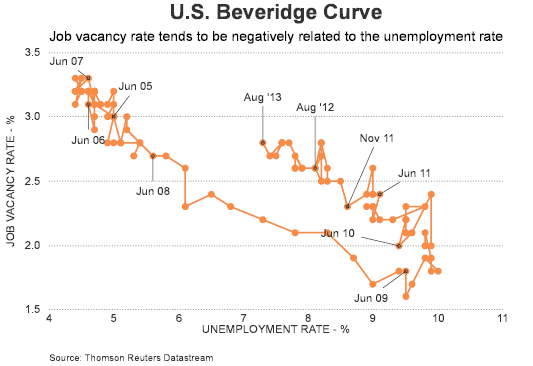
It has been nearly two years since I posted an article on structural unemployment, specifically, looking at the Beveridge Curve. As noted in that prior post, the Bureau of Labor Statistics notes the relationship between the unemployment rate and the vacancy rate, also known as the Beveridge Curve, named after the British economist William Henry Beveridge (1879-1963). The economy’s position on the downward sloping Beveridge Curve reflects the state of the business cycle. For example, a greater mismatch between available jobs and the unemployed in terms of skills or location would cause the curve to shift outward, up and toward the right (emphasis added). Certainly the unemployment rate shows improvement, yet the curve has maintained its outward and upward shift during this recovery.

From The Blog of HORAN Capital Advisors


Thursday, October 31, 2013

70% Health Care Cost Increase

I just had a conversation with an individual that has an individual family health insurance policy. His current policy comes due in February 2014 and he is evaluating his health care insurance options for next year. With his current plan, his total cost is $11,616 including deductible. According to his insurance contact, the Obamacare policy he qualifies for on the health care exchange through the state of Ohio that matches his current policy comes in at a total cost of $19,800. This represents a 70% increase in his cost for health insurance next year. The individual does not qualify for any subsidies so this will have a direct impact on funds his family has available for discretionary spending. The impact on the broader consumer economy as a result of these premium increases is likely not going to be positive.


Sunday, October 27, 2013

The Week Ahead Magazine: October 27, 2013

Investors seemed to have put events in Washington into the rear view mirror as fund flows have turned positive this past week. Below is the link to this week's magazine covering a few articles investors might enjoy in the coming week.


HORAN Celebrates 65 Year Anniversary

Last week HORAN held an open house and client appreciation event at our firm's headquarters to celebrate our 65th year of keeping promises made to our clients and staying committed to our value of corporate social responsibility. The firm has grown from one employee in 1948 to over 90 today. The foundation on which the firm was build remains in place today. This has allowed HORAN to prepare clients for their future and overcome the obstacles many individuals are faced with today. HORAN is also deeply committed to improving the quality of life in the communities where our employees live and work. As the firm's CEO, Terry Horan, often notes, “What matters most, each and every day, is helping our clients address two of life’s greatest challenges: obtaining access to quality, affordable health care and securing professional counsel to build wealth and transfer it on to future generations.” We thank our clients for allowing us to serve them.

More on our anniversary can be found by reading our recent press release.


Investor Letter: Multiple Expansion Contributing To Market Returns

Our most recent Investor Letter looks at the market's recent return and the positive influence of multiple expansion on the indexes' performance. In spite of issues surrounding the budget and debt ceiling in Washington, DC, the market seems to shrug off these headline events and continue its move higher. Our newsletter looks at these recent events and the fact similar ones will grab the headlines as 2014 begins.

From The Blog of HORAN Capital Advisors

The complete Investor Letter can be accessed at our website at this link: 3rd Quarter 2013 Investor Letter.


Sunday, October 20, 2013

The Week Ahead: October 20, 2013

The debt ceiling and budget stalemate was resolved in Washington, DC last week. If only a temporary resolution to the crisis, the market certainly cheered the short term agreement. This week's magazine includes some article links focusing on what might lie ahead for the markets.


Thursday, October 17, 2013

Housing Issues A Continuing Drag On Consumer Spending

A recent report by the Federal Reserve Bank of New York shows residential non performing loans (NPLs) at bank holding companies remain highly elevated. This is in contrast to the improvement seen in commercial NPLs have declined significantly.

From The Blog of HORAN Capital Advisors

From The Blog of HORAN Capital Advisors

At issue is the impact higher residential NPLs are having on the individual consumer. Economists indicate the wealth effect that results from rising stock and real estate prices has a positive impact on consumer spending. Mark Zandi of Moody's Analytics recently stated, "an added dollar of housing wealth might produce 8 cents in extra spending, and an extra dollar of stock wealth, 3 cents. The overall effect was about 5 cents per dollar of new wealth, Zandi says. Now, 2 or 2.5 cents 'seems more likely to me.'"

It appears the elevated level of residential NPLs may be showing up in the continually declining  rate of growth in personal consumption expenditures (PCE). The first chart below shows the year over year change in personal consumption expenditures and the second shows the same information, but using real PCE.

From The Blog of HORAN Capital Advisors

From The Blog of HORAN Capital Advisors

On top of a potentially struggling consumer sector that is not benefiting from the "wealth effect". The sticker shock associated with the health insurance premiums being realized on the health care exchanges is another headwind for growth in consumer spending. Since consumers account for 70% of GDP, the lack of wealth creation from real estate and fewer dollars to spend as a result of the increased cost of health care via the exchanges, it appears a slow growing economy is likely with us for the foreseeable future.


Sunday, October 13, 2013

The Week Ahead Magazine: October 13, 2013

Much of the focus in the coming week will most certainly be on events surrounding the debt ceiling debate and budget stalemate in Washington, DC. In that regard a number of the articles in this week's magazine focus on the Washington issues.


Saturday, October 12, 2013

Funding Entitlements With An Ever Increasing Government Debt Burden

In an attempt to add some perspective to the issues influencing the stalemate in Washington, DC, one overriding issues is the rate of growth of the federal government's debt; hence, the fast approaching debt limit. Driving the government's seemingly ever increasing debt level is entitlement spending. Charles Hugh Smith recently wrote an article that focused on the growth of entitlement spending in the U.S. titled, Have We Reached Peak Entitlements?. His article is a worthwhile read. The result of continued growth in this expenditure category is the growth in the government's debt level. The consequences of not gaining some control over this spending will likely be a lower quality of life for the younger generation.

To put this in perspective, they say a picture is worth a 1,000 words so the below charts provide a snapshot of the government's debt along with current government receipts and expenditures. The first chart shows the absolute dollar level of receipts and expenditures for the federal government. In spite of the much maligned, by some, sequestration cuts, the actual dollar level of expenditures has really not declined by much. On the other hand, government receipts now surpass the level where they stood prior to the financial crisis.

From The Blog of HORAN Capital Advisors

Some will say this is not a fair representation of how one should look at the revenue/expenditures of the government. A fairer way should compare this to the level of economic activity or GDP level. In that regard, the gap remains quite large.

From The Blog of HORAN Capital Advisors

The last two charts display the absolute debt levels for the government. This is the significant issue that has driven a wedge between the two parties in Congress and the debt limit being reached on October 17th. The first chart is the actual level of debt, while the second chart shows the debt as a percentage of GDP. Readers/voters should note the increasing rate of growth of the debt reflected by the increasing steepness of the curve's slope. Just as the law of compound interest favors long term savers, this same law will make it increasingly difficult to repay/reduce this debt as long as the can continues to be kicked down the road.

From The Blog of HORAN Capital Advisors

From The Blog of HORAN Capital Advisors

As Charles Smith's article shows, we may have reached peak entitlements. Maybe it isn't the fact the Affordable Care Act (ACA) isn't well intentioned. It is more the question of what is the best way to provide healthcare to the uninsured and how is this new entitlement funded. Is this a program better run by the government or the private sector? Smith's article shows the high hurdle facing continued growth in entitlements of which the ACA is another add on and yet to be reflected in the balance between the government's revenues and expenditures. In my view opponents of the ACA have not clearly drawn this connection. And proponents of the ACA have not clearly addressed the funding side of this new entitlement as well as existing ones.


Tuesday, October 08, 2013

Market Looking Oversold But What Is The Catalyst

Afters today's late market sell off, the S&P 500 Index is looking oversold based on a couple of technical measures.
  • The percentage of stocks trading above their 50 day moving average is now 38%. This measure got as low as 28% in the run up to the election in November of last year.
  • The percentage of stocks trading above their 150 day moving average reached 65% today. This measure reached 46% in November of last year.
One technical indicator we highlighted in our early September post, S&P 500 Index Less Overbought This September Versus Last September, was the Money Flow Index (MFI). The MFI works best at extreme levels and this indicator has reached near the same level as early September when it was indicating an oversold market.

From The Blog of HORAN Capital Advisors

From The Blog of HORAN Capital Advisors

Of course the wild card in determining the future direction of the market is the stalemate in Washington over the budget and more importantly the debt ceiling. The outcome on these two events will weigh heavily on the market's future direction though.


Monday, October 07, 2013

The Congressional Impact On Equity Prices

In a study by Michael F. Ferguson of the University of Cincinnati and H. Douglas Witte of The University of Missouri (Missouri State University) titled Congress and the Stock Market, they show a relationship between the return for the Dow Jones Industrial Average based on whether Congress is in or out of session. They call this the "Congressional Effect. They study notes,
"We find a strong link between Congressional activity and stock market returns that persists even after controlling for known daily return anomalies. Stock returns are lower and volatility is higher when Congress is in session. This “Congressional Effect” can be quite large—more than 90% of the capital gains over the life of the DJIA have come on days when Congress is out of session. The Effect varies systematically with the public's opinion of Congress: returns are lower and volatility higher when a relatively unpopular Congress is active. Public opinion appears to play a fundamental role in market prices. This is consistent with a mood-based explanation that sees Congress as ‘depressing’ the average investor. Alternatively, our results can also be reconciled with rational explanations that view Congressional activity as a proxy for regulatory uncertainty or rent-seeking behavior."
The below chart contained in the Ferguson and Witte study displays the return history of the Dow Jones Industrial Average going back to 1897,
From The Blog of HORAN Capital Advisors
"The 'Out-of-Session' strategy is the cumulative return to a strategy that invests $1 in the DJIA on days Congress is not in session and in cash (earning 1 basis point per day) when Congress is in session. Conversely, the 'In-Session' strategy invests in the market index on days Congress is in session and in cash on days Congress is out of session."
H/T: 361 Capital


Sunday, October 06, 2013

The Week Ahead Magazine: October 6, 2013

Third quarter earnings season begins this week and FactSet notes,

"For Q3 2013, 89 companies have issued negative EPS guidance while 19 companies have issued positive EPS guidance. If 89 is the final number of companies issuing negative EPS guidance for the quarter, it will mark the highest number of companies issuing negative EPS guidance since FactSet began tracking guidance data in 2006. The current record is 88, which was recorded in Q2 2013. If 19 is the final number of companies issuing positive EPS guidance, it will mark the lowest number of companies issuing positive EPS guidance for a quarter. The current record is 22, which was also recorded in Q2 2013."
This week's magazine contains links to articles with thoughts on upcoming earnings reports. Also, Washington continues to operate in a dysfunctional way and several articles contain commentary on the fast approaching debate on raising the debt ceiling.


Thursday, October 03, 2013

Government Shutdown: Time To Buy Or Sell Stocks?

With the government shutdown completing its third day, investors are certainly asking themselves whether they should reduce their equity exposure as this media fueled crisis drags on. We wrote a post several days ago, Prior Government Shutdowns And S&P 500 Performance, outlining the market's performance in the prior 17 government shutdowns. Several other firms have written commentary about the market's performance around prior shutdowns as well. The first is from the Chart of the Day charting service and they note the following along with a performance graph,
"Monday marked the beginning of the 18th government shutdown in US history. For some perspective, today's chart plots the average S&P 500 performance for the 20 trading days (approximately one calendar month) before and 60 trading days (approximately 3 calendar months) after a government shutdown began. As today's chart illustrates, the stock market has tended to struggle prior to and during the initial three days following a government shutdown. Following this, the stock market has (on average) trended higher over the ensuing three months. One explanation for this particular average pattern is that the market abhors uncertainty. So as the shutdown approaches, investors fear for the worst. However, after the shutdown begins and investors notice that the economy continues to function coupled with the fact that the shutdown may be short-lived ultimately encourages a stock market rally as investors worst fears are not realized. It should be noted that today's chart is an average performance chart and that following the last 17 shutdowns, the stock market traded up 60 trading days after a shutdown on 10 out of 17 occasions (i.e. 58.8%) with the average shutdown lasting 6.4 calendar days."
From The Blog of HORAN Capital Advisors

The other firm, Guggenheim Partners, prepared the below chart showing the performance of differing asset classes during the shutdown period and the 10-day period following the shutdown's end.

From The Blog of HORAN Capital Advisors

In large part the market's short term reaction to this event is more of an emotional one than fundamental one. However, if the crisis drags on for weeks, the government will bump up against the debt ceiling limit and further market disruption could be the fallout. From a positive standpoint though, the government is taking in sufficient tax revenue to continue paying the interest due on the outstanding debt. A debt default would only occur if a conscious decision is made by the executive branch to skip the interest payments due on the government's outstanding debt.

At the end of the day, the market does not like uncertainty and this shutdown is creating just that. However, not if, but when a resolution is finally agreed upon, the equity market will again trade on fundamentals. At the moment, company fundamentals and the economy have not been negatively impacted, but if the shutdown drags on into weeks like the shutdown in 1998, a differing story could unfold.


Tuesday, October 01, 2013

Non Dividend Payers Outperforming Payers Through September

As we noted in our post yesterday, Low Quality Equities Outperforming High Quality Equities, the lower quality companies in the S&P 500 Index are outperforming the higher quality ones. One characteristic of lower quality stocks is many of them do not pay a dividend. True to form, through the end of the third quarter, the non dividend paying stocks in the S&P 500 Index are outperforming the payers by a wide margin. The return comparison is detailed in the below table.

From The Blog of HORAN Capital Advisors


Monday, September 30, 2013

Low Quality Equities Outperforming High Quality Equities

One factor S&P Dow Jones indices uses in their stock classifications is an Earnings and Dividend Quality Ranking measurement. The basis for this measurement is to provide investors with a ranking that S&P evaluates based on a company's stability of earnings and dividend over time. The highest ranking is A and the lowest is D (a company in reorganization).

With this as background S&P has constructed indices based on these rankings. The S&P 500 High Quality Rankings Index consists of stocks with a ranking of A and better. The S&P 500 Low Quality Rankings Index consists of stocks with a ranking of B or lower. The high quality index has a larger weighting in sectors like consumer staples that tend to hold up better in a more defensive or "risk off" market. As the below table shows, this year, the low quality index has outperformed the high quality index by a wide margin.

From The Blog of HORAN Capital Advisors

This pattern of the "risk on" and more cyclical stocks outperforming has continued in the the second half of September, in spite of a down equity market.

From The Blog of HORAN Capital Advisors
Source: 361 Capital


Prior Government Shutdowns And S&P 500 Performance

Investors are beginning the last trading day of the third quarter knowing there is a high likelihood the government will experience its 18th shutdown since 1976. These shutdowns occur when Congress fails to pass a budget that would continue to fund government operations. The media would have one believe a shutdown is going to lead to a catastrophic market event. History does not guarantee the future outcome will be the same; however, the below table suggests a government shutdown is pretty much a non event as it pertains to the equity market. The median return for the S&P 500 Index during these shutdown periods is -.3% and one month later the S&P return median is .7%.

From The Blog of HORAN Capital Advisors
Source: Forbes

Certainly, the market action may be much different than detailed in the above table assuming the government does shutdown. However, investors should continue to focus on company fundamentals and technical market action and attempt to minimize the noise associated with the shutdown debate.


Sunday, September 29, 2013

The Week Ahead Magazine: September 29, 2013

This week's magazine contains links to articles that look at factors that could impact the market in the fourth quarter. Additionally, several of the article links highlight the strength of corporate balance sheets as well as the resurgence in manufacturing activity in the U.S.


Wednesday, September 25, 2013

Is The Market Simply Enjoying A Refreshing Pause?

Much seems to be made of the S&P 500 Index's five day losing streak. Listening to the daily chatter on the daytime business channels, one would think the market has entered some type of major correction. The S&P 500 Index closed at a high of 1,725 on 9/18 and closed today at 1,692. This represents a decline of only 1.9% from the 9/18 high. On a year to date basis the S&P is still up over 20%

From The Blog of HORAN Capital Advisors

The below chart details the "daily" price movement of the S&P 500 Index over the course of the last year. Since the end of 2012 the market remains firmly in an uptrend channel while continuing to make higher lows and higher highs.

From The Blog of HORAN Capital Advisors

The next chart details the S&P 500 Index price performance on a "weekly" basis. Again, the index price movement remains in an uptrend channel on this weekly time frame. The last red candle is showing the market's return for the current week. Prior to this week, the market has generated positive returns in each full week of September. There are a few negative technical signals, such as the negative MACD cross over and negative Money Flow Index on the daily chart. On the other hand the Money Flow Index has turned positive on the weekly view chart below.

From The Blog of HORAN Capital Advisors

Of more concern is the anticipated earnings growth for companies in the balance of the year. As noted by Thomson Reuters AlphaNow, analyst had expected a weaker earnings picture in the first half of 2013 with earnings growth strengthening in the second half of the year. In a report released earlier this week, Thomson notes,
"As the third-quarter earnings reporting season approaches, growth estimates have declined to a more modest 4.8%, down from the 8.5% projection from the beginning of the quarter... Looking ahead to the fourth quarter, the current estimate is for 11.1% earnings growth, which appears optimistic, given projections for only 1.3% revenue growth."
Of particular concern is the weak revenue growth estimate. At this point in the economic cycle, revenue growth would be expected to be stronger.

The budget and debt ceiling issues in Washington could certainly have a short term impact on the market; however, these type of political issues typically do not have a long term impact on the market. The implementation of the Affordable Care Act, on the other hand, could have an outsized impact on the consumer. From recently released data on exchange premiums, it does appear middle income tax payers, including younger workers, could be paying more for their health insurance. This alone would take a bite out of these consumers' discretionary spending and consumers account for 70% of economic growth.


Monday, September 23, 2013

Buybacks And Dividends Continued Higher In Second Quarter

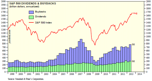
Last week S&P Dow Jones Indices reported buyback and dividend results for the S&P 500 Index for the second quarter. For the second quarter buybacks increased 18.1% on a quarter over quarter basis and increased 5.6% year over year. Buybacks plus dividends for the second quarter totaled $194.72 billion. This level remains below the record set in the third quarter of 2007 when the combined buyback and dividend level reached $232.79 billion.

From The Blog of HORAN Capital Advisors

The one company with a notable buyback was Apple (AAPL). According to Howard Silverblatt, Senior Index Analyst at S&P Dow Jones Indices, "Apple spent $16 billion on buybacks in the second quarter, accounting for 13.5% of all buybacks in the period and setting a new index record for quarterly buybacks by surpassing International Businesses Machines' Q2 2007 expenditure of $15.7 billion." A couple of additional buyback facts in the second quarter report were:
  • "Excluding Apple, the 18.1% Q2 increase in buybacks becomes 2.0%. If we adjust for the average stock price in Q2 being 6.3% higher than in Q1, the takeaway is that less shares were actually repurchased in Q2 than Q1, even as the headline, legitimately, reads 18%"
  • "The Information Technology sector, with the help of Apple, easily maintained its dominance of buybacks, accounting for 31.5% of all expenditures, up from 19.6% in the first quarter. The Industrials sector increased its expenditures and percentage of buybacks, accounting for 12.2% of expenditures, up from 9.0% in the first quarter."
  • "Of the 309 which reported buybacks, 252 companies paid a cash dividend, with their 12 month buybacks 42% higher than dividends."

Source: S&P Dow Jones Indices


Sunday, September 22, 2013

Ray Dalio On How The Economy Works

Ray Dalio runs the world's largest hedge fund at Bridgewater and Associates. According to the company's website, in both 2012 and 2013 Bridgewater was recognized for having earned its clients more than any other hedge fund in the history of the industry. Ray recently created a video, How The Economic Machine Works. The video graphic seems simplistic, however, the three tenants Ray focuses on have served him well over time as his net worth is estimated to be $13 billion. Ray's video cites three main forces that drive the economy: Productivity, the Short Term Credit Cycle and the Long Term Credit Cycle. The thirty minute video is worth taking the time to watch especially in light of the current global deleveraging cycle.


H/T: Business Insider


The Week Ahead Magazine: September 22, 2013

The market's performance so far in September has not delivered the sell off many pundits believed would occur when the month began. This week is the last full week of the month so investors will see if end of month window dressing trades reduce the gains achieved to date. Below is our magazine for the upcoming week. The magazine content contains links to some articles we have read and we believe our clients and investors may find of interest.


Saturday, September 21, 2013

Is It QE, Dividends Or Buybacks That Determine Market's Future Direction?

A couple of charts circulating around the web this past week no doubt focused on the Fed's decision to continue QE unabated. Most economist and strategist believed the Fed would begin to taper even if the taper amount was a small amount. With the Fed's "no taper" decision, the S&P 500 Index shot higher immediately as noted in the below chart. The S&P was trading at 1,702 prior to the announcement and ultimately closed on the day at 1,725 or 1.35% higher.

From The Blog of HORAN Capital Advisors
When the market achieves a new 52-week high on Fed announcement days, the below chart, highlighted by Andrew Thrasher, shows graphically the market's subsequent direction. In short, a sell off is not uncommon.

From The Blog of HORAN Capital Advisors

The immediate positive reaction to the Fed announcement most certainly has to do with the market's addiction to QE. Ed Yardeni notes the high correlation of the S&P 500 to Quantitative Easing. Yet he does point to several other influences that may be having a positive impact on the market, i.e., dividends and buybacks.
From The Blog of HORAN Capital Advisors

Corporations have certainly enhanced their dividend and buyback policies. In large part this is not uncommon as the economy improves and corporations have excess cash to return to shareholders. At HORAN we have noted in a number of prior posts that we prefer an increasing dividend versus buybacks. Dividends are a longer term commitment on a company's part, where as a buyback can be reduced or go unfulfilled at any time by the company. Yardeni notes in the below chart these buybacks appear to be having a positive impact on the market as well.

From The Blog of HORAN Capital Advisors

A concern we have with this elevated buyback activity is the fact companies have a history of buying back their stock at highs and not lows. In our earlier post, Stock Buybacks Do Not Benefit Future Stock Performance, we highlighted research from Thomson Reuters where the report noted, "...The negative correlation between repurchases and forward returns shows that most buybacks did not pay off within the year after purchase."

As the second chart above shows, the market has a tendency to move higher subsequent to these pullbacks. For many investors market timing is a difficult endeavor. A key point is for investors to evaluate their holdings to ensure their asset allocation is one they are comfortable with in the event the market does sell off.


Sunday, September 15, 2013

The Week Ahead Magazine: September 15, 2013

Below is our magazine for the upcoming week. The magazine content contains links to some articles we have reviewed and we believe our clients and investors may find of interest.