Saturday, July 30, 2016

Income Oriented Equities Lag In July

In a few recent posts I have discussed the elevated valuation of dividend growth equities. It would appear bond investors have gravitated to the anticipated safety of equities that generate dividend income greater than can be found in the low rate bond market. The extended valuation of these income equities/sectors may result in investors being surprised in the event the market does encounter a pullback. In fact, August and September tend to be the the poorer performing months for stocks.

Just as the "sell in May' mantra has yet to play out this year, maybe the much anticipated August/September weakness becomes more discussion than reality. And given all the concern about this late summer weakness, in July, investors seemed to rotate out of the so-called safe income stocks and into the higher beta, more cyclical equities. As the below chart shows, the income oriented equity market segments underperformed the broader S&P 500 Index and the PowerShares S&P 500 High Beta ETF (SPHB).


From a sector perspective, the more defensive sectors in the S&P 500 Index lagged the more cyclically oriented ones as well. Energy has its own issues and the other bottom three performing sectors in July were Consume Staples, Utilities and Telecommunications. On a year to date basis the performance of these three sectors remains strong; however, Technology, Materials, Health Care and Industrials generated strong returns in the month of July. An important factor for continued strong performance in the cyclically oriented sectors is improved earnings.

 
In Thomson Reuters This Week in Earnings report, they note,
"312 companies in the S&P 500 Index have reported earnings for Q2 2016. Of these companies, 72% reported earnings above analyst expectations, 12% reported earnings in line with analyst expectations and 16% reported earnings below analyst expectations. In a typical quarter (since 1994), 63% of companies beat estimates, 16% match and 21% miss estimates. Over the past four quarters, 70% of companies beat the estimates, 9% matched and 21% missed estimates. In aggregate, companies are reporting earnings that are 4% above estimates, which is above the 3% long term (since 1994) average surprise factor, and in line with the 4% surprise factor recorded over the past four quarters."
Absent the energy sector, overall earnings appear to be on an improving trend. With respect to the energy sector, year over year comparisons will become easier starting with the third quarter.

Given the tight range the S&P 500 Index has traded in over the last two weeks, a break to the upside or downside will certainly occur. Historically, these tight trading ranges tend to resolve themselves to the upside. Having noted this, a little consolidation of the market gains since February would be healthy and not a surprise given the upcoming weak seasonal market months. And finally, investors chasing yield in stocks need to be cognizant of the rich valuations of these stocks and recent rotation may indicate some investors are figuring this out.


Thursday, July 28, 2016

Sentiment: Bullish Institutions Versus Bearish Individuals

This week's NAAIM Exposure Index was reported at 101, only the fifth time the exposure index has been reported above 100 since the index's inception on July 5, 2006. The NAAIM Exposure Index consists of a weekly survey of NAAIM member firms who are active money managers and provide a number which represents their overall equity exposure at the market close on a specific day of the week, currently Wednesday. Responses are tallied and averaged to provide the average long (or short) position or all NAAIM managers as a group.


Conversely, today individual investor bullish sentiment, reported by the American Association of Individual Investors, fell four percentage points to 31.3%. This is below the long term average of the bullish sentiment reading of 38.5%.


The individual investor sentiment measure is considered a contrarian one as individual investors tend to be the most bullish near market tops and the least bullish near market bottoms. So, if this is the case, and institutions tend to be on the bullish or right side of the allocation debate, are these two readings indicating the market has more room to move to the upside?

Below is a table comparing the prior NAAIM readings above 100, the AAII individual bullish sentiment reading and the subsequent one year return for the S&P 500 Index. Although the number of NAAIM readings is small, the subsequent 12-month return for the S&P 500 Index has averaged a low double digit positive return when NAAIM readings were above 100.


Lastly, the S&P 500 Index has traded within a very tight 1% trading range for the last eleven trading days. From a positive standpoint, markets can correct in price (a steep decline), or over time. This sideways trading range may be one where a correction is occurring over time. The obvious questions is whether the market breaks to the upside or to the downside.


Additional commentary, and an interesting one, highlighted by Ryan Detrick, CMT of LPL Financial, on the market level and whether or not it is in a bubble can be read in an research report, Is the S&P 500 in a Bubble?.


Friday, July 22, 2016

Weak Investor Sentiment Yet New Equity Market Highs

Today the S&P 500 Index closed at another all time record high. This higher advance in the market is becoming a regular occurrence as this is the fourth consecutive week for the market to close higher on a weekly basis. From the market's intraday low on February 11th, the S&P has advanced over 20% on a price only basis.


The magnitude and trajectory of the move higher is seen more clearly on the daily chart below.


Somewhat interesting is the fact individual investor bullish sentiment as reported by the American Association of Individual Investors is far from indicating excess optimism. This week's bullishness reading of 35.43% was a decline from the prior week's reading of 36.87%.  The long term average bullishness level is 38.5% and bullish sentiment has not exceeded this level since early November of last year.


So given the strength of this move in the market since February, and reviewing some of the technical market indicators, a pullback would not be surprising. However, in a June 2nd article I posted, Is It Right To Be Bullish Near A Record Market High?, I noted:
"Being bullish after a double digit market decline seems a lot easier than being bullish near market tops. Knowing the market does not move up or down in a straight line, are there factors we see that would support higher equity prices? In the intermediate and long run, we believe fundamental company and economic factors are key drivers of stock price returns."
Our view that company and economic data will continue to remain favorable is unchanged from early June.

Lastly, Ryan Detrick, a strategist at LPL Financial, provided a link to one of his firm's recent research reports, Is an Overbought Condition Necessarily Bad for the Stock Market?. This research article is a worthwhile read for investors. The conclusion might surprise some readers. In the end, the market will not move higher in a straight line; however, this longer term trend seems to be a friendly one for investors at the moment.


Wednesday, July 20, 2016

Summer 2016 Investor Letter: Searching For Yield

In our just published Summer 2016 Investor Letter, we explore the investor's pursuit of income generating investments. In our view this has led to extended valuations in some of the income yield segments of the equity market, for example, utility stocks. If interest rates do remain lower for longer then the extended valuations in the income yielding sectors could remain elevated. The Investor Letter contains broader commentary on this topic.

Our last newsletter mentioned the potential issues surrounding the U.K.'s potential withdraw from the European Union (Brexit). Just a few weeks ago the voters in the U.K. spoke at the ballot box and voted to leave the EU. We wrote separate commentary on Brexit in the days following the vote; however, we include additional highlights in the Summer 2016 Investor Letter on the Brexit topic and more.


For additional insight into our views for the market and economy, see our Investor Letter accessible at the below link.


A Look At Projected Sales And Earnings Growth

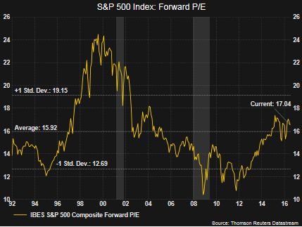
In spite of the S&P 500 Index trading sideways for most of the last 18 months until very recently, the advance from the financial crisis low has been strong. A part of the return generated from equities has been the fact the forward P/E multiple has expanded from low double digits to just over 17 times earnings.


In a low interest rate environment stocks tend to trade at higher P/E multiples. The current forward multiple on the S&P 500 Index is certainly not low; however, the current forward P/E level is not giving off a signal of overvaluation either. Importantly, going forward, we believe growth in stocks will need to be driven by growth in earnings since a large part of the return from multiple expansion is behind us.

Not only is earnings growth obviously important, company revenues need to see growth as well. As the below chart shows, expectations are pointing to stronger earnings growth as one looks one year into the future and top line sales are expected to grow as well. We believe the equity market's strong recovery from the February low earlier this year is partly due to the improved outlook for corporate earnings and revenue growth. The equity markets seem to be anticipating this better environment.


In a post written a few days ago, Value Stock Outperformance May Indicate Stronger Economy Ahead, I highlighted the fact analysts are projecting Q2 2017 (one year forward) earnings growth of 15.3% for the S&P 500. Equally important, the top line is anticipated to return to growth as well.

Lastly, the market recently broke out of its 18-month trading range on a near parabolic move to the upside. It would be nice, and expected, to see the market consolidate some of these gains, but positively, selling volume does not seem to be taking hold.


Sunday, July 17, 2016

Value Stock Outperformance May Indicate Stronger Economy Ahead

Over the course of the past few years several times I have touched on the significance of the value versus growth stock performance cycle. A couple of the earlier articles contain useful information for investors that provides insight into the economic cycle being telegraphed by the value/growth cycle. In short, in a slowing economic environment, growth tends to outperform value and the opposite tends to occur when the economy is strengthening. Value has been outperforming growth this year.


In the March 2014 article, Why It Matters That Value Stocks Are Outperforming Growth Stocks, value's outperformance peaked around April of that year and growth went on a nearly two year run of beating value. The backdrop for this reversal from value to growth is provided in the just noted article, but economic data began to rollover. In an article early this year, Is The Value Style Outperformance Sustainable?, detail is provided on the trend reversal in 2014 from value back to growth as well as value's strength now.

Fast forward to today and the iShare equivalent of the S&P 500 Value Index is outperforming the S&P 500 Growth Index, 9.21% versus 4.79%, respectively. A significant factor contributing to value's strength is the investor focus on income producing equities in a world where bond rates are low, near zero and in some cases below zero. The below graphic compares the sector weights of the S&P 500 Value and Growth indices. The two top performing sectors this year are telecoms, up 24% and utilities, up 22%. Combining these two sectors, telecoms plus utilities, they have a weighting of 11.2% in the value index and only 1.3% in the growth index. Additionally, in each of the six top performing sectors, value's sector weighting is greater than in growth's.


Positively, the next three best performing sectors, energy, materials and industrials, tend to be economically sensitive ones. And, if one believes the equity market serves a bit like a weighing machine, the better performance in these three sectors may just be anticipating a better economic environment ahead.

Friday's industrial production report for June of .6% was better than the high end consensus expectation. The report contained many positives signalling an improving manufacturing sector, retail sales exceeded expectations (.6% vs .1% consensus) and jobless claims of 254,000 were lower than the 265,000 consensus.


With earnings projected to improve as one looks one year forward and economic activity just maybe swinging more positive, there remains the possibility that value's outperformance might last more than just a few quarters this time around. The one concern is the overvaluation of some of the income yielding sectors like utilities; however, investors may still find attractive values in the the more economically sensitive sectors.


Saturday, July 16, 2016

Market Breaks From Trading Range While Sentiment Measures Remain Mixed

The S&P 500 Index has recovered all that was lost in the two day selloff following the Brexit vote. Since the Brexit low, the S&P 500 Index is up over 8.5% and this has taken the index out of its 18+ month trading range. As the below chart shows, the trading range goes back to the end of 2014 and up until this week, the only breakout from the range had been to the downside.


Saturday, July 09, 2016

Dividend Payers And Dividend Focused ETFs Post Strong Returns YTD

A few prior posts have provided detail and potential consequences facing dividend focused equities given their extended valuations. Of course, in a low (and going lower?) interest rate world it seems the simple approach an investor can pursue is just buying a stock that has a higher yield than the 10-year U.S. Treasury. S&P Dow Jones Indices recently reported on the average performance of the dividend and non dividend paying stocks in the S&P 500 Index. Maybe no surprise, but the payers are swamping the non payers this year and over the last twelve months as of June 30, 2016. As the below table details, the payers have outperformed the non payers by 728 basis points year to date and by 1,142 basis points over the prior twelve months.


Also, the strong performance of the dividend payers is evident in several of the dividend focused ETFs. Below is a chart of the SPDR S&P Dividend ETF (SDY) and the iShares Select Dividend ETF (DVY) plotted with the S&P 500 Index.
  • SDY seeks to replicate the performance of the S&P High Yield Dividend Aristocrats. SDY's projected income yield is 2.3%. Notable sector weights in SDY are Utilities (31%) and Financials 14%.
  • DVY's performance is focused on replicating the Dow Jones Select Dividend Index and has a projected yield of 3.0%. Notable sector weights for DVY are Financials at 24% and Utilities at 15%.
Both of these ETFs are up by mid teen percentages this year through Friday's close as can be seen in the below chart.


A Look At The PEG Ratio: Earnings Growth Versus Valuation

In an article I wrote about a week ago, I reviewed the current P/E (price earnings ratio) of the sectors that comprise the S&P 500 Index. The article included the below chart which compared the current sector P/Es to the respective sector's average P/E and minimum P/E over the past ten years. the article noted some of the income or yield producing sectors were trading at elevated valuations.


Simply because the P/E for a sector is high, and the same applies to individual stocks, this does not necessarily mean the sector or stock is overvalued. Importantly, the P/E should be compared to the earnings growth rate for each sector or company. By dividing the P/E by the earnings growth rate, one obtains the PEG ratio (PE to growth rate.) A good discussion on this is contained in an article on the CFA Institute's Inside Investing blog, Is It Overvalued? Look at the PEG Ratio. When evaluating the PEG, a PEG of 1.0 is an indication a sector or company is fairly valued. If the PEG is less than 1.0, this is an indication the sector or company may be undervalued. Conversely, PEGs greater than 1.0 are indications of overvaluation relative to fair value.

As can be seen in the above chart, the energy sector is trading at a P/E of greater than 40, but what is the PEG? Below is a chart comparing the sector P/Es to each sector's PEG ratio. The growth rate used in the denominator is Thomson Reuters' I/B/E/S earnings growth rate for Q2 2017, or one year forward.


Below is the table detailing the earnings growth rates for each sector as reported in Thomson Reuters' 7/8/2016 This Week In Earnings report.


Clearly, the PEG for the utility sector shows investors that are buying utility stocks are paying up for the single digit earnings growth. As discussed in last week's post, one reason this has occurred is investors are purchasing dividend yielding investments in part because they are unable to get that yield in bonds. This reach for yield appears to have pushed some of these yielding sectors and stocks to elevated valuation levels. The first chart in this article does show the forward P/E for utilities is higher than the 10-year average P/E for the sector as well.

The other factor to note is some stocks/sectors trade at higher PEs. Looking at the telecommunications sector for example, the current forward P/E is lower than the sectors 10-year average P/E. As a result, comparing each individual sector's P/E and earnings growth rate with its respective historical data is also important.

And finally, P/E and earnings growth rates are only a couple of factors investors should use in evaluating equity investment opportunities; however, the PEG ratio can be useful as a starting point. In the end, just because a company appears to be great, does not mean it is a great investment at all points in time. Recently, investors have pursued income yielding investments for their safety characteristics. However, many of these income investments are priced, as we call 'for perfection'. In other words, the slightest bit of negative news for some of these yield plays could result in strong price declines.


Sunday, July 03, 2016

An In Depth Look At The Extended Valuation Of Defensive And Income Yielding Equity Sectors

Early last week I highlighted the extended valuation of the utility sector in part due to investor demand for income yielding stocks. Not only are the income sectors attracting investor dollars, defensive sectors like consumer staples are as well. A result of this investor demand for defensive and income producing equities is these sectors have produced market beating returns so far in 2016. As the below sector return chart shows, the defensive consumer staples sector and the income yielding sectors like utilities and telecommunications have generated strong returns this year.


However, the strong return in these sectors has pushed the sector valuation beyond the average longer term valuation for each respective sector itself. The better performing sectors, utilities and staples are some of the most extended compared to the other sectors. Energy sector valuations are at extremes, largely due to earnings headwinds resulting from lower oil prices.


Saturday, July 02, 2016

The Pursuit Of Yield Continues To Benefit Return For 2016 Dogs Of The Dow

Investors' continued pursuit of income in this low bond interest rate environment has led them to higher yielding stocks. Partial evidence of this can be found in the total return of the Dogs of the Dow basket of stocks this year. As noted in earlier posts, the Dogs of the Dow strategy is one where investors select the ten stocks that have the highest dividend yield from the stocks in the Dow Jones Industrial Index (DJIA) after the close of business on the last trading day of the year. Once the ten stocks are determined, an investor invests an equal dollar amount in each of the ten stocks and holds them for the entire next year.

The average YTD total return through July 1, 2016 of the ten 2016 Dogs of the Dow equals 15.4%. This compares to the Dow SPDR and S&P 500 SPDR returns of 4.4% and 4.0%, respectively. The top performing Dow Dog this year is Verizon (VZ), returning 24.5%. Of course, it was also the highest yielding Dow Dog at the beginning of 2016. Below is a table containing various metrics on the 2016 Dogs of the Dow.


A full list of the Dow stocks with return and yield data can be found at the Dogs of the Dow website.