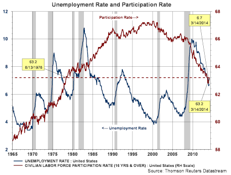
If there is one seemingly boring economic statistic that is now creating a lot of controversy it is the continuing decline in the labor force participation rate. Much of the debate around this statistic is important because it provides insight into the health of the economy and more importantly the labor market. As can be seen in the below chart, the participation rate (maroon line) is now at a level reached in 1978.
I surmise if we could go back to 2007 and rewrite history so the financial crisis and resulting recession never occurred as well as no quantitative easing programs, the labor force participation rate would not be on many economists and non-economists radar. However, the angst this statistic can cause spiked last week when the Wall Street Journal reported on Friday's Employment Situation report,
U.S. Reaches a Milestone on Lost Jobs. One factor in the report that stimulated some interest was the below chart that is included in the WSJ article.
In a response to the article, Bill McBride author of the well written Calculated Risk website, wrote an article indicating the Journal needed to post a correction to its article. The main point made in the Calculated Risk article is the Wall Street Journal's above graph ignores the demographic impact on the participation rate. Bill's article,
WSJ Employment Graph ignores Demographics, Needs Correction, provides his viewpoint on the Journal's take on the payroll report.
In an article written in Investor's Business Daily,
Hold The Champagne On That Job Report, this article notes the labor force has grown by 12.2 million participants. The IBD article uses the current labor force participation rate and notes, "That means just to get back to where we were when the recession started — based on a labor force participation rate of 63.2% — we have to create at least 8 million more private-sector jobs. Even if the workforce didn't grow at all, it would take us more than 3 1/2 years."
"Labor force participation in the United States has been a controversial subject in current macroeconomic discussions...The participation rate - a measure of the number of people actively involved in labor markets - has generally been a secondary concern in macroeconomics. However, with recent sharp declines following the financial crisis and recession of 2007-2009, it has suddenly become a salient topic, and one that gets discussed even in non-economic settings."
"At its broadest level, the debate about the labor force participation rate is a debate about the nature of the U.S. economy over the 4½ years since the end of the recession in the summer of 2009. Should we characterize the economy as substantially back to normal following the very severe recession? Or, has little progress really been made, so that the economy remains far from its potential?"
"There are clear lines of argument on both sides, sometimes blurring political boundaries. Some suggest that the extraordinary policy response since the end of the recession has been largely ineffectual, perhaps citing the very flat employment-to-population ratio since 2009, and that their own suggested policy responses would have produced better outcomes...." (emphasis added)
In the Bullard paper, he notes the steady rise in the participation rate from 1980 to 2000. Subsequent to 2000 the participation rate has mostly been on a decline. He does believe demographics has played a roll in the rise and now decline of the participation rate. From the late 1940s to mid 1960s the participation rate was fairly stable at 59.1%. Additionally, economic activity was pretty good during this period of a lower participation level. In the Bullard paper he notes several studies projecting future participation rate levels. In one such study, the participation rate is expected to decline steadily, or by 15 basis points, to the year 2022. In this study, 70% of the decline is attributable to demographic factors like baby boomer retirements. Several other studies are cited in the Bullard paper, but he is clear that further work needs to be done on this topic.
Lastly, if the participation rate decline is due to demographic factors, one might expect to see changes in the number of individuals receiving social security benefits that are directly attributable to retirements. The below chart shows the annual change in individuals receiving benefit payments from social security strictly as a result of retirement. For the four years from 2009 to 2012, a net of over four million individuals joined the social security system due to retirement. The below chart is certainly on a trend that would forecast net new beneficiaries for social security in excess of one million individuals annually.
Certainly, more work needs to be done in the area of participation. I believe it is fairly clear though that demographic effects are having a large impact in the declining participation rate itself. However, as the IBD article referenced above notes, the labor force has grown by 12.2 million individuals since the recession began. Maybe the current 63.2% participation rate is not the appropriate long run percentage, maybe it is several percentage points lower, but the economy is still not operating at full employment. The Fed is obviously looking at the unemployment rate, which continues to slowly improve, and they may be placing less weight on the participation rate.


