Today the
St. Louis Fed tweeted several charts that provide a snapshot of employment in the U.S. As background the St. Louis Fed provides a database
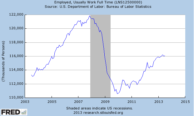
called FRED that contains a comprehensive archive of economic and financial information. Below are three of the charts highlighted by the St. Louis Fed this afternoon. I believe they all speak for themselves.
- Chart shows the labor force participation rate (employed + unemployed but looking for a job) since 1960.
- The trend in the number of people who usually work full time.
- The trend in the number of people who usually work part time.


No comments :
Post a Comment