Saturday, October 24, 2015

S&P 500 Death Cross Update

In early September I wrote a post that examined prior instances where the S&P 500 Index moving averages triggered the death cross signal. In the article I concluded the death cross generally has triggered near market bottoms versus signalling further market weakness. The death cross is where the 50 day moving average crosses the 200 day moving average from above.

The most recent death cross was triggered on August 27th and as the below chart shows, this was only two days after the s&p 500 Index bottomed. Subsequent to the death cross, the S&P 500 index is up 4.4% and appears to be replaying those "V-shaped" recoveries investors are becoming accustomed to of late. In hindsight, had investors simply bought stocks when the market was down over 10%, they obviously would have enjoyed a more significant bounce off the bottom. The significance of the double digit decline in this cycle is the fact the market had not experienced one for nearly four years until this August.

From The Blog of HORAN Capital Advisors

For investors then, some technical indicators are more predictive of future stock or index movements than others. In the case of the Death Cross, it is an interesting conversation topic; however, it appears not to be a reliable sell indicator and in fact may be a signal to buy.


Dogs Of The Dow Slightly Underperform Year To Date

The Dogs of the Dow theory suggests investors select the ten stocks that have the highest dividend yield from the stocks in the Dow Jones Industrial Index (DJIA) after the close of business on the last trading day of the year. Once the ten stocks are determined, an investor invests an equal dollar amount in each of the ten stocks and holds them for the entire next year.

With the first 10-months of the year nearly behind us, the Dow Dogs for 2015 are trailing both the Dow Jones Industrial Index and the S&P 500 Index on a price basis. The below table shows the performance of this year's Dow Dogs compared to the DJIA. For reference, the S&P 500 Index is up .79% through the market's close on Friday. The weak links in the Dow Dog strategy this year are the energy stocks, ExxonMobil  (XOM) down 10.2% and Chevron (CVX) down 18.7%. The industrial stock Caterpillar (CAT) has also contributed to the underperformance as the stocks is down 21.6% YTD.

From The Blog of HORAN Capital Advisors


Thursday, October 22, 2015

Expected Consumer Holiday Spending Highest Since 2007

A recent survey by Gallup suggests consumers expect to spend more this holiday and the highest since 2007. The Gallup survey notes:
  • the majority of Americans routinely say they will spend about the same as they did the previous year, the 20% saying they will spend less is down from 24% in October 2014, and is the lowest Gallup has recorded for any October since 2007.
From The Blog of HORAN Capital Advisors
  • a third of U.S. adults plan to spend $1,000 or more on gifts and another quarter say they will spend between $500 and $999, while about a third will spend between $100 and $499. Another 3% plan to spend less than $100, while 8% say they will not spend anything.
From The Blog of HORAN Capital Advisors


Tuesday, October 20, 2015

Crude Oil Inventories Continue To Rise

At mid-year of 2014 West Texas Intermediate (WTI) crude oil prices were trading over $100 per barrel. Just over a year later, WTI is now priced at just under $50 per barrel. This steep fall in crude prices has confounded the market from the standpoint of the magnitude of the price decline. Is the price decline simply a reaction to elevated supply due to the growth of fracking or has worldwide oil demand fallen as a result slowing global growth? We briefly address this issue in our Fall Investor Letter, but following is a closer look at oil supply and the performance of energy related investments.

An important data point will be the release of the weekly Petroleum Status Report by the Energy Information Administration (EIA) on Wednesday's at 10:30 am. Last week's EIA report noted "U.S. commercial crude oil inventories (excluding those in the Strategic Petroleum Reserve) increased by 7.6 million barrels from the previous week. At 468.6 million barrels, U.S. crude oil inventories remain near levels not seen for this time of year in at least the last 80 years (emphasis added.)

The first two charts below compare the performance of the SPDR Energy Sector ETF (XLE) to the percentage change in the price of WTI. As the first chart shows, the SPDR Energy Sector Fund ETF held up better as WTI's price began to fall beginning in 2014. One question for investors is whether the relative outperformance of XLE is justified or might it resumes its decline in order to catch up to the fall in WTI's price. The second chart compares the same two assets but on a shorter six month time frame. In this chart both XLE and WTI are once again trading in sync with one another.

From The Blog of HORAN Capital Advisors

From The Blog of HORAN Capital Advisors

At HORAN we do believe the issues impacting oil are more supply related, yet acknowledging the continued "bump along the bottom" economic growth rate around the world. Iran indicates it will increase supply at any cost and Saudi Arabia continues with the desire not to reduce production levels. The green line in the below chart shows the rig count in Saudi Arabia and the chart clearly shows they have not reduced rig levels unlike in the U.S. and globally.

From The Blog of HORAN Capital Advisors

Finally turning to supply, the green line in the below chart shows the unabated oil inventory growth in the U.S. since late 2014. The currently high inventory levels seem not suggestive of an oil market where crude prices are likely to move higher in the near term. And this downward pressure on oil prices will likely be a continued headwind for energy related investments.

From The Blog of HORAN Capital Advisors


Investor Letter Fall 2015: The Third Quarter Correction

In our recently published Fall 2015 Investor Letter we discuss the long awaited third quarter market correction and issues issues facing companies in the fourth quarter and the first half of 2016. Prior to the market decline that began in May, the S&P 500 Index climbed higher for nearly four years without incurring a greater than 10% correction; however, based on current price to earnings multiples, U.S. large company stocks are trading at average valuation levels compared to historical data.

From The Blog of HORAN Capital Advisors

U.S. company earnings are expected to decline 4.8% in the third quarter compared to the third quarter of 2014. Excluding the greater than expected 60% year-over-year decline in energy sector earnings, the balance of companies are expected to report an increase in earnings of about 2%. A decline in earnings is generally associated with the onset of recessions; however, as noted in the newsletter, an earnings recession does not always precede economic recessions. U.S. company earnings reports are facing the headwinds from a stronger U.S. Dollar while energy and materials company earnings are being pressured by low oil prices. The newsletter notes this earnings weakness is expected to be transitory with growth resuming in the first half of 2016 when year over year earnings comparisons to prior quarters become easier. Based on current price to earnings multiples, U.S. large company stocks are trading at average valuation levels compared to historical data. Additionally, it seems reasonable to believe recent earnings weakness is temporary and concentrated in the commodity and energy sectors.

While worldwide growth has slowed and the risk of a global recession is heightened, we believe a U.S. recession is unlikely at this time; however, investors should be prepared for a higher level of market volatility in this environment. While short-term volatility can rattle investor confidence, it is important to maintain a view of the horizon and the opportunities and rewards of longer term investing.

For additional insight into our views for the market and economy, one can read our Investor Letter accessible at the below link.

From The Blog of HORAN Capital Advisors


Tuesday, October 06, 2015

Dollar Strength Continuing Headwind For Emerging Market Equities

Since mid 2011 emerging market equities began to underperform the U.S. equity market (S&P 500 Index). Earlier this year we noted in a post, Emerging Markets Not Out Of The Woods Yet, the headwind a stronger U.S. Dollar can have on emerging market equity performance. The updated chart below continues to show the accelerated strengthening of the Dollar (orange line) and the underperformance of the MSCI Emerging Markets Index relative to the S&P 500 Index.

From The Blog of HORAN Capital Advisors

The U.S. Dollar tends to move in an average cycle of about seven to eight years and this cycle is about four years old. A number of factors can contribute to a stronger Dollar. One factor is a higher interest rate trend in the U.S. and the Fed's desire to raise rates continues to place an upward bias on the Dollar. 

Investors seem to be taking note of the headwind facing the emerging markets as ETF fund outflows have accelerated. Today, in a Bloomberg report, it was noted,
  • Outflows from U.S. exchange-traded funds that invest in emerging markets more than doubled last week, with redemptions exceeding $12 billion in the third quarter.
  • Withdrawals from emerging-market ETFs that invest across developing nations as well as those that target specific countries totaled $566.1 million compared with outflows of $262.1 million in the previous week.
  • The losses marked the 13th time in 14 weeks that investors withdrew money from emerging market ETFs and left the funds down $12.4 billion for the quarter, the most since the first quarter of 2014, when outflows reached $12.7 billion. For September, emerging market ETFs suffered $1.9 billion of withdrawals.
As difficult as it can be to predict currency moves, getting the directional call correct will likely be a factor that influences emerging market returns over the next several years. A stronger Dollar will serve as a headwind and a weaker one could be a positive for emerging market equities.


Saturday, October 03, 2015

Will The Equity Market Finish The Year In Positive Territory?

A portion of the recent equity market volatility can be attributed to the fact a number of factors seem to be at critical turning points. At top of mind seems to be the focus on the timing of the Fed's move to begin increasing/normalizing interest rates. Historically, a tightening of interest rates has led to a slowdown in economic activity. Added to this is the fact corporate profit growth is forecast to be negative as we noted in a recent post, A Few Positive Equity Market Technicals. These two issues alone, a Fed wanting to tightening and weak corporate profit growth, both are playing a part in the market's recent pullback.

Just for grins, if one were to dismiss these fundamental issues and simply look at the history of the equity market itself, are there stats that would suggest the market could finish the year in positive or negative terriory? A couple of articles over the past week addressed this issue. The first article was written by Ryan Detrick. He notes in the article,
  • "...going back to 1928, the S&P 500 has never been positive year-to-date after being down more than six percent after the third-quarter. The S&P 500 was down 6.74% after the third-quarter in 2015."
In the article, he notes the average decline through the third quarter in the 23 years the S&P 500 Index was down was a negative 16%. For this year though, he notes the three quarter decline is -6.74% and is the best starting point for for any of those years. He goes on to note, for the S&P to finish the year in positive territory, the fourth quarter return would need to equal about 7.23%. More insight can be gained by reading his article.

The second article was written by Dana Lyons. his article notes,
  • "going back 140 years, every year ending in a "5" has posted a positive return since 1875. In other words, the last 13 years ending in "5" have left stock investors "high-fiving" each other. It is likely mainly due to coincidence, with a healthy dose of positive Presidential Cycle “Year 3″ tailwind mixed in for several of the years. Nevertheless, it is a consistent and compelling track record."
From The Blog of HORAN Capital Advisors
Source: Dana Lyons

So there you have it, computer algorithms might just force the continuation of the year 5 winning streak or they might decide to force the negative year streak noted in Ryan Detrick's article. Fortunately, as noted in Ryan's article, the market is at the best starting point for negative returns through three quarters.


Friday, October 02, 2015

Bearish Sentiment Is Spreading

Since mid March the AAII bullish sentiment reading has been below its long term bullish average. As a contrarian indicator, low levels of bullish investor sentiment typically point to equity markets that are near their bottom. Keeping in mind though, this sentiment reading is most predicative at its extremes. Earlier this week, the AAII bullish reading declined 4 percentage points to 28.1% and the bearishness reading jumped 11 percentage points to 39.9. The bullishness level is now more than one standard deviation below its long run average.

From The Blog of HORAN Capital Advisors
Data Source: AAII

In addition to a low level of bullishness for individual investors, the recent release of the NAAIM Exposure Index declined to 16.39%, down from 21.34% in the prior week. The NAAIM Exposure Index represents the average exposure to US Equity markets reported by NAAIM members. NAAIM member firms who are active money managers are asked each week to provide a number which represents their overall equity exposure at the market close on a specific day of the week, currently Wednesdays. Responses are tallied and averaged to provide the average long (or short) position or all NAAIM managers, as a group. As noted in the below chart, low NAAIM Exposure Index levels have generally coincided with equity market turning points.

From The Blog of HORAN Capital Advisors

These various sentiment measures seem to be coming together at the same time to indicate a bearish view of the markets. Since these sentiment readings are contrarian ones, possibly the market is nearing a turning point with stronger returns through the fourth quarter. As we have noted numerous times in prior posts, sentiment measures alone must be evaluated in the context of other market and economic fundamentals.


Thursday, October 01, 2015

Buyback Strategy Continues To Lag Broader Market Return

Although S&P Dow Jones Indices reported second quarter 2015 buybacks declined 8.7% versus the first quarter of 2015, the twelve month total increased 3.8% versus the prior twelve month total that ended June 2014. As the below chart shows, this reduction in buybacks on a quarter over quarter basis might be tied to the declining trend developing in as reported earnings (blue line.) In spite of the declining trend in operating earnings, Howard Silverblatt notes, "company cash reserves increased to $1.32 trillion versus the first quarter total of $1.23 trillion." Also, Silverblatt noted in the S&P report,
"Higher levels of shareholder return are now part of the market expectation, with many investors anticipating continued high payouts. While companies currently have the resources and low-cost access to funds to continue this trend, once interest rates increase, the higher costs will eventually influence the decision making process for corporate expenditures. Buybacks may be more susceptible to an interest rate hike, given that they are more discretionary and dividend cutbacks are typically seen as a last resort action. Based on the current data, the Q3 actual dividend payment is expected to be the sixth consecutive quarter of new record payments, with Q4 2015 expected to be the seventh."
From The Blog of HORAN Capital Advisors

It may simply be a spurious relationship, but the buyback index return began to trail the broader market return since the beginning of the first quarter. This can be seen in the below chart comparing the S&P 500 Index to the Powershares Buyback Index (PKW).

From The Blog of HORAN Capital Advisors

Given the decline in equity prices since the market peaked in late May, companies would benefit from increasing buybacks with their share prices at these lower levels. Unfortunately, companies have a tendency to increase buybacks when their shares are near highs. If buybacks do slow in the coming quarters, this will likely be a headwind for an already weak near term earnings growth picture.


Saturday, September 26, 2015

A Few Positive Equity Market Technicals

The equity markets have been anything but kind to investors long stocks. Nearly all the broad market equity indices are in negative territory for the year. The S&P 500 Index: -6.2%, Dow Jones Industrial Average: -8.5%, S&P MidCap Index: -4.4% and the S&P SmallCap Index: -4.6%. Simply reviewing social media comments from investors, one could be lead to believe the market has no where to go but down. Admittedly, the market trend and direction of least resistance does seem to favor the bears; however, some technical data is beginning to potentially signal a turn to a more bullish posture.

In August when the S&P 500 Index dropped to 1,867 the CBOE Equity Put/Call Ratio spiked to over 1.0 indicating a potentially oversold market. The market did recover from that August low, but recently has resumed its downtrend. Sometimes a better indicator is to look at the 21-day moving average of the put/call ratio. As can be seen in the below chart, the moving average of this ratio has begun to trend lower after reaching a high of .79 on 9/18/2015. Declines in this ratio are generally associated with a market that trends higher on a go forward basis.

From The Blog of HORAN Capital Advisors


Friday, September 18, 2015

The Fed Is In A Pretty Tight Corner On Future Of Rates

So the Fed did not raise rates yesterday. To some this seemed to be a surprise; however, as we noted in our post a few days prior to the announcement we believed global economic factors could play a part in the Fed's rate decision. In fact, Janet Yellen cited issues in markets outside the U.S. as one reason for not moving on rates. Additionally, inflation in the U.S. remains well below the Fed's 2% target rate. Possibly the biggest surprise out of the meeting was the fact one Fed member believes the Fed needs to move to a negative interest rate position.

In our view the Fed has waited too long to move interest rates higher. The result is the Fed is now in a position where their next move, not necessarily in the next six months, would be lowering rates given where both the U.S. and global economies are in their respective business cycles. The comment on negative interest rates by one Fed member was likely not made without the blessing of Yellen in advance of the meeting. Because the Fed may believe they missed the opportunity to raise rates, the negative interest rate comment is a way to telegraph to the market they have a tool to stimulate if necessary in spite of the current zero interest rate level.

From The Blog of HORAN Capital Advisors

The other factor at play in the Fed's decision maybe the interplay of higher rates and currency exchange rates. It is clear that China and Russia have been selling Treasuries in an effort to weaken support their own currencies.  (updated: 8:30pm)


Wednesday, September 16, 2015

Fed Rate Decision More About The Economy Than The Rate Itself

Probably the most discussed potential Fed decision on rates is the one forthcoming on Thursday. When it is all said and done, the rate increase in and of itself is really not the issue investors should factor into their investment decision. As we have pointed out in prior posts, higher rates have mostly been a positive for stock returns. A primary issue is the state of the economy, both in the U.S. and globally and the tightening impact of a rate increase. Compounding the confusion around the impending rate increase or no increase, is the uncharted territory created by all of the Fed's quantitative easing activities implemented since the end of the financial crisis.

In reality, a quarter percent (25 basis points) increase from a near zero rate is likely to have no material impact on many fronts. The pace at which the tightening is pursued though is an issue. The other is the fact the Fed states rate decisions will be data dependent going forward. Therein lies the market's confusion. The Fed has a 2% inflation target which has yet to be reached and it is debatable if the economy is near full employment given the sharp decline in the participation rate. A case can be made that the last QE program was not needed and a tightening cycle should have been started over a year ago. In reality, at the end of QE3 the Fed made clear it would retain bonds purchased under the QE programs, would also reinvest bond proceeds and rates would remain near zero for a "considerable time." All of these are easing activities. This brings us to the decision on Thursday and the data that outlines economic activity.


Saturday, September 12, 2015

A Potentially Weakening Consumer And The Fed's Predicament

One aspect of the market's recovery since the financial crisis has been the strength of the consumer discretionary sector. Within the sector itself the retail industry group has outperformed both the S&P 500 Index and the overall discretionary sector itself. This strength could not occur over this long of a period without an improving consumer. The second frame in the below chart, however, shows the retail ETF has begun to underperform the discretionary sector this year and is a potential sign of a weakening consumer.

From The Blog of HORAN Capital Advisors

This weakness in the retail sector is further confirmed by the very poor University of Michigan Consumer Sentiment Index preliminary results reported on Friday. The sentiment reading of 85.7 was over six points lower than the August reading of  91.9 and below the low end estimate of 86.5. Econoday's summary of this report indicates this may put a potential Fed rate hike on hold later this month.
"Just when you think you've gotten through the week, consumer sentiment dives and, perhaps, tips the balance against a rate hike. The mid-month September flash for the consumer sentiment index is down more than 6 points to 85.7 which is below Econoday's low-end forecast. The index is now at its lowest point since September last year.

Weakness is centered in the expectations component which is down more than 7 points to 76.4, also the lowest reading since last September. Weakness in this component points to a downgrade for the outlook on jobs and income. The current conditions component also fell, down nearly 5 points to 100.3 for its weakest reading since October. Weakness here points to weakness for September consumer spending. Inflation readings are quiet but did tick 1 tenth higher for both the 1-year outlook, at 2.9 percent, and the 5-year, at 2.8 percent.

New York Fed President William Dudley himself has said he is focused on this report as an early indication of how U.S. consumers are responding to Chinese-based market turbulence. These results offer a rallying cry for the doves at next week's FOMC meeting."

From The Blog of HORAN Capital Advisors

The above chart also includes retail and business inventory to sales ratios. The business inventory to sales ratio (blue line) is far above the pre-2008 recession level and near the recession level prior to 2001. Also, the retail I/S ratio is near the levels reported in 2008. As noted above, the expectations and current conditions components of the sentiment report suggest weakness in the months ahead.

Consumer sentiment is not the only driving force of economic growth; however, the consumer does account for 70% of economic activity. The poor sentiment report does provide some Fed members with data that suggests a Fed hike should not occur this month. The Fed is in a corner for sure as we have noted in several recent blog posts. They seem to have missed an opportunity to raise rates a year or more ago. We will see if they raise them now in spite of the continued slow growth economy and a potentially weakening one.


Thursday, September 10, 2015

Bullish Technicals Forming In The Midst Of The Correction

As is typically the case when the market is attempting to form a bottom, positive technical signs can be difficult to uncover in the midst of the bearish chatter. This time seems to be no different and the key is whether potentially positive technicals can win out in the face of some weakening fundamental factors.

The below chart shows the daily price action for the S&P 500 Index along with several technical indicators. Although the MACD  indicator line has not crossed the signal line, the MACD line (green) is nearing that cross. Additionally, the stochastic oscillator made new highs in August at a time the market was selling off. Shortly thereafter the stochastic oscillator fell below 20 on the gap lower low. Subsequent to this oversold indication, the market moved higher. Of interest in the below chart is the symmetrical pennant pattern that has formed with the market's higher lows and lower highs. A break above resistance will be important for further market upside.

From The Blog of HORAN Capital Advisors

Sometimes changing the exponential moving average settings for the stochastic oscillator can provide a clearer picture of the action in the market. The below chart uses a (5,21,5) setup. As can be seen below, this set up also shows strengthening upside momentum.

From The Blog of HORAN Capital Advisors

Investor sentiment measures are at extreme bearish levels as well. Yesterday, Pension Partners noted the Investors Intelligence Sentiment of the percentage of bulls was at its lowest level since the October 2008 reading of 22.2%.

From The Blog of HORAN Capital Advisors

Lastly, the 21-day moving average of the equity put/call ratio is at its highest level since late 2011. The equity put/call ratio is also indicating overly bearish sentiment and at this level the market has a history of moving higher.

From The Blog of HORAN Capital Advisors

In short, the market correction seems to be attempting to form a bottom. Of particular interest will be watching how the pennant pattern is resolved that is noted in the first chart above. A break above resistance would be an important market inflection point. With the increased influence of algorithmic trading, short term trading within the pennant is a high probability. And the market's uncertainty around whether the Fed raises rates or not this month has many investors on the sidelines until this event is resolved. In the end, some positive technical setups are forming in the face of this uncertainty that could enable the market to move higher into year end.


Saturday, September 05, 2015

Market Timing Risk

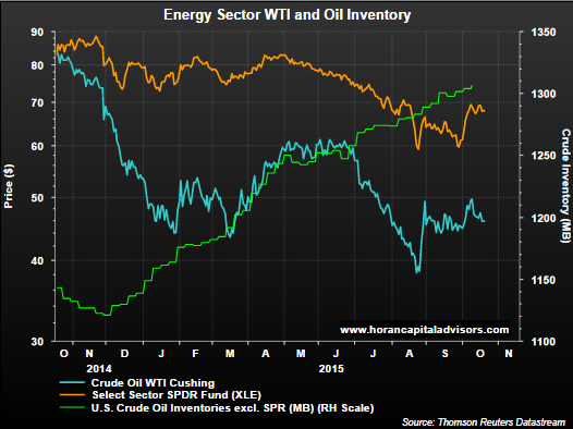
Market timing, i. e., when attempting to trade into our out of the market, is a difficult strategy for nearly all investors. A Barron's article written in October of last year, The Timeless Allure of Stock-Market Timers, highlighted a few strategists' ill-timed calls and their confusion on why it did not work. The worst part of market timing is the fact the timing of getting out tends to occur near market bottoms and then getting back in the market near market tops.

Making ill-conceived market moves can reduce the growth of one's investments substantially. The below chart graphs the growth of the S&P 500 Index from 1990 through June 30, 2015. The blue line displays the growth of $10,000 that remains fully invested in the S&P 500 Index over the entire time period. The yellow line shows the same growth, but excludes the top 10 return days over the 25 year period (6,300 trading days.) By missing the top 10 return days over the 25 year period, the end period value grows to only half the value of the blue line that represents remaining fully invested.

From The Blog of HORAN Capital Advisors
Source: ICMA-RC

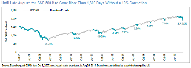
Given the market's recent pullback the calls for getting out of stocks has picked up momentum. Until this most recent pullback, the S&P 500 Index had gone over 1,300 trading days without a 10+% correction. This extended run without a 10+% correction can be seen in the below chart.

From The Blog of HORAN Capital Advisors
Source: Goldman Sachs

For an investor they should not get caught up in the market timing conundrum. These sell decisions often occur near equity market bottoms. Alternatively, an investor should stick with their asset allocation plan that incorporates their time horizon and risk tolerance. If the recent market pullback is jeopardizing one's retirement as a consequence of the recent downward move in equities, they should reevaluate what an appropriate asset allocation should be. The investor's asset allocation preferences should incorporate the time horizon for various buckets of assets. Shorter term investments should not be invested in equities if accessing these funds will occur over the next several years.

Timing the market may sound appealing, especially after a pullback like we are experiencing at the moment. Reducing equity exposure when the market has become increasingly volatile will certainly relieve some anxious feelings. If near term access to investments necessitates reducing equity at the moment, be sure that is the case and equity exposure is not being reduced in an effort to simply time the market. The increased market volatility experienced over the last few months is certainly more typical of equity movements and is likely to continue in the near term.


Thursday, September 03, 2015

Rising Interest Rates Historically A Positive For Equity Returns

The upcoming two day Federal Reserve meeting that concludes September 17th seems to have investors on edge. The million dollar questions is whether the Fed will raise rates or not. If one is a stock investor, they should hope the Fed raises rates and puts this extended anticipation to rest. Another reason investors may want to see the Fed raise rates is due to the positive impact a rate increase has on equity prices.

As we noted in a post last month, Anticipating The Rate Hike, initial Fed rate increases tend to not have a negative impact on equity prices. Further evidence can be seen in the below chart. The red dots on the S&P 500 Index chart line denote the first rate hike in a Fed tightening cycle. The yellow line represents the yield curve (30 yr treasury minus 3 month treasury bill) and one can see why investors focus on equity performance when the yield curve inverts.

From The Blog of HORAN Capital Advisors

As the red dots clearly show, the onset of a tightening cycle isn't necessarily a precursor to poor equity market performance. In our earlier article link above, we provide a magnified look at equity market performance around this initial rate hike period. Equities do tend to exhibit weakness initially; however, the weakness tends to be short lived.

S&P Dow Jones Indices recently released a report, What Rising Rates Will Not Do, that also examined equity returns in rising interest rate environments. The below chart included in the report shows the S&P 500 Index return during rising rate periods. The shaded area represents rising 10 year yields and clearly a rising 10-year treasury yield has not been a negative for stock returns.

From The Blog of HORAN Capital Advisors

Breaking down returns by month, S&P notes,
"Furthermore, between January 1991 and June 2015, the average monthly return for the S&P 500 was 0.88%. Paradoxically, in the four periods of rising rates, the average monthly return was 1.26%, compared with an average monthly return of 0.73% for the periods of declining rates. Rising rates have clearly not been bad for stocks over the past two decades (emphasis added.)"
For more insight into equity returns during these tightening cycles, our article a few years back, Rising Interest Rates Can Be Good For Stocks, provides a table outlining equity returns over various cycles going back to 1973. It seems the Fed has missed an opportunity to increase rates as far back as a year ago; however, a lift off in September doesn't mean stocks are a poor investment over a complete tightening rate cycle. Certainly, stocks are likely to experience more volatility around this initial lift off period, but can move higher after the beginning of the rate increase cycle.


Wednesday, September 02, 2015

Death Cross More Of A Buy Signal?

With the recent weakness in the equity markets, many stocks' and stock indices' chart patterns have traced out a death cross pattern in their moving averages. The Death Cross is a technical indication when the 50 day moving average crosses the 200 day moving average from above. As Michael Batnick of The Irrelevant Investor blog noted a few days ago, very few technical analyst use the death cross pattern in their chart analysis. However, much has been written about the death cross recently and a closer look at the pattern reveals stocks/indexes tend to be closer to rebounding subsequent to the death cross trigger than experience further weakness.

The chart below highlights the most recent occurrence of the death cross for the S&P 500 Index other than the one just occurring late last month.The below chart covers the calendar years 2010 and 2011. The orange line on the chart is the rolling three month return for the S&P 500 Index. This line has been shifted to the left by three months and shows the forward three month return from near the date the index average triggered the death cross pattern. For example, in August 2011 when the index triggered the death cross, the subsequent three month return for the S&P 500 Index was about 13.97%. Importantly, the worst of a market's decline tended to occur and end near the point the moving averages triggered the death cross.

From The Blog of HORAN Capital Advisors

The following four charts show death cross triggers back to 1999. The times in which the market continued to weaken once the death cross pattern was triggered was closer to or during recessionary economic periods.

From The Blog of HORAN Capital Advisors

Finally, below is the chart for the late August death cross for the S&P 500 Index. Is a subsequent rebound in the index more likely?

From The Blog of HORAN Capital Advisors

Moving averages are lagging indicators by the nature of their construction. In other words, the patterns traced out in the moving averages follow the price of an index or stock. When the death cross is triggered then, it is likely most of the price decline in the index or stock has already occurred. Again, the exception is around recessionary economic periods and our current view at HORAN Capital Advisors is the U.S. economy continues its slow growth pace and does not tip into recession.


Sunday, August 30, 2015

Stocks Higher 10-Years From Now

Before the onset of the market weakness in the early part of last week and the end of the prior week, S&P Dow Jones Indices released a report highlighting rolling 10-year annualized returns for the S&P 500 Index. The report seems prompted by a response Warren Buffett made to a question on timing the market. Buffett noted he was not a market timer and simply responded, "Stocks are going to be higher, and perhaps a lot higher, 10 years from now. I am not smart enough to pick times to get in and get out."

In the report, S&P notes,
  • "Since 1947, the S&P 500’s price return was up in 72% of calendar years. Add in dividends reinvested and that batting average jumped to 80%."
  • "And if one is worried that the S&P 500 has gone too far since the conclusion of the 2007-09 mega-meltdown bear market, consider that the rolling 10-year CAGR through Q2 2015 was +7.9%, nearly 400 basis points below the long-term average."
  • "...there have been times when things didn’t work out too well for investors, but these times were few and isolated. Of the 278 quarters of rolling 10-year CAGRs from Q1 1946 through Q2 2015, only eight were negative, and they all occurred between Q4 2008 and Q3 2010."
From The Blog of HORAN Capital Advisors

The S&P report contains additional detail on sector returns going back to 1990 and investors should find the entire report a worthwhile read. One sector highlight noted in the report is the fact, "...each sector recorded very high monthly 10-year CAGR batting averages, or frequencies of positive observations, from 100% for consumer staples, energy, materials and utilities, to 79% for telecom services and 67% for financials. The S&P 500’s average was 87%."

In short, timing the market can be a difficult endeavor for many investors, Last week's heightened market volatility is an example of this, especially for those who sold out of stocks on Tuesday.

Source:

The Wisdom of Warren
S&P Dow Jones Indices
By: Sam Stovall, U.S. Equity Strategist
August 17, 2015


Thursday, August 27, 2015

Equity Market Recovering Like October 2014

On Tuesday I wrote about the bulls waiting for that elusive equity market bounce. The wait was short as the market snap back over the last two days qualifies for that bounce. Investors are likely contemplating the market's direction from here.

A "V-type" pattern seems to be forming just as the market traced out late last year. As the below chart shows, the contraction from July to October of 2014 was not as severe as the one being experienced at the moment and took longer to develop. What is interesting is the pace of this bounce back seems to be occurring just as quickly as the one last year.

From The Blog of HORAN Capital Advisors


Tuesday, August 25, 2015

Awaiting The Elusive Equity Market Bounce That Holds

The stock market bears have been calling for this current pullback for what seems like years. Now the bulls are looking for the elusive bounce that "holds" and signals another move higher in the market. After the close on Friday, I noted the oversold market conditions and a potential bounce that may follow. Three days into this potential "bounce" scenario, the market has failed to cooperate. This shows how difficult it is to time the market and find market bottoms. Nonetheless, the bears have had years predicting a correction, so for one calling a bounce for a few days (and being wrong) should be given a little leeway.

After today's trading action, with the waterfall decline near the close, much technical damage was done to the market. On the positive side, market conditions are at extreme oversold levels. As the below chart shows, the relative strength index (RSI) reached an oversold level of 16.77. The only lower level for the RSI over the past five years occurred in August 2011 when the RSI reached 16.46 and was followed by a sustained bull market run.

From The Blog of HORAN Capital Advisors

The percentage of S&P 500 stocks trading above their 50 day and 200 day moving averages continue to indicate oversold market levels as noted in the two charts below.