Sunday, January 30, 2011

Money Velocity A Key To Potential Inflation

Inflation pressures have been finding their way into commodity prices. Much of this commodity price inflation may be the result of investor speculation; however, commodity price pressures are having an impact on some of the emerging market economies. Inflation has not shown in the U.S. consumer price index, but an increase in the velocity of money may provide investors with insight into future inflation.

From The Blog of HORAN Capital Advisors

From The Blog of HORAN Capital Advisors

The importance of the relationship between money velocity and inflation is explained by the quantity theory of money. One concern we have at HORAN is the fact banks are sitting on large amounts of deposits/cash at the federal reserve.

From The Blog of HORAN Capital Advisors

With economic conditions improving, along with banks seeming to get the lending side of their organizations in order, these reserve deposits can quickly find their way into the economy via more relaxed lending standards (increased velocity.) The Fed is doing all it can to stimulate money velocity including a reduction in the interest rate paid to banks on their reserve deposits.

From The Blog of HORAN Capital Advisors


Egypt, Investor Sentiment And The Market

The events in Egypt over the last week are now dominating headlines and impacting recent market actions. Many are commenting about the events in Egypt so I will not restate what is occurring in that part of the world. Readers can follow the news on Reuters live coverage link.

The events in that country have provided investors with a reason to take profits though. Often times market pullbacks or corrections occur as the result of unpredictable events. Given the strength of the market's advance since the lows in July last year, this pullback is not surprising.

From The Blog of HORAN Capital Advisors

As I noted in a post in mid December regarding the cup and handle formation of the S&P 500 Index, a breakout occurred around the 1,225 level. A retest of this level would not be surprising if the market falls through the 50-day moving average support. A retest of this cup and handle support would equate to a 4% decline in the market from Friday's close.

For investors then, they should maintain a focus on company fundamentals. With just over 40% of S&P 500 companies reporting earnings, Thomson Reuters notes 71% of those firms have reported earnings that exceeded analyst expectations. Additionally, the estimated earnings growth rate in Q4 is 36% and the forward four quarter (Q4 2010 – Q3 2011) P/E ratio for the S&P 500 is 13.3.

From The Blog of HORAN Capital Advisors

Investor sentiment figures reported by the American Association of Individual Investors is not overly bullish either. Last week's AAII sentiment survey reported that bullish investor sentiment declined nearly 9 percentage points to 42%. This compares to the long term average of 39%. Last week's bullish sentiment reading is down from the 63% reported in late December.

From The Blog of HORAN Capital Advisors

At HORAN Capital Advisors, we continue to be constructive on the longer term fundamentals for equities, especially compared to bonds. To us large multinational U.S. firms appear to be trading at more reasonable valuations vis-à-vis midcap and small cap equities. One factor we are focusing on is the ability of firms to generate top line revenue growth, and not at the expense of margins. The potential pullback the market may experience near term will likely give investors an opportunity to build or add to equity holdings.


Sunday, January 23, 2011

QE2: A Reason Risky Assets Are Inflating?

On August 27th of last year Ben Bernanke's speech at the Jackson Hole, WY meeting signal beginning of the Fed's second round of quantitative easing. Since the speech the stock market has responded favorably for long equity investors.

From The Blog of HORAN Capital Advisors

Not only have equity prices reacted favorably to the Fed Put, many commodity assets have responded as well and noted in our post, More Evidence Of Inflation In The System.

I do not recall the source of the below chart; however, during the Fed's first round of quantitative easing, the market experienced strong upward returns. The market's positive return during QE1 could be viewed as a coincidence; however, the quantitative easing dollars need to flow somewhere, and risky asset prices seem to be the beneficiary. This has been a stated desire by the Fed as well.

From The Blog of HORAN Capital Advisors

One question that comes to mind is what will be the market's reaction once QE2 comes to an end in June. One date that might be of importance is the Fed's Humphrey-Hawkins testimony before Congress in February. Given the change in the control of the House to the Republican side and their prior opposition to quantitative easing, might the Fed step up the QE program and have it end around the time of the Humphrey Hawkins testimony? Ron Paul, who has not displayed much favor for the Federal Reserve, has been named Chairman of the Subcommittee on Domestic Monetary Policy and Technology, the committee charged with overseeing the Federal Reserve.


Friday, January 21, 2011

Funds Flowing Out Of Bond Investments

Investors seem to be realizing that higher interest rates are not good for their bond investments. As we wrote in mid November in our article, Interest Rates On The Rise, higher interest rates translate into a declining value in the price of an investor's bonds. Recent mutual fund flow data shows investors have been placing less of their funds into bond mutual funds. The below chart shows the trend in the flow of funds into bond and equity funds through mid November. Bond inflows had essentially dried up.

From The Blog of HORAN Capital Advisors

The below table from the Investment Company Institute shows that bond flows have now turned negative with a majority of the outflow occurring in municipal bond funds.

From The Blog of HORAN Capital Advisors

This recent action reverses a long term trend of investors pouring investment dollars into fixed funds since 2006 and detailed by the red line in the below chart.

From The Blog of HORAN Capital Advisors


Wednesday, January 19, 2011

4th Quarter Investor Insight Newsletter

We are a little more than two weeks into the new year and 2010 seems to be quickly fading in investors' minds. The common theme this year, 2011, is the new year is looking similar to the last half of 2010. Our firm's 4th quarter investor letter summarizes 2010 and provides our insights into 2011. HORAN Capital Advisor's complete Investor Letter can be accessed at the following link: 4th Quarter Investor Letter.

Information on HORAN Capital Advisors can be found at http://www.horancapitaladvisors.com/.


Monday, January 17, 2011

Sector Rotation And The Economic Cycle

Since the S&P 500 reached a low in March 2009, the market has enjoyed a strong recovery to the upside. Along with the stronger equity market, the economy has gained a firmer footing as well. Some of the economic support is a result of the Fed's and government's intervention. Some would say that in spite of this intervention the economy is experiencing growth, albeit slow growth. An important fact for investors is the market sectors perform differently depending on where the economy is as it relates to the economic cycle.

From The Blog of HORAN Capital Advisors

The chart below shows the performance of the various market sectors at various points along the economic cycle. A report prepared by Fidelity last year, A Tactical Handbook of Sector Rotations, details the four phases of the economy. The first two phases:
  • Early-cycle phase: Begins prior to the end of a recession as investors begin to anticipate an economic recovery, and extends through the initial economic acceleration. The stock market historically has registered exceptional gains, on average 32% during this period. [For the purposes of this article, this phase begins three months prior to the end of a recession and extends through the first nine months of recovery.]
  • Mid-cycle phase: Begins prior to the Fed’s initial rate increase, as the recovery broadens into expansion and the Fed moves to dampen inflation pressure. The market typically performs well during this phase (average return of 11%). [Begins three months prior to the initial rate hike, and extends nine months beyond.]

From The Blog of HORAN Capital Advisors

The early cycle phase tends to last through the first nine months of the recovery. The National Bureau of Economic Research (NBER) sets the beginning and ending dates of recessions. NBER has marked the end of the current recession as occurring June of 2009. If the economy follows its average cycle, the early cycle phase would have ended on March 2010. At HORAN we do not believe this is a typical recovery for a number of reasons, many of which have been debated in the media. Much debate occurred during the summer last year about a double dip recession. Consequently, the phases of this cycle seem to be lengthened. Having noted this, we believe the economy is in the later stages of the early-cycle. The mid-cycle phase begins prior to the Fed's initial rate increase.

From The Blog of HORAN Capital Advisors

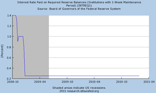
Among many factors, one that investors need to look at are actions and statements by the Fed to gain clues that a rate increase may be forthcoming.

Source:

A Tactical Handbook of Sector Rotations
Market Analysis, Research & Education
A unit of Fidelity Management & Research Company
August 23, 2010
http://personal.fidelity.com/products/pdf/a-tactical-handbook-of-sector-rotations.pdf


Saturday, January 08, 2011

Ed Hyman And Dennis Stattman Outlook

On this week's Consuelo Mack WealthTrack, she conducts an exclusive interview with Wall Street's long-time number one ranked economist, Ed Hyman of ISI Group, plus BlackRock's star Global Asset Allocation Fund manager, Dennis Stattman. Both discuss the outlook for the United States' economy and markets in the new world order.


Wednesday, January 05, 2011

Dividend Payers Outperform Non Payers In 2010

The average return of the dividend paying stocks in the S&P 500 Index outperformed the non dividend paying stocks in 2010. The dividend payers returned 18.75% versus 16.24% for the non payers in 2010. Given the attractive valuations and yields for many dividend paying stocks, especially compared to fixed income yields, outperformance of dividend paying equities has a high likely to continue in 2011.

From The Blog of HORAN Capital Advisors


Gold's Chart Pattern Indicates A Triple Top Has Formed

The market action in gold has created a triple top pattern in gold's stock chart. Additionally, it is common for the volume to continue to decline when triple top chart patterns are formed. This technical pattern development would indicate there is likely more downside weakness in the price of gold ahead.

From The Blog of HORAN Capital Advisors


Sunday, January 02, 2011

Returns For Various Market Segments In 2010

Several of the hard commodities such as Gold and Copper lead returns in 2010. Below are several graphics from Thomson Reuters that show segment returns in both Dollars and local currency. Readers can click the graphs for an interactive feature for other return periods.

Returns In Dollars
From The Blog of HORAN Capital Advisors

Returns In Local Currency
From The Blog of HORAN Capital Advisors


Significant Decline In Bullish Investor Sentiment

This past week saw a significant decline in bullish investor sentiment as reported by the American Association of Individual Investors. Bullish sentiment fell over 11 percentage points to 51.6% versus the prior week's reading of 63.3%. The bull/bear spread remained at a fairly wide 31 percentage points. As the market enters a new year, it does appear, from a sentiment perspective, investors are somewhat cautious about the future direction of the market.

From The Blog of HORAN Capital Advisors


Saturday, January 01, 2011

Review Of Dow Jones Industrial Constituents

Below is a list comprised of the 30 companies that make up the Dow Jones Industrial Index. Additionally, the companies highlighted in yellow are those firms that make up the 2011 Dogs of the Dow as discussed in a post earlier this week.


Top Article Posts From 2010

Below is a list of a few of the article posts from our blog that received the most clicks in 2010. Given the potential trend in interest rates and investor interest in dividend paying stocks, it is not surprising the list contains some of the articles it does.


Pre-Election Year Market Returns Tend To Be Strong

The average return for the Dow Jones Industrial Average in the pre-election year tends to be relatively strong. Most of the returns historically occur in the the first 6-7 months of the year. As Chart of the Day notes in their report,
"...One theory to support this behavior is that the party in power will make difficult economic decisions in the early years of a presidential cycle and then do everything within its power to stimulate the economy during the latter years in order to increase the odds of re-election."
From The Blog of HORAN Capital Advisors


Thursday, December 30, 2010

Emerging Economies Still Expected To See Strong Growth

Much is made of the fact that investors should allocate some of their investment portfolios to emerging market economies. This makes sense from the standpoint the emerging economies of the world have been experiencing stronger economic growth versus the developed economies.

From The Blog of HORAN Capital Advisors

From a cautionary perspective though, investors need to be aware of the strong returns already achieved in the emerging markets over the last ten years. From a performance perspective, the emerging markets' 10-year annualized returns are around 13% (MSCI Emerging Markets Index) versus the 10-year annualized return of the S&P 500 Index of around 1%.

On a prospective basis, the emerging economies are still expected to achieve economic growth rates that are higher than those of the developed economies. A recent article by T. Rowe Price, The Decade Ahead, highlights economic growth rates out through the end of 2020. Certainly a long time frame, but the graph to the right points to the opportunities in these emerging economies based on their projected growth rates.

At HORAN Capital Advisors, we do have an overweight to the emerging markets versus our baseline allocation. Also included in our investment philosophy is to invest in U.S. or foreign multinational companies that do, or intend to, derive a large part of their revenue from emerging market economies.

Lastly, on a shorter time frame, two years, GDP growth in the developed countries is expected to grow 3.5%. And GDP growth in the developing economies is projected to grow 25%% through 2012.

Before investors allocate investment funds to the emerging markets, they should conduct there own research. A number of the emerging countries are attempting to slow their faster growing economies by pursuing a tighter monetary policy. On a short term basis the tighter policy could reduce growth rates and have a short term negative impact on market returns.
From The Blog of HORAN Capital Advisors


Wednesday, December 29, 2010

Consumer Confidence, Consumer Sentiment and S&P 500 Index

Strategist tend to focus attention on consumer related data when attempting to forecast the future direction of the stock market. The consumer receives attention since he/she accounts for two-thirds of the data that goes into the GDP calculation. Because of this focus on the consumer, there are a number of different data points one can follow. On this blog we highlight the AAII sentiment survey data from time to time. Other sites have their own sentiment data. On the SentimenTrader site, they track a smart money/dumb money indicator. Technical Take has another version of sentiment.

Beyond these consumer oriented data points, more publicly reported data is reported by the Conference Board in its Consumer Confidence Index (CCI) and the University of Michigan's Consumer Sentiment Index (MCSI). The two surveys are similar, but have two differences investors should be aware of. The MCSI survey asks one less question about employment. This fact makes the Conference Board survey a better indicator of consumers' expectations about employment. But the MCSI survey's questions focus on consumer expectations one year ahead instead of six months for the CCI. The Michigan survey therefore attempts to predict economic conditions a full year into the future. For a more detailed discussion on these two indicators click here. It should be noted that the CCI is a component of the Composite Index of Leading Indicators. Having highlighted these two indicators, do they predict in any way the future direction of the stock market?

Earlier this week the Conference Board reported that the CCI came in at a lower than expected 52.5 versus expectations of 56.0. As the below chart shows, there does appear to be a positive correlation between the CCI, MCSI and the S&P 500 Index. From the graph perspective, one could argue which is the dependent variable.

From The Blog of HORAN Capital Advisors

As noted in a research paper by Sydney Ludvigson(PDF):
"...the evidence from in-sample regressions suggests that measures of consumer confidence—taken alone—have important predictive power for quarterly consumer expenditure growth...the results indicate that both the Michigan and Conference Board overall indexes have modest incremental forecasting power for total personal consumer expenditure growth."
Given the significance of the consumer as it relates to GDP, tracking these indexes can have important implications for investors. The recent below expected CCI result is worth watching near term. Although the trend is higher since the beginning of 2010, it is beginning to flatten out.


Monday, December 27, 2010

Dogs Of The Dow Update

One investment strategy that seems to get quite a bit of press is the "Dogs of the Dow" strategy. This strategy consists of selecting, after the close of business on the last trading day of the year, the ten stocks which have the highest dividend yield from the stocks in the Dow Jones Industrial Index. Once the ten stocks are determined, an investor would invest an equal dollar amount in each of the ten stocks. The strategy has had mixed results over the years.

With the year coming to an end, it does appear the 2010 Dow Dogs will outperform the Dow Jones Industrial Index. Additionally, the Dow Dogs are maintaining a narrow performance edge over the S&P 500 Index. On a price only basis, the YTD return for the S&P 500 Index is 12.77% and the S&P's total return equals 15.03%.

From The Blog of HORAN Capital Advisors

As of the market's close last Thursday, the below table contains the list of stocks that are in the running to make up the Dow Dogs list in 2011.

From The Blog of HORAN Capital Advisors


Sunday, December 26, 2010

Better Investing's Most Active December 2010

From time to time it is interesting to review Better Investing's most active stocks. The list is based on an informal sampling of Better Investing members. Readers can compare the below list to the list of stocks in May of this year and the list of stocks in November of 2009.


Friday, December 24, 2010

The Market After Bear Rallies

Over the last few weeks, the Chart of the Day service has presented several charts that reflect the market's performance subsequent to bear rallies. As they say a picture is worth a thousand words. Chart of the day notes in their first chart,

"...a 'massive' bear market is defined as a decline of greater than 50%. Since the Dow's inception in 1896, there have been only three bear markets whereby the Dow declined more than 50% (early 1930s, late 1930s until early 1940s, and during the very recent financial crisis). Today's chart also adds the rally that followed the dot-com bust during which the Nasdaq declined 78%. The current Dow rally has followed a path that is fairly similar to that of post-massive bear market rallies. The initial surge of the current rally lasted nearly 300 trading days and has been trading flat/choppy ever since. It is worth noting that the current rally just made new rally highs. However, both the 1932 Dow rally and the 2002 Nasdaq rally briefly made new highs during their flat/choppy phases. If the current rally were to continue to follow the post-massive bear market rally pattern, the current choppy phase would continue for another 150+ trading days (i.e. 7+ months)."
From The Blog of HORAN Capital Advisors

The x-axis in the above chart is presented in days; thus a shorter time frame than the chart below. In the below chart, for both the 2000 to present S&P 500 (blue line) and the 1929-1949 S&P 500 (gray line) have been normalized to where each of their peaks begin in year zero and at the $100 level. COTD notes,
"What is of interest is not that both of these markets had declines and rallies of equal magnitude -- they did not. What is of interest is that both bear markets have tended to head in the same direction for approximately the same amount of time. For example, both bear markets suffered through a major decline during the first 2 1/2 years and then rallied sharply into year seven. Both markets then formed a major peak in year seven and declined sharply in the middle of the eighth year. Both bear markets have continued to follow a similar path following the eighth year trough. However, if this similarity in direction were to continue, the current stock market rally would need to close out in fairly short order."
From The Blog of HORAN Capital Advisors

The question for many investors is what will be the future direction of the market as the 2010 year closes and we move into 2011?


Thursday, December 23, 2010

Bullish Investor Sentiment Increases 13 Points

This week's release of the American Association of Individual Investors weekly sentiment survey shows bullish sentiment increased over 13 percentage points to 63.28%. This is the highest level the bullishiness reading has reached since November 18, 2004. Shortly after the November 2004 period, the 8-period moving average reached almost 57% and the market experienced a small correction of about 3%.

From The Blog of HORAN Capital Advisors

As regular reader of this blog know, the investor sentiment reading is a contrarian indicator. As a result increasingly higher bullishness readings are one factor to consider when evaluating whether or not the market is overbought. The 8-period moving average does smooth the volatility that is associated with the weekly sentiment figures.