Saturday, July 30, 2016

Income Oriented Equities Lag In July

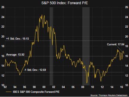
In a few recent posts I have discussed the elevated valuation of dividend growth equities. It would appear bond investors have gravitated to the anticipated safety of equities that generate dividend income greater than can be found in the low rate bond market. The extended valuation of these income equities/sectors may result in investors being surprised in the event the market does encounter a pullback. In fact, August and September tend to be the the poorer performing months for stocks.

Just as the "sell in May' mantra has yet to play out this year, maybe the much anticipated August/September weakness becomes more discussion than reality. And given all the concern about this late summer weakness, in July, investors seemed to rotate out of the so-called safe income stocks and into the higher beta, more cyclical equities. As the below chart shows, the income oriented equity market segments underperformed the broader S&P 500 Index and the PowerShares S&P 500 High Beta ETF (SPHB).


From a sector perspective, the more defensive sectors in the S&P 500 Index lagged the more cyclically oriented ones as well. Energy has its own issues and the other bottom three performing sectors in July were Consume Staples, Utilities and Telecommunications. On a year to date basis the performance of these three sectors remains strong; however, Technology, Materials, Health Care and Industrials generated strong returns in the month of July. An important factor for continued strong performance in the cyclically oriented sectors is improved earnings.

 
In Thomson Reuters This Week in Earnings report, they note,
"312 companies in the S&P 500 Index have reported earnings for Q2 2016. Of these companies, 72% reported earnings above analyst expectations, 12% reported earnings in line with analyst expectations and 16% reported earnings below analyst expectations. In a typical quarter (since 1994), 63% of companies beat estimates, 16% match and 21% miss estimates. Over the past four quarters, 70% of companies beat the estimates, 9% matched and 21% missed estimates. In aggregate, companies are reporting earnings that are 4% above estimates, which is above the 3% long term (since 1994) average surprise factor, and in line with the 4% surprise factor recorded over the past four quarters."
Absent the energy sector, overall earnings appear to be on an improving trend. With respect to the energy sector, year over year comparisons will become easier starting with the third quarter.

Given the tight range the S&P 500 Index has traded in over the last two weeks, a break to the upside or downside will certainly occur. Historically, these tight trading ranges tend to resolve themselves to the upside. Having noted this, a little consolidation of the market gains since February would be healthy and not a surprise given the upcoming weak seasonal market months. And finally, investors chasing yield in stocks need to be cognizant of the rich valuations of these stocks and recent rotation may indicate some investors are figuring this out.


Thursday, July 28, 2016

Sentiment: Bullish Institutions Versus Bearish Individuals

This week's NAAIM Exposure Index was reported at 101, only the fifth time the exposure index has been reported above 100 since the index's inception on July 5, 2006. The NAAIM Exposure Index consists of a weekly survey of NAAIM member firms who are active money managers and provide a number which represents their overall equity exposure at the market close on a specific day of the week, currently Wednesday. Responses are tallied and averaged to provide the average long (or short) position or all NAAIM managers as a group.


Conversely, today individual investor bullish sentiment, reported by the American Association of Individual Investors, fell four percentage points to 31.3%. This is below the long term average of the bullish sentiment reading of 38.5%.


The individual investor sentiment measure is considered a contrarian one as individual investors tend to be the most bullish near market tops and the least bullish near market bottoms. So, if this is the case, and institutions tend to be on the bullish or right side of the allocation debate, are these two readings indicating the market has more room to move to the upside?

Below is a table comparing the prior NAAIM readings above 100, the AAII individual bullish sentiment reading and the subsequent one year return for the S&P 500 Index. Although the number of NAAIM readings is small, the subsequent 12-month return for the S&P 500 Index has averaged a low double digit positive return when NAAIM readings were above 100.


Lastly, the S&P 500 Index has traded within a very tight 1% trading range for the last eleven trading days. From a positive standpoint, markets can correct in price (a steep decline), or over time. This sideways trading range may be one where a correction is occurring over time. The obvious questions is whether the market breaks to the upside or to the downside.


Additional commentary, and an interesting one, highlighted by Ryan Detrick, CMT of LPL Financial, on the market level and whether or not it is in a bubble can be read in an research report, Is the S&P 500 in a Bubble?.


Friday, July 22, 2016

Weak Investor Sentiment Yet New Equity Market Highs

Today the S&P 500 Index closed at another all time record high. This higher advance in the market is becoming a regular occurrence as this is the fourth consecutive week for the market to close higher on a weekly basis. From the market's intraday low on February 11th, the S&P has advanced over 20% on a price only basis.


The magnitude and trajectory of the move higher is seen more clearly on the daily chart below.


Somewhat interesting is the fact individual investor bullish sentiment as reported by the American Association of Individual Investors is far from indicating excess optimism. This week's bullishness reading of 35.43% was a decline from the prior week's reading of 36.87%.  The long term average bullishness level is 38.5% and bullish sentiment has not exceeded this level since early November of last year.


So given the strength of this move in the market since February, and reviewing some of the technical market indicators, a pullback would not be surprising. However, in a June 2nd article I posted, Is It Right To Be Bullish Near A Record Market High?, I noted:
"Being bullish after a double digit market decline seems a lot easier than being bullish near market tops. Knowing the market does not move up or down in a straight line, are there factors we see that would support higher equity prices? In the intermediate and long run, we believe fundamental company and economic factors are key drivers of stock price returns."
Our view that company and economic data will continue to remain favorable is unchanged from early June.

Lastly, Ryan Detrick, a strategist at LPL Financial, provided a link to one of his firm's recent research reports, Is an Overbought Condition Necessarily Bad for the Stock Market?. This research article is a worthwhile read for investors. The conclusion might surprise some readers. In the end, the market will not move higher in a straight line; however, this longer term trend seems to be a friendly one for investors at the moment.


Wednesday, July 20, 2016

Summer 2016 Investor Letter: Searching For Yield

In our just published Summer 2016 Investor Letter, we explore the investor's pursuit of income generating investments. In our view this has led to extended valuations in some of the income yield segments of the equity market, for example, utility stocks. If interest rates do remain lower for longer then the extended valuations in the income yielding sectors could remain elevated. The Investor Letter contains broader commentary on this topic.

Our last newsletter mentioned the potential issues surrounding the U.K.'s potential withdraw from the European Union (Brexit). Just a few weeks ago the voters in the U.K. spoke at the ballot box and voted to leave the EU. We wrote separate commentary on Brexit in the days following the vote; however, we include additional highlights in the Summer 2016 Investor Letter on the Brexit topic and more.


For additional insight into our views for the market and economy, see our Investor Letter accessible at the below link.


A Look At Projected Sales And Earnings Growth

In spite of the S&P 500 Index trading sideways for most of the last 18 months until very recently, the advance from the financial crisis low has been strong. A part of the return generated from equities has been the fact the forward P/E multiple has expanded from low double digits to just over 17 times earnings.


In a low interest rate environment stocks tend to trade at higher P/E multiples. The current forward multiple on the S&P 500 Index is certainly not low; however, the current forward P/E level is not giving off a signal of overvaluation either. Importantly, going forward, we believe growth in stocks will need to be driven by growth in earnings since a large part of the return from multiple expansion is behind us.

Not only is earnings growth obviously important, company revenues need to see growth as well. As the below chart shows, expectations are pointing to stronger earnings growth as one looks one year into the future and top line sales are expected to grow as well. We believe the equity market's strong recovery from the February low earlier this year is partly due to the improved outlook for corporate earnings and revenue growth. The equity markets seem to be anticipating this better environment.


In a post written a few days ago, Value Stock Outperformance May Indicate Stronger Economy Ahead, I highlighted the fact analysts are projecting Q2 2017 (one year forward) earnings growth of 15.3% for the S&P 500. Equally important, the top line is anticipated to return to growth as well.

Lastly, the market recently broke out of its 18-month trading range on a near parabolic move to the upside. It would be nice, and expected, to see the market consolidate some of these gains, but positively, selling volume does not seem to be taking hold.


Sunday, July 17, 2016

Value Stock Outperformance May Indicate Stronger Economy Ahead

Over the course of the past few years several times I have touched on the significance of the value versus growth stock performance cycle. A couple of the earlier articles contain useful information for investors that provides insight into the economic cycle being telegraphed by the value/growth cycle. In short, in a slowing economic environment, growth tends to outperform value and the opposite tends to occur when the economy is strengthening. Value has been outperforming growth this year.


In the March 2014 article, Why It Matters That Value Stocks Are Outperforming Growth Stocks, value's outperformance peaked around April of that year and growth went on a nearly two year run of beating value. The backdrop for this reversal from value to growth is provided in the just noted article, but economic data began to rollover. In an article early this year, Is The Value Style Outperformance Sustainable?, detail is provided on the trend reversal in 2014 from value back to growth as well as value's strength now.

Fast forward to today and the iShare equivalent of the S&P 500 Value Index is outperforming the S&P 500 Growth Index, 9.21% versus 4.79%, respectively. A significant factor contributing to value's strength is the investor focus on income producing equities in a world where bond rates are low, near zero and in some cases below zero. The below graphic compares the sector weights of the S&P 500 Value and Growth indices. The two top performing sectors this year are telecoms, up 24% and utilities, up 22%. Combining these two sectors, telecoms plus utilities, they have a weighting of 11.2% in the value index and only 1.3% in the growth index. Additionally, in each of the six top performing sectors, value's sector weighting is greater than in growth's.


Positively, the next three best performing sectors, energy, materials and industrials, tend to be economically sensitive ones. And, if one believes the equity market serves a bit like a weighing machine, the better performance in these three sectors may just be anticipating a better economic environment ahead.

Friday's industrial production report for June of .6% was better than the high end consensus expectation. The report contained many positives signalling an improving manufacturing sector, retail sales exceeded expectations (.6% vs .1% consensus) and jobless claims of 254,000 were lower than the 265,000 consensus.


With earnings projected to improve as one looks one year forward and economic activity just maybe swinging more positive, there remains the possibility that value's outperformance might last more than just a few quarters this time around. The one concern is the overvaluation of some of the income yielding sectors like utilities; however, investors may still find attractive values in the the more economically sensitive sectors.


Saturday, July 16, 2016

Market Breaks From Trading Range While Sentiment Measures Remain Mixed

The S&P 500 Index has recovered all that was lost in the two day selloff following the Brexit vote. Since the Brexit low, the S&P 500 Index is up over 8.5% and this has taken the index out of its 18+ month trading range. As the below chart shows, the trading range goes back to the end of 2014 and up until this week, the only breakout from the range had been to the downside.


Saturday, July 09, 2016

Dividend Payers And Dividend Focused ETFs Post Strong Returns YTD

A few prior posts have provided detail and potential consequences facing dividend focused equities given their extended valuations. Of course, in a low (and going lower?) interest rate world it seems the simple approach an investor can pursue is just buying a stock that has a higher yield than the 10-year U.S. Treasury. S&P Dow Jones Indices recently reported on the average performance of the dividend and non dividend paying stocks in the S&P 500 Index. Maybe no surprise, but the payers are swamping the non payers this year and over the last twelve months as of June 30, 2016. As the below table details, the payers have outperformed the non payers by 728 basis points year to date and by 1,142 basis points over the prior twelve months.


Also, the strong performance of the dividend payers is evident in several of the dividend focused ETFs. Below is a chart of the SPDR S&P Dividend ETF (SDY) and the iShares Select Dividend ETF (DVY) plotted with the S&P 500 Index.
  • SDY seeks to replicate the performance of the S&P High Yield Dividend Aristocrats. SDY's projected income yield is 2.3%. Notable sector weights in SDY are Utilities (31%) and Financials 14%.
  • DVY's performance is focused on replicating the Dow Jones Select Dividend Index and has a projected yield of 3.0%. Notable sector weights for DVY are Financials at 24% and Utilities at 15%.
Both of these ETFs are up by mid teen percentages this year through Friday's close as can be seen in the below chart.


A Look At The PEG Ratio: Earnings Growth Versus Valuation

In an article I wrote about a week ago, I reviewed the current P/E (price earnings ratio) of the sectors that comprise the S&P 500 Index. The article included the below chart which compared the current sector P/Es to the respective sector's average P/E and minimum P/E over the past ten years. the article noted some of the income or yield producing sectors were trading at elevated valuations.


Simply because the P/E for a sector is high, and the same applies to individual stocks, this does not necessarily mean the sector or stock is overvalued. Importantly, the P/E should be compared to the earnings growth rate for each sector or company. By dividing the P/E by the earnings growth rate, one obtains the PEG ratio (PE to growth rate.) A good discussion on this is contained in an article on the CFA Institute's Inside Investing blog, Is It Overvalued? Look at the PEG Ratio. When evaluating the PEG, a PEG of 1.0 is an indication a sector or company is fairly valued. If the PEG is less than 1.0, this is an indication the sector or company may be undervalued. Conversely, PEGs greater than 1.0 are indications of overvaluation relative to fair value.

As can be seen in the above chart, the energy sector is trading at a P/E of greater than 40, but what is the PEG? Below is a chart comparing the sector P/Es to each sector's PEG ratio. The growth rate used in the denominator is Thomson Reuters' I/B/E/S earnings growth rate for Q2 2017, or one year forward.


Below is the table detailing the earnings growth rates for each sector as reported in Thomson Reuters' 7/8/2016 This Week In Earnings report.


Clearly, the PEG for the utility sector shows investors that are buying utility stocks are paying up for the single digit earnings growth. As discussed in last week's post, one reason this has occurred is investors are purchasing dividend yielding investments in part because they are unable to get that yield in bonds. This reach for yield appears to have pushed some of these yielding sectors and stocks to elevated valuation levels. The first chart in this article does show the forward P/E for utilities is higher than the 10-year average P/E for the sector as well.

The other factor to note is some stocks/sectors trade at higher PEs. Looking at the telecommunications sector for example, the current forward P/E is lower than the sectors 10-year average P/E. As a result, comparing each individual sector's P/E and earnings growth rate with its respective historical data is also important.

And finally, P/E and earnings growth rates are only a couple of factors investors should use in evaluating equity investment opportunities; however, the PEG ratio can be useful as a starting point. In the end, just because a company appears to be great, does not mean it is a great investment at all points in time. Recently, investors have pursued income yielding investments for their safety characteristics. However, many of these income investments are priced, as we call 'for perfection'. In other words, the slightest bit of negative news for some of these yield plays could result in strong price declines.


Sunday, July 03, 2016

An In Depth Look At The Extended Valuation Of Defensive And Income Yielding Equity Sectors

Early last week I highlighted the extended valuation of the utility sector in part due to investor demand for income yielding stocks. Not only are the income sectors attracting investor dollars, defensive sectors like consumer staples are as well. A result of this investor demand for defensive and income producing equities is these sectors have produced market beating returns so far in 2016. As the below sector return chart shows, the defensive consumer staples sector and the income yielding sectors like utilities and telecommunications have generated strong returns this year.


However, the strong return in these sectors has pushed the sector valuation beyond the average longer term valuation for each respective sector itself. The better performing sectors, utilities and staples are some of the most extended compared to the other sectors. Energy sector valuations are at extremes, largely due to earnings headwinds resulting from lower oil prices.


Saturday, July 02, 2016

The Pursuit Of Yield Continues To Benefit Return For 2016 Dogs Of The Dow

Investors' continued pursuit of income in this low bond interest rate environment has led them to higher yielding stocks. Partial evidence of this can be found in the total return of the Dogs of the Dow basket of stocks this year. As noted in earlier posts, the Dogs of the Dow strategy is one where investors select the ten stocks that have the highest dividend yield from the stocks in the Dow Jones Industrial Index (DJIA) after the close of business on the last trading day of the year. Once the ten stocks are determined, an investor invests an equal dollar amount in each of the ten stocks and holds them for the entire next year.

The average YTD total return through July 1, 2016 of the ten 2016 Dogs of the Dow equals 15.4%. This compares to the Dow SPDR and S&P 500 SPDR returns of 4.4% and 4.0%, respectively. The top performing Dow Dog this year is Verizon (VZ), returning 24.5%. Of course, it was also the highest yielding Dow Dog at the beginning of 2016. Below is a table containing various metrics on the 2016 Dogs of the Dow.


A full list of the Dow stocks with return and yield data can be found at the Dogs of the Dow website.


Monday, June 27, 2016

Income Yielding Equity Sector Valuations Near Historical Highs

Towards the end of 2015 and far ahead of the BREXIT induced market downturn, investors began to seek the apparent safety of income yielding equities. The initial motivation for this seems to have been investors seeking yield outside of fixed income where yield seems hard to find in this low interest rate environment. The consequence of this pursuit of yield is the valuation of some of the defensive, income yielding sectors has been pushed to extremes. This move towards higher valuations has been exacerbated by the BREXIT outcome. One example of this is the utility sector.

The below chart displays the performance of the S&P 500 Index sectors for the year to date period through June 27, 2016. Three of the top performing sectors are viewed as defensive ones and tend to be comprised of companies that pay and grow their dividends, i.e., utilities, telecom and consumer staples sectors. The top performing sector is utilities garnering a return of 19.8% so far this year.


Of importance, investors should keep in mind the utility sector is trading at a near record valuation based on the sector's forward price to earnings ratio of 17.8 times (blue line.)


Other sectors such as consumer staples and energy also trade at higher valuations or P/E multiples as well. Yardeni Research ($$) updates sector valuations on a periodic basis and their most recent report can be read here. Sectors, and for that matter specific stocks, can remain elevated from a valuation perspective for an extended period of time. However, when rates rise and/or a more risk on equity environment returns, these defensive sectors are likely to underperform.

S&P Dow Jones Indices and Factset recently highlighted the continued growth in cash balances for S&P 500 companies. A part of this cash growth has gone towards dividend payments and stock buybacks as I noted in a post yesterday, Stock Buybacks Up Double Digits In First Quarter, In Factset's report released today, they acknowledge the growth in cash levels; however, they also note the Cash to Debt Ratio for S&P 500 companies (ex-financials) has fallen to its lowest level since the second quarter of 2009. And back to utilities, six of the top ten companies with the lowest cash to debt ratios are utilities as can be seen in the below table.


There is more to valuation than simply looking at cash/debt ratios, and utility rates are regulated and maybe more sustainable from that point of view, but higher demands on cash due to debt payments can become an issue for utility companies. Just last month Moody's downgraded the long-term senior unsecured rating of The Southern Company (SO)to Baa2 from Baa1 due to increased debt levels and lower cash flow coverage resulting from an acquisition.

For investors pursuing investments in higher dividend yielding equity sectors, paying attention to valuations and coverage ratios is important. Additionally, not if, but when a risk on equity environment returns, these defensive, income yielding stocks could come under pressure.


Sunday, June 26, 2016

Stock Buybacks Up Double Digits In First Quarter

S&P Dow Jones Indices reports first quarter stock buybacks for the S&P 500 Index were higher by 12% on a year over year basis. On a quarter over quarter basis buybacks were higher by 10.6%. The increase in buyback activity was supported by a quarter over quarter 15.8% increase in as reported earnings. Disappointingly though was the fact QOQ dividend payments declined 3.1%. Additionally, the combination of dividends and buybacks equaled $257.65 billion and was in excess of reported earnings of $189.11 billion. This is the six straight quarter buybacks plus dividends exceeded reported earnings.


Several highlights from S&P's report:

  • The Health care sector increased 86.1% to $30.6 billion for the quarter, up from the prior quarter’s $16.5 billion, as Gilead Sciences (GILD) spent $8 billion (ranking as the 18th largest in S&P 500 history).
  • The Energy sector conducted only minor buybacks ($2.1 billion), as it posted a 20.6% decline for the quarter and a 62.9% decline from Q1 2015.
  • For the ninth consecutive quarter, more than 20% of the S&P 500 issues reduced their year-over-year diluted share count by at least 4%, therefore boosting their earnings-per-share (EPS) by at least 4%. The participation rate for significant EPS impact rose to 28.2% for Q1 2016, up from 25.8% in Q4 2015.
  • Total shareholder return, dividends plus buybacks, set a quarterly record of $257.6 billion in Q1 2016 and a 12-month record of $974.6 billion for the period ending in March 2016.
Howard Silverblatt, Senior Index Analyst at S&P Dow Jones Indices. said, "The Q4 2015 uptick in buybacks was a surprise to many in the market, but it continued in Q1 2016. The pace of buybacks was partially driven by companies supporting their stock during the opening downturn of the year, which coincidentally started in early February when many earnings lock-ups ended. The upswing in both expenditures and participation appears to persist in the market, meaning that the upturn in Q4 was not single-shot. Looking at Q2 2016, the share count reduction trend is already baked in, as more than 20% of the issues have reduced their share count by at least 4% from Q2 2015."

Silverblatt also noted in the report cash reserves set a new record and increased 1.6% to $1.347 trillion. "Shareholder returns continue to increase, as companies remain awash with cash and have access to low-cost financing – especially in Europe and Asia," said Silverblatt. "The rate of dividend increases has slowed, as commodity-based issues remain a major uncertainty. Given the current cash-flow, projections, and an expected slow and measured pace of interest rate increases in the U.S. by the FOMC, companies have the ability to increase returns, as they remain under continued pressure from outside investors."

From an investor perspective, at HORAN, we prefer to see companies commit to higher dividend payments versus just an increase in buybacks. Dividends tend to be a more permanent commitment on a company's part and an indication of more consistent expected earnings 'growth', where buybacks can be turned off and on at will.

Source:

S&P Dow Jones Indices
By: Howard Silverblatt, Senior Index Analyst
June 22, 2016


Saturday, June 25, 2016

BREXIT Inspired Equity Pullback: The World Is Not Coming To An End

Much is being written regarding the impact of the United Kingdom's exit from the European Union and all the conclusions lead to uncertainty. It is the uncertainty equity markets do not handle well, thus, the sell off on Friday. One conclusion I believe is certain is the world will not come to an end and business will continue to be conducted between EU and non-EU countries. This is a wakeup call for the EU and its seemingly unending promulgation of rules and regulations that seem to favor some EU member countries over others. On paper the formation of the EU seemed like a good idea; however, a monetary union without a fiscal union has led to a lack of spending discipline by some countries. And, no real spending discipline is a symptom not only of EU countries, but with non-EU countries as well. The United States can be included in the 'no discipline' crowd too. Our firm will have more commentary on the Brexit outcome later.

The damage done to global equity markets on Friday is pretty clear. The Nikkei was down 7.9%, S&P 500 Index down 3.6%, the Dow down 3.4%, the French CAC Index down 8.0%, Spain's IBEX 35 Index down 12.35% and the UK's FTSE 100 Index was down 3.2%. The unknown is what additional weakness can be expected in global equity markets over the next weeks and months ahead. In earlier blog articles, I have noted past crisis events and their duration and time to recover. Below is a chart from a June 28, 2015 post.

From The Blog of HORAN Capital Advisors

Some of the crisis influenced market declines bottomed after one day while other declines took place over a longer period of time. The average decline in terms of days was six with an average return of -5.3%.

The sentiment technicals for the S&P 500 Index are indicating fear is elevated. Historically, when the fear measure like the VIX is elevated or the equity put/call ratio is above one, these levels have coincided with near market bottoms. The first chart below shows the CBOE Equity Put/Call ratio spiked above 1.0 on Friday.


The VIX futures went into backwardation on Friday as well. VIX backwardation refers to the situation when the near-term VIX futures are more expensive than longer-term 3-month VIX futures (VXV). This is an indication traders expect volatility in the future to be lower than it is now. Historically, when this occurs, short term market rallies tend to result from this technical event.


The other sentiment measure that is indicative of an oversold market is the ratio of the VIX to the 10-year U.S. Treasury yield. The low level of the denominator of this ratio, the 10-year Treasury yield, is indicative of a slow growth economic environment and investors' propensity for risk off assets; hence, driving the yield lower. The numerator, the VIX, is elevated thus, an indication of investors' fear of the equity markets.


An expected certainty in this Brexit inspired uncertainty is the fact the markets will continue to be volatile. Of importance is whether or not this event pushes Europe into a recession and drags the U.S. into one along with it. What makes this a heightened issue is the slow, bump along growth, of the U.S. economy and the slow economic growth globally. The added uncertainty is whether or not Brexit leads to additional EU countries taking steps like the UK's and then the ultimate breakup of the EU. The world is not coming to an end and this Brexit induced equity market pullback will likely provide investors with a buying opportunity in equities that have been unduly punished.


Saturday, June 11, 2016

Simply A Technical Review Of The S&P 500 Index

Quite a bit of discussion circulated after the market closed on Friday surrounding the S&P 500 Index and the resulting weekly chart candle that formed for the week. As the below candle stick chart clearly shows, a shooting star formed out of the weekly market action. One factor making this formation of interest to technical market traders is it occurrence subsequent to a strong market uptrend and the previous weekly candle was an indication of pretty strong uptrend. So, this shooting star is viewed as a bearish signal since sentiment has changed so dramatically. Downside market follow through is needed though in order to confirm a potential market reversal.


A couple of factors that may counter this bearish formation is the fact volume on down weeks has been declining. Equally important is the fact volume on up weeks has been declining as well.

From a positive standpoint, the chart pattern on a 30 minute chart shows buyers came in during the last hour and a half of trading. This resulted in the market bouncing off the 200 period moving average. The market has a tendency to fill gaps created in chart patterns and a gap above formed with Friday's lower open.


From an investor sentiment perspective, the individual investor remains skeptical of the market's rebound from the February low based on AAII's Sentiment Survey. The 8-week moving average of bullish sentiment is at a level coincident with a market bottom.


And lastly, reviewing the bull/bear spread that is reported with AAII's Sentiment Survey, the below chart shows the 8-week moving average of the spread compared to the S&P 500 Index. The level of this average of the bull/bear spread is also at levels associated with a market that is nearing a turn to the upside.


The above analysis is all based on technicals and the market certainly needs to digest other issues, like a Fed rate hike and the BREXIT vote on the 23rd of this month. From a sentiment perspective, and given the contrarian nature of this measure, investors may be too heavily tilted to bearishness. On the other hand, the technicals are giving off mixed signals and combined, these are likely to lead to continued market volatility over the next several weeks.


Saturday, June 04, 2016

The Consumer Is In Good Financial Shape

With the weak nonfarm payroll report on Friday, heightened concern arose about the pace of economic growth or lack thereof. Pundits and market indicators believe a Fed rate increase in June is off the table. A weak payroll report is an indicator of a weakening economy and certainly the trend in nonfarm payrolls has been a declining one. This declining trend has been in place over several months, +233,000 in February, +186,000 in March, +123,000 in April and +38,000 in May. Determining what this means as investors look ahead for the balance of the year is important. I believe Scott Grannis provides good insight on Friday's report and implications for the months ahead in his post, No Improvement in the Jobs Market.

The weak payroll report comes on the back of some weakness in the manufacturing data. For example, in late May the Durable Goods report saw core capital goods orders decline a .8%. However, there are some bright spots in a few of the manufacturing reports. For example, Econoday noted, "There are...solid points of strength in the report including 0.6 percent gains for both total shipments and total unfilled orders. The gain for unfilled orders is the largest since July 2014. Another plus is a 0.2 percent decline in inventories which pulls down the inventory-to-shipments ratio to a leaner 1.65 from 1.67. A graph of the unfilled orders chart is below. A small positive is the fact unfilled orders have increased in three of the last four months.


The consumer accounts for about 70% of economic activity (GDP) and their health is critical to economic activity. In this regard, there are many positives with consumers overall.
  • University of Michigan Consumer Sentiment: The May sentiment survey showed an increase of 5.7 points compared to the April report. The May report noted, "consumers became more optimistic about their financial prospects and anticipated a somewhat lower inflation rate in the years ahead. Positive views toward vehicle and home sales also posted gains in May largely due to low interest rates."
  • Retail Sales: The positive consumer sentiment report also carries over into retail sales. The favorable report was spread across many of the categories, autos up 3.2%, non-store retailers (e-commerce) up 2.% for the month and up 10.2% versus April last year. Overall for April, retail sales were up 1.3% and up 3.0% on a year over year basis. The next retail sales report comes in about ten days. This growth in retail sales is evident in the below chart. A cautionary observation is the rise in both the retail inventory to sales ratio and the manufactures inventory to sales ratio. On the positive side, the above noted durable goods report indicated inventory of manufactured durable goods is down in nine of the last ten months which has pulled down the inventory to shipments ratio.

A final question revolves around how are consumers financing this spending. Clearly, the below chart shows borrowing has been an important source of funds.


This increase in consumer credit outstanding certainly raises the question of the ability of these consumers to repay their debts. Positively, debt payments as a percentage of disposable income remain at levels seen in the early 1980s and down from the 2004 high of 13.2%.


Manufacturing sector growth has slowed to a snails pace as well. In our view this has become the norm in this subpar GDP growth economy. As the below chart shows, the Composite PMI is near contraction, not unlike the economy has experienced a number of times since the end of the financial crisis.

Source: TalkMarkets

In summary, Friday's payroll report probably puts the Fed on hold for a rate increase this month. Reading the Grannis article mentioned in the opening paragraph places Friday's report in proper perspective. Data suggests the consumer is on pretty sound footing and they are responsible for more than two thirds of economic activity. Given the consumer is a fairly good shape, we believe this factor provides support for continued economic growth, albeit subpar growth. On top of all of this is the fact consumers, businesses and investors will continue to face election year rhetoric that most likely leads to continued market volatility. However, a recession does not seem in the cards at the moment. 


Thursday, June 02, 2016

Is It Right To Be Bullish Near A Record Market High?

One outcome that comes from writing periodic content on our blog is we are held accountable for our various points of view whether they are right or wrong. No investor is going to be correct 100% of the time; however, being right more often than wrong enhances ones chance of better returns over the long run. So, as the S&P 500 Index is only 1.2% below its all time record closing high, being bullish now feels more difficult than being bullish this past February, after the market had declined nearly 12% to begin the year.

On February 27th of this year I published a post, Bearish Sentiment And Positive Uptick In Economic Reports May Translate To Higher Equity Prices, where I discussed reasons why higher equity prices were a most likely outcome. At that time individual and institutional sentiment measures were deeply bearish. In fact, an RBS economist said to sell everything in mid January after a large part of the early year equity decline already occurred. For our clients, we took advantage of the February equity market pullback to reposition some stock holdings in our client accounts and purchase companies we had an eye on, but believed a purchase at a lower price/valuation would come along and February provided that opportunity.

Today the market is near a record high, individual investor sentiment remains low, the U.S. economy is growing at a snails pace (less than 1.0%), Britain is contemplating exiting the Euro, debt issues in Greece remain unresolved, some retailers are losing out to online retail (Sports Authority files bankruptcy). Well you get the picture and I have only touched on a few issues facing economies around the world, but there does not seem to be a lack of bad news and anyone of those might be reason enough to sell equities, but we aren't at the moment.

Being bullish after a double digit market decline seems a lot easier than being bullish near market tops. Knowing the market does not move up or down in a straight line, are there factors we see that would support higher equity prices? In the intermediate and long run, we believe fundamental company and economic factors are key drivers of stock price returns.

From a fundamental company perspective, a few weeks ago we wrote about the potential for improved earnings, and a resumption of growth, as the year progresses. As the updated chart below shows, an improved earnings picture is something that would favor higher equity prices if the growth materializes. Reading the earlier post provides our point of view on why this seems a likely outcome.


In the short run though, technical market factors can impact equity price movements. A part of what drives this is the growth in computerized trading and the algorithms used by the trading programs. Technical chart patterns enable the algorithms to trade in and out of equities, for example, based on price targets generated by chart patterns.

As the below technical chart of the S&P 500 Index shows, the chart pattern for this index has traced out a cup and handle chart pattern. The pattern has triggered as the index has moved through the line representing the cup top. The measured move target for the S&P 500 Index based on this pattern is 2,340.04.  If the target price is realized, this is a mid-teens price increase for the Index. As coincidence would have it, the expected earnings growth rate approaches double digits as the year progresses. Of course, not every chart pattern that triggers will see follow through to the target; however, this is a favorable set up at a time the S&P 500 Index is near a market high.


Lastly, looking at individual investor bullish sentiment, it currently remains at a low level, i.e., 30.2%, and remains below the long term average level of 38.5%. In the weekly Sentiment Survey report released today, bullish sentiment did show a rather large increase of 12.4 percentage points.

Source: AAII

Are there issues ahead that will result in an equity market pullback? Most likely. However, with the prospects of an improved earnings picture and a positive technical set up for the market, the S&P 500 Index may be set to finally breakaway to the upside and out of its nearly two year trading range. Leaning bullish at the moment, and near a market high, seems reasonable given the favorable technical and fundamental picture.


Monday, May 30, 2016

An Allocation To International Small/Mid Cap Equities

One aspect that has faced investors over the past five years is the fact diversification has detracted from a mostly large cap U.S. equity allocation. Investments in high yield bonds and emerging markets generated negative returns, while investments in the NASDAQ and S&P 500 Composites resulted in double digit annualized returns over the most recent five year period.


Thursday, May 26, 2016

Bullish Investor Sentiment Lower Than Level Reached In 2009

The American Association of Individual Investors reported another decline in bullish sentiment this morning. Bullish sentiment was reported at 17.8% and comes in below the level reached at the depths of the financial crisis in 2009. The lowest reading in 2009 was 18.9% and occurred in early March of that year. A number of market technical indicators have turned positive as we noted in a few posts over the past several days. Now with bullish sentiment coming in at an extremely low level, it is not a surprise the market has bounced higher over the course of the past week. Investors are reminded this is a contrarian indicator and is most predictive at its extremes.


Wednesday, May 25, 2016

Dow Jones Industrial Average Celebrates Its 120th Year

On May 26th the Dow Jones Industrial Average (DJIA) will celebrate its 120th year. In honor of this feat, S&P Dow Jones Indices published a white paper containing a number of facts and figures around the Index.  For example, the best trading day of the week for the DJIA is actually Saturday so maybe we should bring back Saturday trading. From 1887 to 1952 stocks were traded on the NYSE from 10:00am to noon.


And for all the 'sell in May' hype, at least for the DJIA Index, July and August are two of the three best performing months of the year. In fact, the summer rally tends to begin accelerating in June. Simply avoiding the month of September, the largest draw-down month, is maybe what investors should consider if they are true believers in the 'sell in May' mantra.


The entire white paper is an interesting and fact-filled read. The action over the last few days make it seem a possibility the nearly two year sideways trading pattern we are stuck in is coming to an end. If so, just maybe it won't be such a long hot summer and investors will be rewarded with average returns generally achieved by the market in the June, July and August months.