
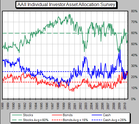
Below is a chart from the American Association of Individual Investors that summarizes investors current asset allocation. The data included in the chart is updated at the end of each month by AAII. As the chart shows an investors bond allocation at 21% is above the longer term average of 15%. Additionally, the equity allocation is down to 55% or 5% below the 60% longer term average.
 |
| From The Blog of HORAN Capital Advisors |
The AAII data supports the mutual fund flow data we have outlined in prior posts. Below is a chart that shows the flow of funds into bond mutual funds and out of equity funds. This is the opposite of what occurred at the top of the market in 2000.
 |
| From The Blog of HORAN Capital Advisors |
As the below chart of the iShares Barclays 20+ year Treasury ETF (TLT) shows, the price has broken support.
 |
| From The Blog of HORAN Capital Advisors |
A declining price means higher interest rates. If rates would continue to move higher, bond prices would adjust lower. With inflation working its way into the pipeline, and who knows what happens in November (could be bullish for stocks and bearish for bonds), inflation seems a greater threat than deflation.


No comments :
Post a Comment